
Why Helvetica Took Over the World: The Neutrality Paradox of Modernist Typography
Created in 1957 to be invisible, Neue Haas Grotesk became the ubiquitous visual language of corporate and civic life.
In-depth essays, historical investigations, and critical writing exploring graphic design, typography, and visual culture.
Created in 1957 to be invisible, Neue Haas Grotesk became the ubiquitous visual language of corporate and civic life.

How Müller-Brockmann and the Zurich School turned a layout tool into a rigorous worldview.

A short-lived school that dismantled centuries of decorative convention.
Why the designer behind some of the most durable American logos insisted that form and content are inseparable.
Simplicity, systems and stubborn consistency: the quiet principles behind identities that outlive their designers.
How mid-century posters used scale, contrast and white space to be understood in a single glance.
Material, colour and form before style: inside the foundation course that reshaped design education.
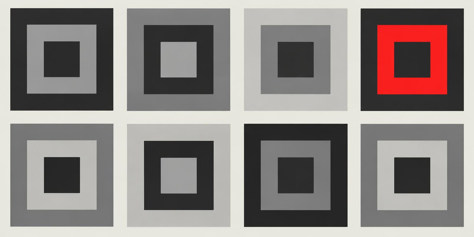
Why a single accent colour can do more work than a full palette.
Grids, sans-serif type and objective photography: how designers in Zurich and Basel built a visual language that still shapes layouts today.
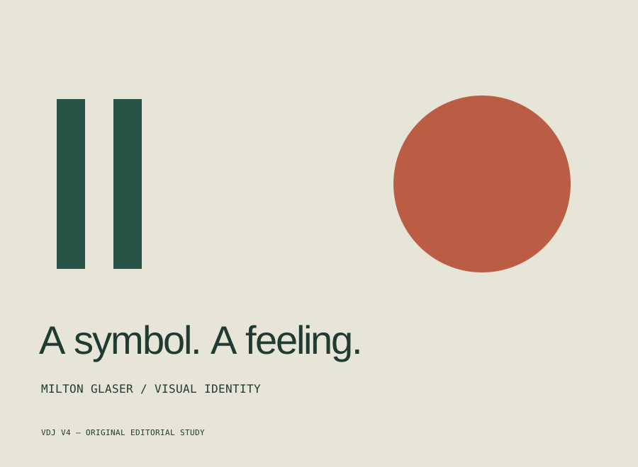
Reading Milton Glaser’s I ♥ NY as a lesson in participation, emotional clarity, and the limits of visual shorthand.
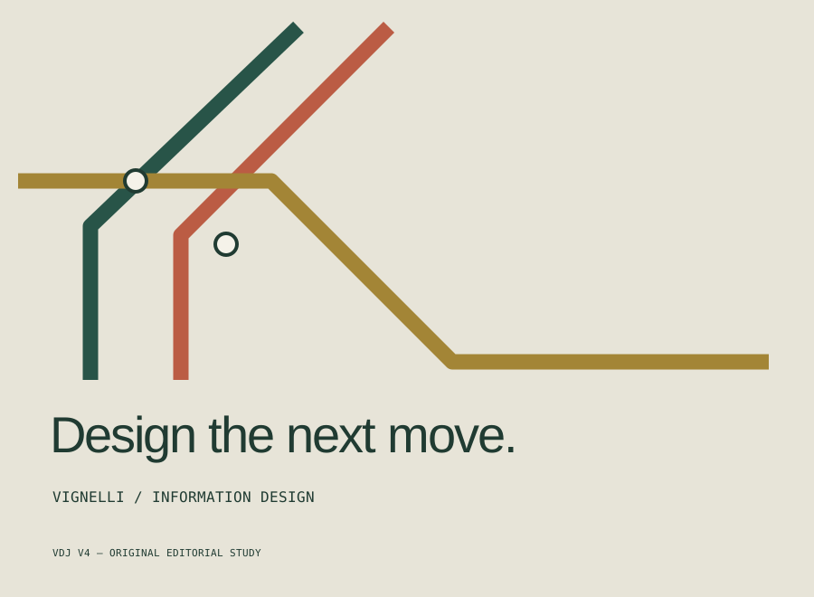
What the 1972 New York subway diagram teaches us about abstraction, useful omissions, and the reader’s next move.
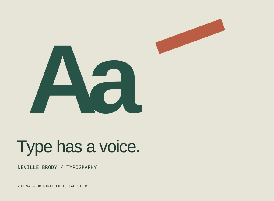
An exercise-led guide to scale, rhythm, and typographic voice, starting from Neville Brody’s approach to experimentation.
How to choose readable text and background colours, understand WCAG contrast ratios, and document a palette your team can use.
A practical way to combine headline, body, and interface type without turning every page into a different visual system.
Build a useful brand guide around logo usage, accessible colours, type roles, image direction, and the decisions your team makes every week.
Understand the difference between visual rules, reusable components, and the processes that keep a digital product consistent.
Become a Premium member and support independent design publishing.
€5 / month
Or €50 / year · save two months
Become a Premium memberCancel anytime. Access continues until your paid period ends.