Lessons from the Modernist Poster
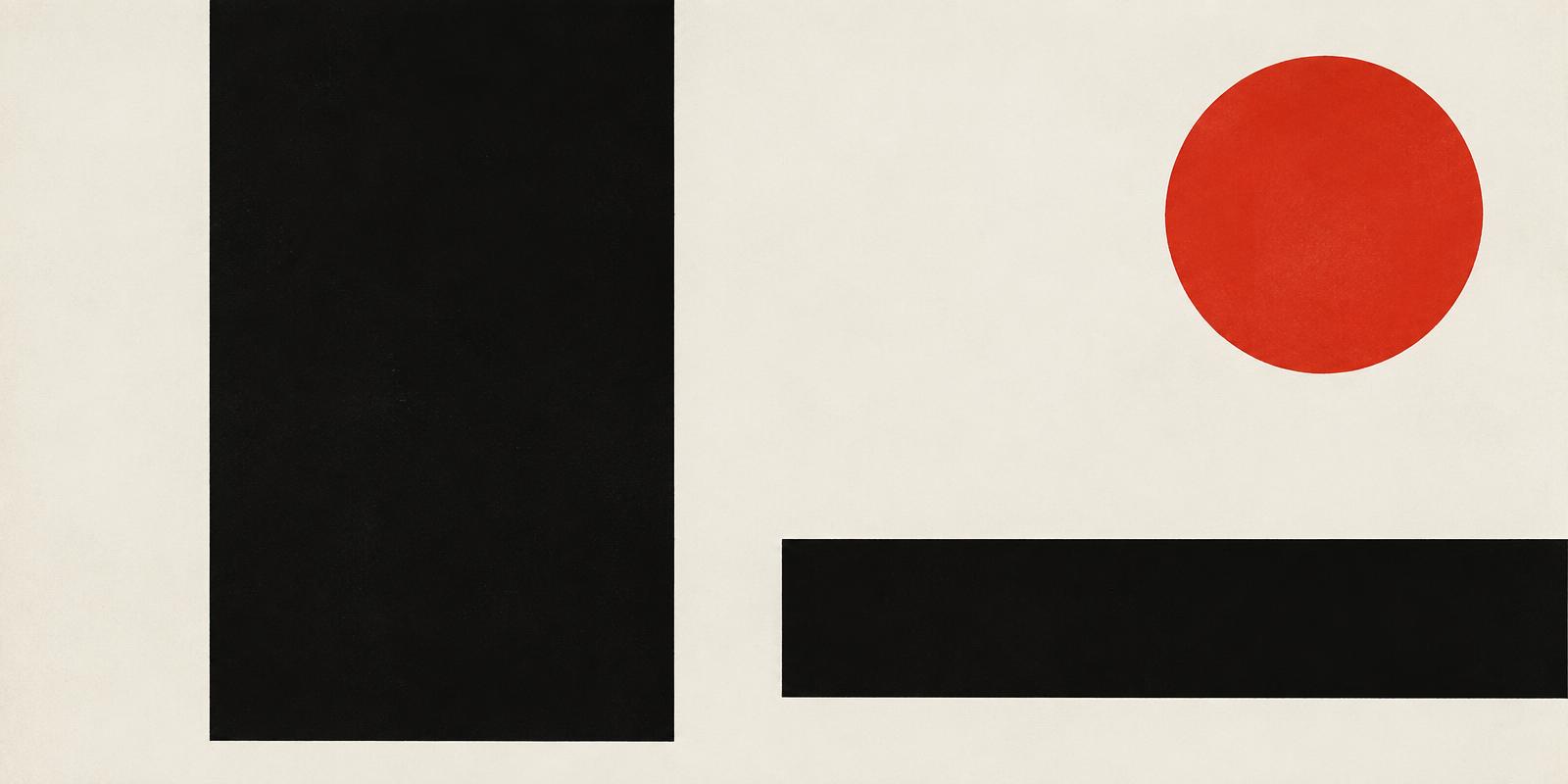
A poster has seconds to work. Modernist designers treated that constraint as a discipline, building compositions that could be read from across a street.
The tools were few: one dominant image or word, a strong contrast of scale, an asymmetric layout held together by an underlying grid, and generous empty space. Photography and sans-serif type replaced illustration and ornament.
The result was a visual language that felt objective and urgent at once. It influenced transit signage, concert posters and, eventually, the screen layouts we scroll through today.
To apply it now, ask what a viewer should understand in one second — then remove everything that competes with that.
Comments (0)
- No comments yet. Start the conversation.
Why Helvetica Took Over the World: The Neutrality Paradox of Modernist Typography
Created in 1957 to be invisible, Neue Haas Grotesk became the ubiquitous visual language of corporate and civic life.
The Mathematical Grid That Changed Graphic Design
How Müller-Brockmann and the Zurich School turned a layout tool into a rigorous worldview.
Paul Rand and the Idea That Design Is a Way of Thinking
Why the designer behind some of the most durable American logos insisted that form and content are inseparable.