What Makes a Corporate Identity Last for Decades?
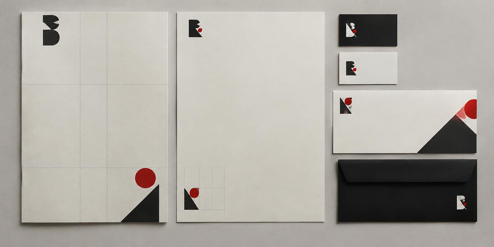
Some identities feel dated within five years; others remain almost untouched for half a century. The difference rarely comes down to a clever symbol. It comes down to the system around it.
The postwar identity programmes of the 1950s and 1960s introduced the design manual: rules for typography, spacing, colour and application across everything from letterheads to vehicles. Consistency turned a mark into a recognisable voice.
Durable identities share a few traits. Their forms are simple enough to reproduce at any size. Their typography is chosen for clarity rather than fashion. And their owners resist the temptation to redesign whenever leadership changes.
Longevity, in other words, is as much an organisational achievement as a creative one.
Comments (0)
- No comments yet. Start the conversation.
Why Helvetica Took Over the World: The Neutrality Paradox of Modernist Typography
Created in 1957 to be invisible, Neue Haas Grotesk became the ubiquitous visual language of corporate and civic life.
The Mathematical Grid That Changed Graphic Design
How Müller-Brockmann and the Zurich School turned a layout tool into a rigorous worldview.
Paul Rand and the Idea That Design Is a Way of Thinking
Why the designer behind some of the most durable American logos insisted that form and content are inseparable.