Make Type Expressive Without Losing the Reader
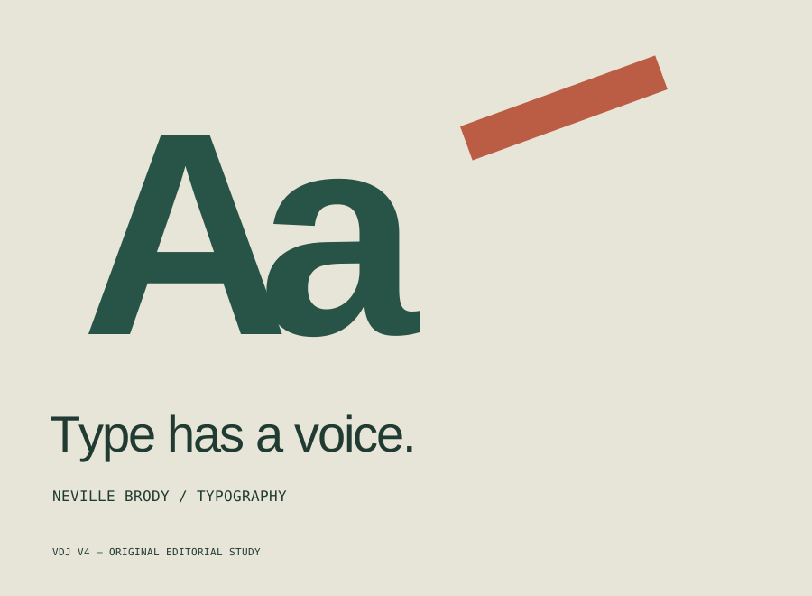
Typography does two things at once. It carries words, and it establishes a way of encountering them. A compact column invites sustained reading. An oversized headline interrupts it. Neither choice is inherently right: the question is what kind of attention the text needs at that moment.
Neville Brody’s practice offers a useful starting point for that question. Brody Associates works across editorial design, identity, and custom type, and presents experimentation alongside precision. Our interpretation is that expressive typography becomes most valuable when the experiment changes how a message is experienced.
Begin with a readable baseline. Set a short headline, a paragraph, and a caption using one family and a restrained range of sizes. Make the reading order obvious. This version is not a compromise to abandon later; it is the reference against which every expressive decision can be assessed.
Now change only scale. Enlarge one word until it begins to compete with the shape of the page. Ask what has become more urgent, and what has become harder to find. If the emphasis changes the meaning in a useful way, keep it. If it only fills space, try another relationship.
Next, experiment with spacing and rhythm. Tightening a headline can make it feel dense and immediate, but tightening body text can make a long passage exhausting. Let different kinds of text do different jobs. A display treatment does not have to become the default voice of the entire publication.
Test the result under less flattering conditions. Reduce the viewport, increase the text size, and read the page without its images. Check whether a headline breaks at a confusing word and whether the next paragraph still has a clear beginning. An expressive design should adapt its emphasis instead of relying on one perfect screenshot.
Finally, remove the most noticeable effect. If the page becomes clearer and loses nothing meaningful, the effect was probably doing too little work. If removing it flattens the subject or erases a useful distinction, you have a stronger reason to keep it. The aim is not to avoid personality. It is to make personality serve the reader.
Comments (0)
- No comments yet. Start the conversation.
Why Helvetica Took Over the World: The Neutrality Paradox of Modernist Typography
Created in 1957 to be invisible, Neue Haas Grotesk became the ubiquitous visual language of corporate and civic life.
Paul Rand and the Idea That Design Is a Way of Thinking
Why the designer behind some of the most durable American logos insisted that form and content are inseparable.
Swiss Design: A Guide to the International Typographic Style
Grids, sans-serif type and objective photography: how designers in Zurich and Basel built a visual language that still shapes layouts today.