Swiss Design: A Guide to the International Typographic Style
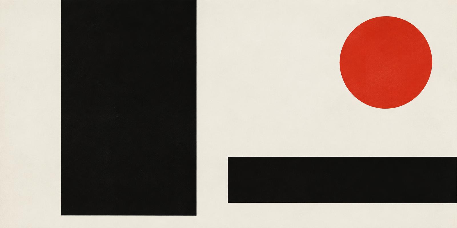
Swiss design — also called the International Typographic Style — is the approach to graphic design that took shape in Switzerland in the 1950s and spread worldwide in the 1960s. Its aim was clarity: information presented as objectively as possible, without decoration competing for attention.
Where it came from. The style grew from the modernism of the 1920s, including the Bauhaus and Jan Tschichold's New Typography. Two schools carried it forward: the Kunstgewerbeschule in Zurich and the Allgemeine Gewerbeschule in Basel, where teachers such as Ernst Keller, Armin Hofmann and Emil Ruder trained a generation of designers.
The core principles. Swiss designers built pages on a mathematical grid, set text flush left with a ragged right edge, favoured sans-serif typefaces, and used photography instead of illustration. Asymmetric layouts and generous white space gave each element room to be read. The goal was not a personal style but a neutral system any message could fit into.
The typefaces. Two sans-serifs released in 1957 became emblems of the movement: Neue Haas Grotesk, drawn by Max Miedinger with Eduard Hoffmann and later renamed Helvetica, and Univers by Adrian Frutiger, conceived from the start as a family of coordinated weights.
Josef Müller-Brockmann and the grid. The Zurich designer Josef Müller-Brockmann (1914–1996) is the figure most associated with the style. His concert posters for the Zurich Tonhalle turned rhythm and proportion into visual form, and his book Grid Systems in Graphic Design (1981) remains a standard reference. From 1958 to 1965 he co-edited the journal Neue Grafik with Richard Paul Lohse, Hans Neuburg and Carlo Vivarelli, which brought the movement to an international audience.
Why it still matters. Corporate identity programmes, transport signage and, later, web and app layouts all borrowed the Swiss toolkit. Every time a designer sets up columns, a baseline grid and a restrained type scale, they are working in its tradition.
How to apply it today: start with a grid, choose one well-made typeface family, let hierarchy come from size and position rather than ornament, and leave space empty on purpose. Explore the Swiss Style entry in our Movements index and the modernist poster lessons in Stories to go further.
Comments (0)
- No comments yet. Start the conversation.
Why Helvetica Took Over the World: The Neutrality Paradox of Modernist Typography
Created in 1957 to be invisible, Neue Haas Grotesk became the ubiquitous visual language of corporate and civic life.
The Mathematical Grid That Changed Graphic Design
How Müller-Brockmann and the Zurich School turned a layout tool into a rigorous worldview.
Paul Rand and the Idea That Design Is a Way of Thinking
Why the designer behind some of the most durable American logos insisted that form and content are inseparable.