Paul Rand and the Idea That Design Is a Way of Thinking
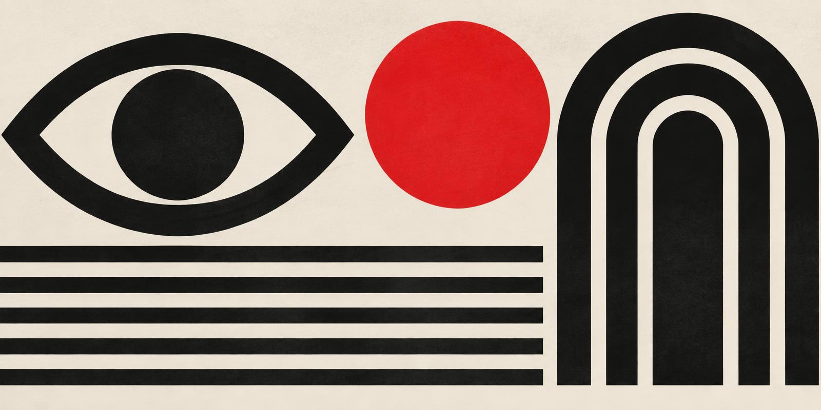
Paul Rand (1914–1996) is often remembered through the marks he left behind: identities for IBM, Westinghouse, ABC and UPS. But his more lasting contribution may be an attitude. For Rand, design was not decoration added at the end of a process. It was the process — a way of organising ideas until they became clear.
Rand drew openly on European modernism, from Cubist collage to the Bauhaus, and translated it for American advertising and business. His work shows how simple geometric forms, wit and a disciplined use of colour can carry a message further than ornament ever could.
He also insisted that a logo does not need to explain a company. As he put it: “A logo derives its meaning from the quality of the thing it symbolizes, not the other way around.” (Paul Rand, “Logos, Flags, and Escutcheons,” published by AIGA, 1991; reprinted in Looking Closer: Critical Writings on Graphic Design, Allworth Press.) That idea still shapes how identity designers defend reduction and restraint to their clients.
For today's designers, the lesson is practical: start with the problem, remove whatever does not serve it, and let humour and surprise do the rest.
Comments (0)
- No comments yet. Start the conversation.
Why Helvetica Took Over the World: The Neutrality Paradox of Modernist Typography
Created in 1957 to be invisible, Neue Haas Grotesk became the ubiquitous visual language of corporate and civic life.
What Makes a Corporate Identity Last for Decades?
Simplicity, systems and stubborn consistency: the quiet principles behind identities that outlive their designers.
Lessons from the Modernist Poster
How mid-century posters used scale, contrast and white space to be understood in a single glance.