-
Table of Contents
- Understanding Grid Systems for Typography Layouts
- What are Grid Systems?
- The Benefits of Using Grid Systems for Typography Layouts
- 1. Consistency and Structure
- 2. Hierarchy and Readability
- 3. Visual Balance and Harmony
- Implementing Grid Systems for Typography Layouts
- 1. Define the Grid Structure
- 2. Establish Vertical Rhythm
- 3. Align Text Elements
- 4. Consider Responsive Design
- Case Studies: Successful Typography Layouts with Grid Systems
- 1. The New York Times
- 2. Medium
- Conclusion
Understanding Grid Systems for Typography Layouts

Typography is a crucial element in design, and it plays a significant role in conveying information effectively. When it comes to creating visually appealing and readable typography layouts, understanding grid systems is essential. Grid systems provide a framework that helps designers organize and structure their typography, resulting in harmonious and balanced compositions. In this article, we will explore the concept of grid systems for typography layouts, their benefits, and how to effectively implement them.
What are Grid Systems?
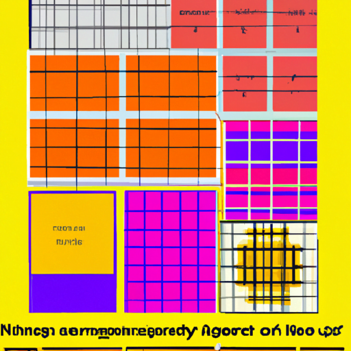
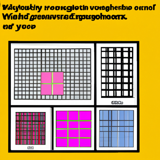
A grid system is a framework that divides a layout into columns and rows, creating a structure that guides the placement of elements. Grids provide a sense of order and consistency, allowing designers to align and position elements in a visually pleasing and organized manner. Grid systems have been used in various design disciplines, including print design, web design, and typography layouts.
Grid systems for typography layouts are specifically designed to structure and align text elements. They help establish a hierarchy, improve readability, and create a cohesive visual experience. By using a grid system, designers can ensure that their typography layouts are well-organized, balanced, and visually appealing.
The Benefits of Using Grid Systems for Typography Layouts
Using grid systems for typography layouts offers several benefits that contribute to the overall effectiveness of the design. Let’s explore some of these benefits:
1. Consistency and Structure
Grid systems provide a consistent and structured framework for typography layouts. By adhering to a grid, designers can ensure that their text elements are aligned and positioned consistently throughout the design. This consistency creates a sense of order and professionalism, making the design more visually appealing and easier to read.
For example, a newspaper layout often utilizes a grid system to align headlines, subheadings, and body text. This consistency helps readers navigate the content easily and enhances the overall reading experience.
2. Hierarchy and Readability
Typography layouts often require establishing a hierarchy to guide readers through the content. Grid systems can help designers achieve this hierarchy by providing a structure that allows for clear differentiation between different text elements.
For instance, a grid system can be used to allocate more space to headings, making them stand out and grab the reader’s attention. By establishing a clear hierarchy, designers can improve the readability of the content and ensure that important information is easily accessible.
3. Visual Balance and Harmony
Grid systems contribute to the visual balance and harmony of typography layouts. By aligning text elements to a grid, designers can create a sense of order and balance within the design. This alignment helps avoid awkward spacing and ensures that the design looks visually pleasing.
For example, a grid system can be used to align text elements with images or other visual elements, creating a cohesive and harmonious composition. This visual balance enhances the overall aesthetic appeal of the design and improves the user experience.
Implementing Grid Systems for Typography Layouts
Now that we understand the benefits of using grid systems for typography layouts, let’s explore how to effectively implement them. Here are some key steps to consider:
1. Define the Grid Structure
The first step in implementing a grid system for typography layouts is to define the grid structure. Determine the number of columns and rows that will best suit your design. Consider the content you need to include and how you want to distribute it within the layout.
For example, if you are designing a magazine article, you may choose a grid structure with multiple columns to accommodate the text, images, and other elements. On the other hand, a simple blog post layout may require a more straightforward grid structure with fewer columns.
2. Establish Vertical Rhythm
Vertical rhythm is an essential aspect of typography layouts. It refers to the consistent spacing between lines of text, ensuring readability and visual harmony. When implementing a grid system, it is crucial to establish a vertical rhythm that aligns with the grid structure.
Consider the line height, leading, and baseline grid to create a consistent vertical rhythm. This will help maintain a balanced and visually pleasing layout, making it easier for readers to follow the text.
3. Align Text Elements
Once the grid structure and vertical rhythm are established, it’s time to align the text elements within the grid. Use the columns and rows of the grid to position headings, subheadings, body text, and other text elements.
Aligning text elements to the grid will create a sense of order and consistency within the design. It will also help establish a clear hierarchy and improve the overall readability of the typography layout.
4. Consider Responsive Design
In today’s digital age, responsive design is crucial for typography layouts. With the variety of devices and screen sizes available, it is essential to consider how the grid system will adapt to different layouts.
When implementing a grid system, ensure that it is flexible enough to accommodate different screen sizes and orientations. Consider using responsive design techniques, such as media queries, to adjust the grid structure and alignment based on the device being used.
Case Studies: Successful Typography Layouts with Grid Systems
Let’s take a look at some real-world examples of successful typography layouts that effectively utilize grid systems:
1. The New York Times
The New York Times is known for its well-structured and visually appealing typography layouts. The newspaper utilizes a grid system to align headlines, subheadings, and body text consistently. This grid-based approach ensures readability and creates a cohesive reading experience.
2. Medium
Medium, a popular online publishing platform, also implements a grid system for its typography layouts. The platform uses a responsive grid that adapts to different screen sizes, ensuring a consistent reading experience across devices. The grid system helps establish a clear hierarchy and enhances the overall readability of the content.
Conclusion
Understanding grid systems for typography layouts is essential for creating visually appealing and readable designs. Grid systems provide a framework that ensures consistency, hierarchy, and visual balance within the layout. By implementing grid systems effectively, designers can enhance the overall readability and user experience of their typography layouts.
Remember to define the grid structure, establish vertical rhythm, align text elements, and consider responsive design when implementing a grid system. By following these steps and studying successful case studies, designers can create typography layouts that are visually pleasing, organized, and easy to read.
So, the next time you embark on a typography design project, don’t forget to leverage the power of grid systems to create stunning and effective layouts.
