-
Table of Contents
The Role of Contrast in Designing Striking Graphics

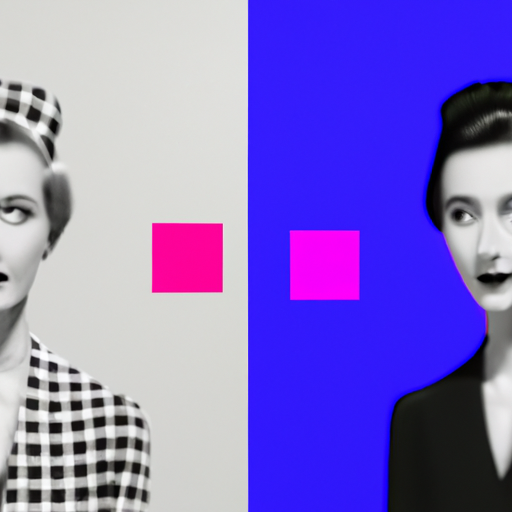
When it comes to designing graphics, one of the most powerful tools at a designer’s disposal is contrast. Contrast refers to the difference between elements in a design, whether it be in color, size, shape, or texture. By strategically using contrast, designers can create visually striking graphics that capture attention and communicate effectively. In this article, we will explore the role of contrast in design and how it can be leveraged to create impactful visuals.
The Power of Contrast
Contrast is a fundamental principle of design that helps create visual interest and hierarchy. It allows designers to emphasize certain elements, guide the viewer’s attention, and create a sense of balance and harmony. Without contrast, designs can appear flat, dull, and unengaging.
One of the most common ways contrast is used in design is through color. By using colors that are opposite on the color wheel, such as black and white or red and green, designers can create a strong visual impact. This is known as complementary contrast. For example, a black background with white text immediately grabs attention and is easy to read.
Another type of contrast is value contrast, which refers to the difference in lightness and darkness between elements. By using light and dark values, designers can create depth and dimension in their designs. This is particularly important in creating realistic illustrations or adding depth to flat graphics.
Using Contrast to Enhance Readability
One of the key considerations when designing graphics is readability. Whether it’s a poster, a website, or an infographic, the information needs to be easily digestible and understandable. Contrast plays a crucial role in enhancing readability.
When it comes to typography, contrast can be used to make text stand out and improve legibility. By using a high contrast between the text color and the background color, designers can ensure that the text is easily readable. For example, using a dark text color on a light background or vice versa.
Contrast can also be used to differentiate between different sections or elements within a design. By using contrasting colors or sizes, designers can create a clear visual hierarchy and guide the viewer’s eye. This is particularly important in complex designs with multiple elements or sections.
Case Studies: Contrast in Action
Let’s take a look at some real-world examples of how contrast has been effectively used in graphic design:
1. Apple
Apple is known for its sleek and minimalist design aesthetic. One of the key elements of their design is the use of high contrast. Whether it’s their iconic white logo on a black background or the clean typography with ample white space, Apple’s designs are visually striking and instantly recognizable.
2. Nike
Nike is another brand that effectively uses contrast in its graphic design. Their logo, the Nike Swoosh, is a simple and bold design that stands out due to its high contrast. The combination of a solid black swoosh on a white background creates a strong visual impact and makes the logo easily recognizable.
3. National Geographic
National Geographic is known for its stunning photography and captivating visuals. Their magazine covers often feature high contrast images that immediately grab attention. By using contrasting colors and strong visual elements, National Geographic creates visually striking graphics that entice readers to pick up their magazine.
Statistics on the Impact of Contrast
The importance of contrast in design is not just anecdotal; there is evidence to support its effectiveness. Here are some statistics that highlight the impact of contrast:
- According to a study by the Nielsen Norman Group, users spend an average of 5.59 seconds looking at a website’s main image. By using contrast to make the main image stand out, designers can increase the chances of capturing the user’s attention.
- A study published in the Journal of Consumer Psychology found that high contrast packaging designs are more likely to be noticed and remembered by consumers. This highlights the importance of contrast in product packaging and branding.
- In a study conducted by the University of Toronto, researchers found that high contrast images are more likely to be shared on social media platforms. This suggests that contrast plays a role in increasing the virality and engagement of visual content.
Conclusion
Contrast is a powerful tool in graphic design that can make or break a visual composition. By leveraging contrast effectively, designers can create visually striking graphics that capture attention, communicate effectively, and enhance readability. Whether it’s through color, value, size, or texture, contrast plays a crucial role in creating impactful visuals. By studying successful case studies and understanding the statistics that support the impact of contrast, designers can take their designs to the next level and create graphics that leave a lasting impression.
