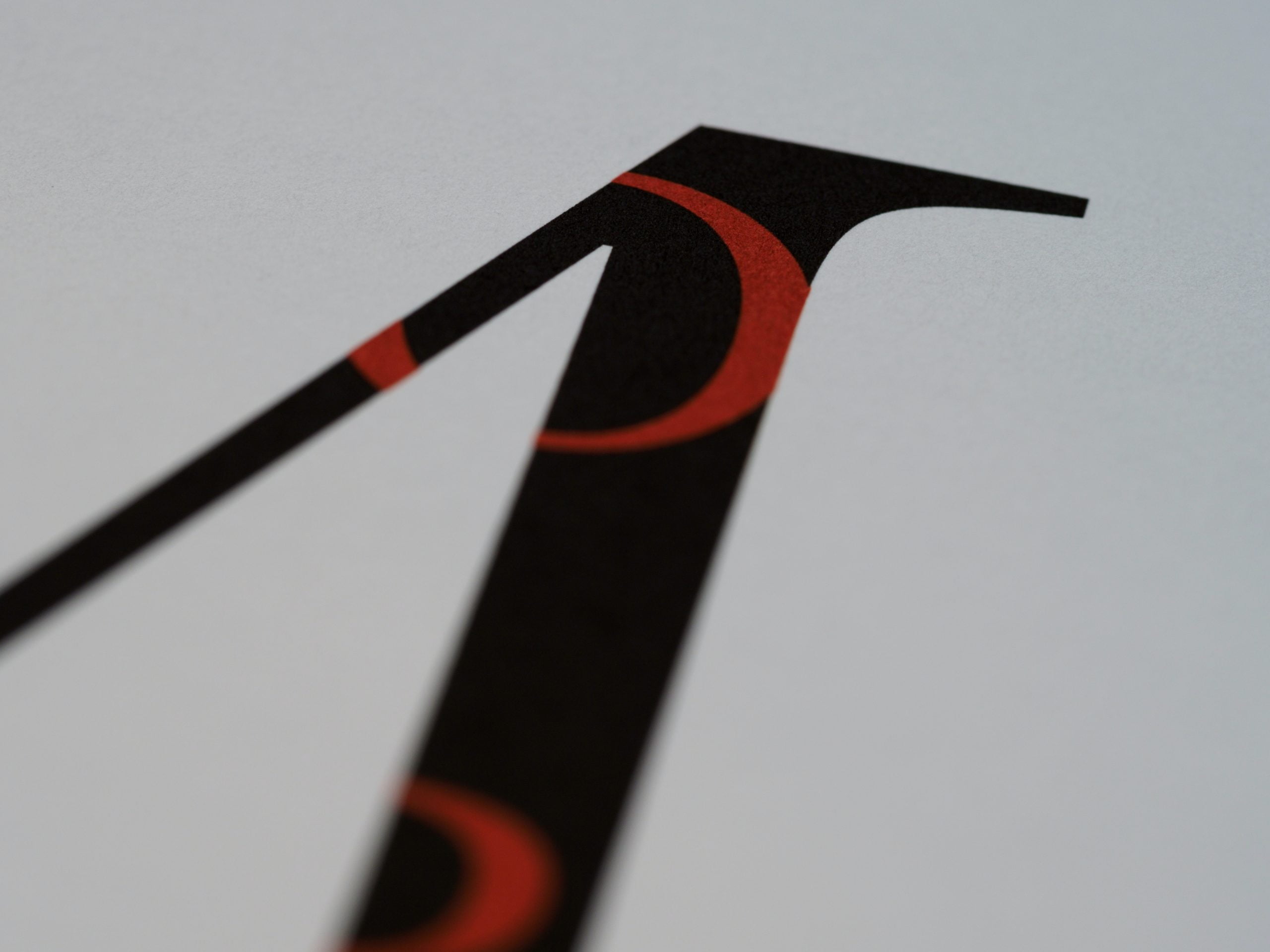
Introduction: The Importance of Typefaces in Design
Typefaces are an essential element of design that can make or break the visual appeal of a project. They are the building blocks of typography, and they play a crucial role in conveying the message of a design. Typefaces are used in various mediums, including print, digital, and web design, and they can evoke different emotions and moods depending on the typeface used.
Choosing the right typeface is crucial in design, as it can affect the readability, legibility, and overall aesthetic of a project. A well-chosen typeface can enhance the message of a design, while a poorly chosen one can detract from it. In this article, we will explore the different types of typefaces, their history, and when to use them.
Serif vs. Sans-Serif: What’s the Difference?
The two main categories of typefaces are serif and sans-serif. Serif typefaces have small lines or flourishes at the end of each stroke, while sans-serif typefaces do not. Serif typefaces are often associated with traditional or formal designs, while sans-serif typefaces are associated with modern or minimalist designs.
Serif typefaces are often used in print design, such as books, newspapers, and magazines, as they are believed to be more legible in long-form text. Sans-serif typefaces are commonly used in digital and web design, as they are believed to be more legible on screens.
The History of Serif and Sans-Serif Typefaces
The history of serif and sans-serif typefaces dates back to the 15th century, when Johannes Gutenberg invented the printing press. The first typeface used in the printing press was a serif typeface called Blackletter, which was commonly used in books and manuscripts.
In the 18th century, a new typeface called Roman was introduced, which had a more refined and elegant look. Roman typefaces were often used in formal documents and books.
Sans-serif typefaces were first introduced in the early 19th century, as a response to the growing demand for simpler and more modern designs. The first sans-serif typeface was called Grotesque, and it was widely used in advertising and signage.
When to Use Serif vs. Sans-Serif Typefaces
The choice between serif and sans-serif typefaces depends on the context and purpose of the design. Serif typefaces are often used in print design, such as books, newspapers, and magazines, as they are believed to be more legible in long-form text. Serif typefaces are also commonly used in formal documents, such as resumes and business letters.
Sans-serif typefaces are commonly used in digital and web design, as they are believed to be more legible on screens. Sans-serif typefaces are also often used in modern and minimalist designs, such as logos and branding.
It is important to consider the audience and the message of the design when choosing a typeface. For example, a serif typeface may be more appropriate for a traditional or formal design, while a sans-serif typeface may be more appropriate for a modern or minimalist design.
Popular Serif and Sans-Serif Typefaces in Design
There are many popular serif and sans-serif typefaces used in design. Some popular serif typefaces include Times New Roman, Georgia, and Baskerville. Times New Roman is a classic serif typeface that is commonly used in print design, such as books and newspapers. Georgia is a modern serif typeface that is commonly used in web design. Baskerville is a refined and elegant serif typeface that is commonly used in formal documents.
Some popular sans-serif typefaces include Helvetica, Arial, and Futura. Helvetica is a classic sans-serif typeface that is commonly used in branding and signage. Arial is a modern sans-serif typeface that is commonly used in digital and web design. Futura is a geometric sans-serif typeface that is commonly used in modern and minimalist designs.
Conclusion: Choosing the Right Typeface for Your Design
Choosing the right typeface is crucial in design, as it can affect the readability, legibility, and overall aesthetic of a project. When choosing a typeface, it is important to consider the context and purpose of the design, as well as the audience and message. Serif typefaces are often used in print design, while sans-serif typefaces are commonly used in digital and web design. There are many popular serif and sans-serif typefaces used in design, each with its own unique characteristics and history. By understanding the different types of typefaces and their uses, designers can choose the right typeface to enhance the message of their design.
