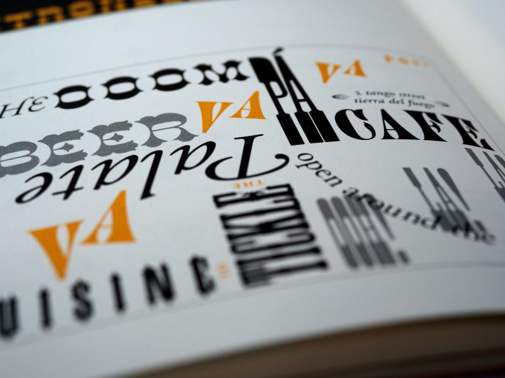
Introduction: The Importance of Typography in Design
Typography is the art and technique of arranging type to make written language legible, readable, and appealing when displayed. It is an essential element of design that can make or break the effectiveness of a message. Typography is not just about choosing a font, but it is also about understanding the psychology of fonts, the differences between serif and sans-serif, the role of color, and the art of pairing fonts. In this article, we will explore the power of typography and how it can impact your message.
The Psychology of Fonts: How Typography Affects Perception
Fonts have a psychological impact on the reader. Different fonts can evoke different emotions and perceptions. For example, a bold and thick font can convey strength and power, while a thin and delicate font can convey elegance and sophistication. A serif font can convey tradition and authority, while a sans-serif font can convey modernity and simplicity.
According to a study by the University of Michigan, people tend to associate serif fonts with more formal and serious content, while sans-serif fonts are associated with more casual and informal content. The study also found that people perceive serif fonts as more legible than sans-serif fonts, especially in printed materials.
Another study by the University of Dayton found that fonts with high legibility and readability scores were perceived as more credible and trustworthy than fonts with low scores. This highlights the importance of choosing the right font for your message.
Serif vs. Sans-Serif: Understanding the Differences and When to Use Each
Serif and sans-serif are the two main categories of fonts. Serif fonts have small lines or flourishes at the ends of the strokes that make up the letters, while sans-serif fonts do not have these lines. Serif fonts are often used in printed materials such as books, newspapers, and magazines, while sans-serif fonts are often used in digital media such as websites and mobile apps.
Serif fonts are generally considered more traditional and formal, while sans-serif fonts are considered more modern and informal. Serif fonts are also perceived as more legible in printed materials, while sans-serif fonts are perceived as more legible in digital media.
When choosing between serif and sans-serif fonts, it is important to consider the context and purpose of your message. If you are creating a formal document such as a legal contract or a wedding invitation, a serif font may be more appropriate. If you are creating a website or a mobile app, a sans-serif font may be more appropriate.
The Role of Color in Typography: Choosing the Right Hue for Your Message
Color is an important element of typography that can enhance the impact of your message. Different colors can evoke different emotions and perceptions. For example, red can convey passion and excitement, while blue can convey trust and reliability. The color of your font can also affect its legibility and readability.
When choosing a color for your font, it is important to consider the context and purpose of your message. If you are creating a website or a mobile app, you may want to choose a color that complements your brand or logo. If you are creating a marketing campaign, you may want to choose a color that evokes the emotions and perceptions that you want to convey.
The Art of Pairing Fonts: Creating Harmonious and Effective Combinations
Pairing fonts is an art that can enhance the impact of your message. When pairing fonts, it is important to consider the contrast, balance, and harmony between the fonts. Contrasting fonts can create visual interest and emphasize important information, while balanced fonts can create a sense of harmony and consistency.
When pairing fonts, it is also important to consider the context and purpose of your message. If you are creating a formal document such as a resume or a business proposal, you may want to pair a serif font with a sans-serif font for contrast and balance. If you are creating a marketing campaign, you may want to pair a bold and thick font with a thin and delicate font for visual interest and emphasis.
Conclusion: Harnessing the Power of Typography for Maximum Impact
Typography is a powerful tool that can enhance the impact of your message. By understanding the psychology of fonts, the differences between serif and sans-serif, the role of color, and the art of pairing fonts, you can create effective and impactful designs. When choosing a font, color, or pairing, it is important to consider the context and purpose of your message. With the right typography, you can create a message that is not only legible and readable but also engaging and memorable.


