-
Table of Contents
- The Psychology of Typography: How Fonts Affect Perception
- The Power of Typography
- Legibility and Readability
- The Impact of Fonts on Perception
- Serif Fonts
- Sans-Serif Fonts
- Script Fonts
- Display Fonts
- The Influence of Typography on Branding
- The Role of Typography in Advertising
- Case Studies: Fonts in Action
- 1. The Obama Campaign
- 2. The Papyrus Font Controversy
- Conclusion
The Psychology of Typography: How Fonts Affect Perception

Typography is an essential element of design that goes beyond mere aesthetics. The choice of font can significantly impact how a message is perceived and understood. In recent years, researchers have delved into the psychology of typography, uncovering fascinating insights into how fonts affect perception. This article explores the various ways in which fonts influence our thoughts, emotions, and behaviors, backed by compelling research and real-world examples.
The Power of Typography
Typography plays a crucial role in communication, as it helps convey meaning and evoke emotions. The right font can enhance the effectiveness of a message, while the wrong choice can lead to misinterpretation or disengagement. Understanding the psychological impact of typography can empower designers, marketers, and communicators to make informed decisions that align with their intended goals.
Legibility and Readability
One of the fundamental aspects of typography is legibility, which refers to how easily individual characters can be distinguished from one another. Readability, on the other hand, encompasses the overall ease of reading a block of text. Both legibility and readability are crucial for effective communication.
Research has shown that certain fonts are more legible than others. For example, sans-serif fonts like Arial and Helvetica are generally considered more legible for on-screen reading, while serif fonts like Times New Roman are often preferred for printed materials. However, legibility can also be influenced by factors such as font size, spacing, and line length.
Readability, on the other hand, is influenced by the overall design of the text. Factors such as line spacing, paragraph length, and text alignment can impact how easily a reader can navigate through a piece of text. For instance, shorter paragraphs and ample white space can enhance readability by reducing cognitive load and allowing for easier scanning.
The Impact of Fonts on Perception
Fonts have the power to evoke specific emotions and shape perceptions. Different fonts can convey different personalities, moods, and tones, influencing how a message is received. Let’s explore some common font categories and their associated psychological effects:
Serif Fonts
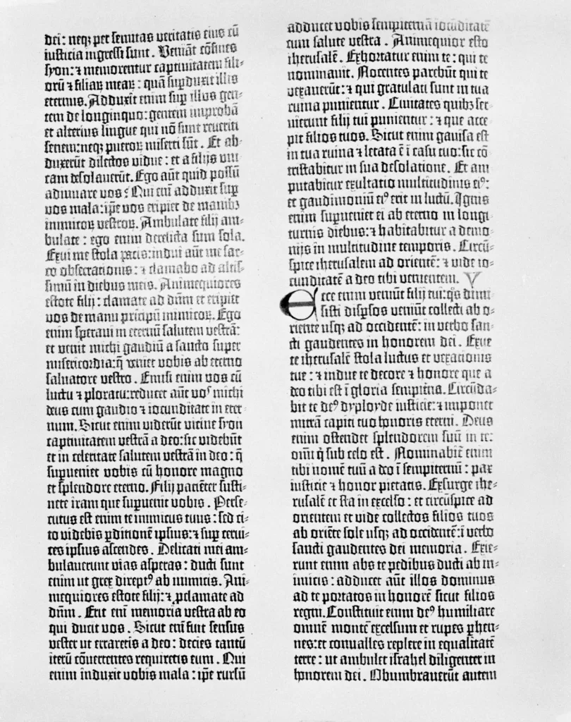
Serif fonts, characterized by small decorative strokes at the end of each letter, are often associated with tradition, reliability, and authority. They are commonly used in formal documents, such as academic papers or legal contracts. Serif fonts can evoke a sense of trustworthiness and professionalism, making them suitable for conveying serious or authoritative messages.
Sans-Serif Fonts
Sans-serif fonts, without the decorative strokes, are often perceived as modern, clean, and straightforward. They are widely used in digital interfaces and contemporary designs. Sans-serif fonts can create a sense of simplicity and informality, making them suitable for conveying casual or friendly messages.
Script Fonts
Script fonts mimic handwriting and can evoke a sense of elegance, creativity, and personal touch. They are often used in invitations, logos, or branding materials. Script fonts can add a touch of sophistication or playfulness to a message, depending on the context.
Display Fonts
Display fonts are highly stylized and attention-grabbing. They are often used for headlines, logos, or advertisements. Display fonts can convey a wide range of emotions and personalities, from bold and energetic to elegant and whimsical. However, they are best used sparingly to avoid overwhelming the reader.
The Influence of Typography on Branding
Typography plays a crucial role in branding, as it helps shape the perception of a company or product. Consistent use of typography across various touchpoints, such as logos, websites, and marketing materials, can create a strong brand identity and foster recognition.
For example, consider the iconic typography of Coca-Cola. The unique script font used in their logo has become synonymous with the brand and instantly recognizable worldwide. The font choice conveys a sense of nostalgia, authenticity, and timeless appeal, aligning with Coca-Cola’s brand values and positioning.
Similarly, tech giant Apple has built a strong brand identity through its use of typography. The clean and minimalist sans-serif font used in their marketing materials and product interfaces reflects their commitment to simplicity, innovation, and user-friendly design.
The Role of Typography in Advertising
In advertising, typography plays a crucial role in capturing attention, conveying messages, and influencing consumer behavior. The right font choice can make an advertisement more memorable, persuasive, and impactful.
Research has shown that fonts can influence consumer perceptions and attitudes. For example, a study conducted by Hyunjin Song and Norbert Schwarz found that participants rated an advertisement as more enjoyable and trustworthy when it was presented in an easy-to-read font compared to a difficult-to-read font. The study suggests that legible fonts can enhance positive perceptions and increase the likelihood of consumer engagement.
Typography can also be used strategically to emphasize certain words or phrases in an advertisement. By adjusting the font size, weight, or style, advertisers can draw attention to key messages and create a hierarchy of information. For instance, bold and larger fonts are often used for headlines or call-to-action statements, while smaller fonts are used for supporting details.
Case Studies: Fonts in Action
Let’s explore a few real-world examples that demonstrate the impact of fonts on perception:
1. The Obama Campaign
During Barack Obama’s presidential campaign in 2008, the campaign team strategically chose the font “Gotham” for their branding materials. Gotham, a sans-serif font, was selected for its modern, approachable, and optimistic qualities. The font choice aligned with Obama’s message of change and hope, resonating with voters and contributing to the overall success of the campaign.
2. The Papyrus Font Controversy
In 2017, the movie “Avatar” faced criticism for its use of the Papyrus font in its logo and promotional materials. Many viewers found the font choice to be incongruent with the film’s futuristic and visually stunning world. The backlash highlighted the importance of font selection in maintaining consistency and aligning with the overall theme and message of a creative work.
Conclusion
The psychology of typography reveals that fonts have a profound impact on perception, emotions, and behavior. By understanding the psychological effects of different fonts, designers, marketers, and communicators can make informed choices that align with their intended goals. Legibility and readability are crucial for effective communication, while font categories can evoke specific emotions and shape brand identity. In advertising, typography can capture attention, convey messages, and influence consumer behavior. The power of typography should not be underestimated, as it can make or break the success of a design or communication piece.


