-
Table of Contents
- The Influence of Typography in Music Festival Posters
- The Importance of Typography in Poster Design
- Case Studies: Typography in Music Festival Posters
- 1. Coachella
- 2. Glastonbury
- The Role of Typography in Creating Visual Impact
- 1. Font Selection
- 2. Typography Hierarchy
- The Impact of Typography on Festival Attendance
- Summary
The Influence of Typography in Music Festival Posters

Typography plays a crucial role in the design of music festival posters. It has the power to capture attention, convey the festival’s atmosphere, and create a lasting impression on the audience. In this article, we will explore the influence of typography in music festival posters and how it contributes to the overall success of the event.
The Importance of Typography in Poster Design
Typography is more than just selecting a font for a poster; it is a form of visual communication. The right typography can evoke emotions, set the tone, and convey the festival’s identity. Here are some reasons why typography is crucial in poster design:
- Brand Identity: Typography helps establish and reinforce the festival’s brand identity. By using consistent typography across all promotional materials, the festival can create a recognizable and memorable visual language.
- Legibility: Clear and legible typography ensures that the information on the poster is easily readable, even from a distance. It helps potential attendees quickly understand the festival’s name, dates, and lineup.
- Atmosphere: Different typefaces evoke different moods and atmospheres. The choice of typography can reflect the genre of music, the festival’s theme, or the overall vibe of the event.
- Visual Hierarchy: Typography helps establish a visual hierarchy on the poster, guiding the viewer’s attention to the most important information. It allows the festival organizers to prioritize key details such as the headliner or ticket information.
Case Studies: Typography in Music Festival Posters
Let’s take a closer look at some real-world examples of how typography has influenced the success of music festival posters:
1. Coachella
Coachella, one of the most renowned music festivals in the world, has consistently used typography to create a unique and recognizable brand. The festival’s logo, featuring a bold, all-caps sans-serif font, has become iconic. It represents the festival’s modern and trendy image, attracting a young and diverse audience.
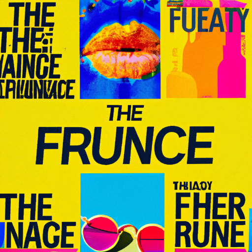
Additionally, Coachella’s posters often feature a mix of bold and playful typefaces. The typography reflects the festival’s eclectic lineup and vibrant atmosphere. The use of bright colors and unconventional layouts further enhances the visual impact of the posters.
2. Glastonbury
Glastonbury, a legendary music festival in the UK, takes a different approach to typography. The festival’s posters often feature hand-drawn lettering and organic shapes, giving them a rustic and handmade feel. This choice of typography aligns with Glastonbury’s focus on sustainability, nature, and community.
The hand-drawn typography creates a sense of authenticity and uniqueness, setting Glastonbury apart from other festivals. It also reflects the festival’s diverse range of music genres, from folk to rock to electronic.
The Role of Typography in Creating Visual Impact
Typography plays a crucial role in creating visual impact in music festival posters. Here are some key factors to consider:
1. Font Selection
The choice of font can greatly influence the overall look and feel of the poster. Different fonts have different personalities and evoke different emotions. For example:
- Serif fonts, with their traditional and elegant appearance, are often associated with classical or sophisticated music festivals.
- Sans-serif fonts, with their clean and modern look, are commonly used in contemporary and mainstream music festivals.
- Handwritten or script fonts can add a personal and intimate touch, suitable for smaller and more intimate events.
It is important to choose a font that aligns with the festival’s brand and target audience. Experimenting with different fonts and combinations can help find the perfect balance between readability and visual impact.
2. Typography Hierarchy
Creating a clear hierarchy in typography ensures that the most important information stands out. This can be achieved through various techniques:
- Using larger font sizes for the festival’s name or headliner.
- Applying bold or italic styles to highlight key details.
- Playing with different weights or variations of the chosen font to create contrast.
By establishing a visual hierarchy, the poster becomes more organized and easier to navigate, allowing potential attendees to quickly grasp the essential information.
The Impact of Typography on Festival Attendance
Typography can have a significant impact on festival attendance. A well-designed poster with effective typography can attract attention, generate interest, and ultimately drive ticket sales. Here are some statistics that highlight the influence of typography:
- A study conducted by the University of Cincinnati found that typography accounted for 95% of the visual impact of a poster.
- According to a survey by Eventbrite, 65% of respondents said that the design of a festival poster influenced their decision to attend the event.
- In a case study by the Design Council, a music festival saw a 30% increase in ticket sales after redesigning their poster with improved typography.
These statistics demonstrate the power of typography in capturing attention, creating a positive impression, and ultimately driving festival attendance.
Summary
Typography plays a crucial role in the design of music festival posters. It helps establish the festival’s brand identity, create a visual hierarchy, and evoke the desired atmosphere. Real-world examples such as Coachella and Glastonbury showcase the impact of typography on the success of music festival posters.
By carefully selecting fonts, creating a clear hierarchy, and considering the target audience, festival organizers can create visually impactful posters that attract attention, generate interest, and drive ticket sales. The influence of typography on festival attendance is undeniable, making it an essential element in the overall success of music festivals.


