-
Table of Contents
Retro Packaging Design: A Blast from the Past

In today’s fast-paced world, where new trends and technologies emerge constantly, it’s easy to overlook the charm and nostalgia of the past. However, in recent years, there has been a resurgence of interest in retro packaging design. From vintage-inspired logos to classic typography, retro packaging design has captured the attention of consumers and marketers alike. In this article, we will explore the reasons behind the popularity of retro packaging design, its impact on consumer behavior, and how brands can effectively incorporate retro elements into their packaging.
The Allure of Nostalgia
One of the main reasons retro packaging design has gained popularity is its ability to evoke a sense of nostalgia. Nostalgia is a powerful emotion that can transport us back to a simpler time, reminding us of fond memories and experiences. By incorporating retro elements into their packaging, brands tap into this emotional connection, creating a sense of familiarity and comfort for consumers.
For example, Coca-Cola’s iconic glass bottle design, which dates back to the early 20th century, is instantly recognizable and evokes a sense of nostalgia for many consumers. The brand has successfully leveraged this retro packaging design to create a timeless image that resonates with people across generations.
Stand Out in a Crowded Market
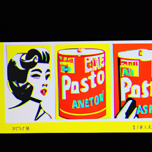
In today’s competitive market, it’s crucial for brands to find ways to stand out from the crowd. Retro packaging design offers a unique opportunity to differentiate products and capture consumers’ attention. While modern packaging designs often focus on sleek and minimalist aesthetics, retro packaging design embraces bold colors, intricate illustrations, and playful typography.
Take, for example, the cereal brand “Lucky Charms.” The brand’s packaging features a leprechaun mascot and vibrant colors, reminiscent of the 1960s. This distinctive retro design sets it apart from other cereal brands on the shelf and creates a memorable visual identity.
Creating an Emotional Connection
Effective packaging design goes beyond aesthetics; it also plays a crucial role in creating an emotional connection with consumers. Retro packaging design has the power to evoke positive emotions and create a sense of authenticity and trust.
Research has shown that consumers are more likely to trust brands that have a sense of history and heritage. By incorporating retro elements into their packaging, brands can convey a sense of longevity and reliability. This emotional connection can lead to increased brand loyalty and repeat purchases.
Case Study: Hershey’s Chocolate
Hershey’s, one of the most well-known chocolate brands in the world, has successfully incorporated retro packaging design to create a strong emotional connection with consumers. The brand’s iconic silver packaging with the classic Hershey’s logo has remained largely unchanged for decades.
This retro packaging design not only evokes a sense of nostalgia but also conveys a sense of tradition and quality. The familiar packaging design reassures consumers that they are purchasing a trusted and beloved brand.
Effect on Consumer Behavior
Retro packaging design has a significant impact on consumer behavior. Studies have shown that consumers are more likely to choose products with retro packaging over modern alternatives. The familiarity and nostalgia associated with retro packaging design can create a sense of trust and reliability, influencing purchasing decisions.
Furthermore, retro packaging design can also enhance the perceived value of a product. Research has found that consumers are willing to pay more for products with retro packaging compared to similar products with modern packaging. This willingness to pay a premium is driven by the emotional connection and perceived authenticity associated with retro designs.
How to Incorporate Retro Elements
When incorporating retro elements into packaging design, it’s important to strike a balance between nostalgia and modernity. Here are some tips to effectively incorporate retro elements:
- Research the target audience: Understand the preferences and nostalgia triggers of your target audience to create a design that resonates with them.
- Choose the right era: Select a specific era that aligns with your brand values and target audience. Whether it’s the 1950s or the 1980s, make sure the chosen era reflects the desired brand image.
- Typography and color palette: Use typography and colors that were popular during the chosen era to create an authentic retro look.
- Combine with modern elements: While retro packaging design is all about nostalgia, it’s important to incorporate modern elements to ensure the design feels fresh and relevant.
- Test and iterate: Conduct consumer research and gather feedback to refine the design and ensure it resonates with the target audience.
Summary
Retro packaging design has become a powerful tool for brands to evoke nostalgia, stand out in a crowded market, and create an emotional connection with consumers. By tapping into the allure of the past, brands can differentiate themselves, enhance brand loyalty, and influence consumer behavior. However, it’s important to strike a balance between nostalgia and modernity when incorporating retro elements into packaging design. By understanding the preferences of the target audience and carefully selecting the right era, typography, and colors, brands can create compelling packaging designs that capture the essence of the past while remaining relevant in the present.
