-
Table of Contents
- Psychedelic Typography: The Marriage of Words and Colors
- The Origins of Psychedelic Typography
- The Characteristics of Psychedelic Typography
- The Impact of Psychedelic Typography on Design
- 1. Album Covers
- 2. Advertising
- 3. Poster Art
- The Psychology of Psychedelic Typography
- 1. Attention and Engagement
- 2. Altered Perception
- 3. Emotional Response
- Case Studies: Psychedelic Typography in Action
- 1. The Grateful Dead
- 2. The Electric Kool-Aid Acid Test
- 3. The Big Lebowski
- The Future of Psychedelic Typography
Psychedelic Typography: The Marriage of Words and Colors

Typography is an art form that goes beyond the mere arrangement of letters and words. It has the power to evoke emotions, convey messages, and create a visual experience. When combined with vibrant and bold colors, typography can transcend its traditional boundaries and enter the realm of psychedelia. In this article, we will explore the fascinating world of psychedelic typography, its history, its impact on design, and its potential for creative expression.
The Origins of Psychedelic Typography
The term “psychedelic” originated in the 1950s, derived from the Greek words “psyche” (mind) and “delos” (manifest). It refers to a style of art and design that aims to replicate the hallucinatory experiences induced by psychedelic substances such as LSD. Psychedelic art emerged as a countercultural movement in the 1960s, influenced by the hippie movement and the exploration of altered states of consciousness.
Typography, on the other hand, has a long history dating back to ancient civilizations. The use of letters and symbols to communicate and record information has evolved over time, with various styles and techniques emerging. However, it was not until the psychedelic era that typography truly embraced the concept of visual experimentation and liberation.
The Characteristics of Psychedelic Typography
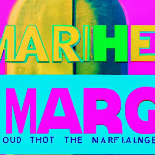
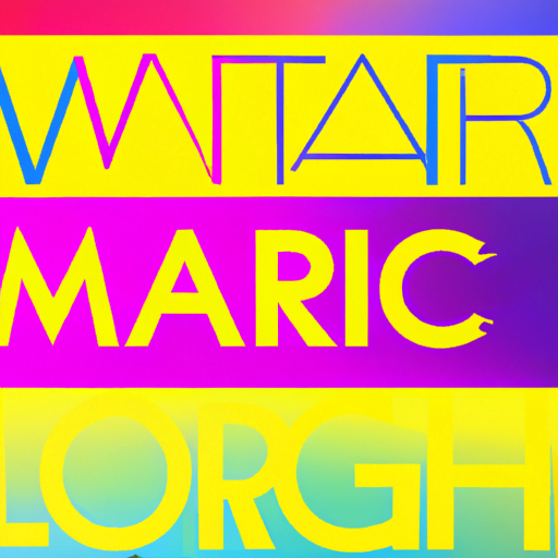
Psychedelic typography is characterized by its boldness, vibrancy, and unconventional use of letterforms. It often incorporates distorted, warped, or elongated letter shapes, creating a sense of movement and fluidity. Colors play a crucial role in psychedelic typography, with bright and contrasting hues dominating the palette. The combination of vibrant colors and distorted letterforms creates a visually stimulating and mind-altering experience.
Another characteristic of psychedelic typography is the use of optical effects and illusions. Typography may appear to be moving, pulsating, or vibrating, creating a sense of dynamism and energy. This effect is achieved through various techniques such as overlapping, blurring, and repetition of letterforms. The goal is to create an immersive and transformative visual experience that mirrors the psychedelic experience itself.
The Impact of Psychedelic Typography on Design
Psychedelic typography has had a profound impact on the world of design, influencing various fields such as graphic design, advertising, album covers, and poster art. Its bold and eye-catching nature makes it particularly effective in capturing attention and conveying messages. Let’s explore some examples of how psychedelic typography has been used in different contexts:
1. Album Covers
Psychedelic typography became synonymous with the music of the 1960s and 1970s, particularly in the rock and psychedelic genres. Album covers often featured bold and colorful typography that reflected the spirit of the music and the countercultural movement. The iconic cover of The Beatles’ “Sgt. Pepper’s Lonely Hearts Club Band” is a prime example of psychedelic typography in album art.
2. Advertising
In the world of advertising, psychedelic typography has been used to create memorable and attention-grabbing campaigns. The use of vibrant colors and distorted letterforms helps brands stand out in a crowded marketplace. The famous Coca-Cola “It’s the Real Thing” campaign from the 1970s featured psychedelic typography that perfectly captured the spirit of the era.
3. Poster Art
Psychedelic typography has also found its place in the world of poster art. Posters promoting concerts, festivals, and cultural events often feature bold and vibrant typography that reflects the energy and excitement of the event. The iconic “Summer of Love” posters from the 1960s are a testament to the power of psychedelic typography in capturing the essence of a cultural movement.
The Psychology of Psychedelic Typography
Psychedelic typography goes beyond its visual appeal and has a psychological impact on the viewer. The combination of vibrant colors and distorted letterforms can evoke a range of emotions and sensations. Here are some psychological effects of psychedelic typography:
1. Attention and Engagement
The bold and vibrant nature of psychedelic typography captures attention and engages the viewer. The unconventional letterforms and colors create a sense of novelty and intrigue, making it difficult to ignore. This can be particularly effective in advertising and marketing, where grabbing attention is crucial.
2. Altered Perception
Psychedelic typography can alter the viewer’s perception of reality. The distorted and moving letterforms create a sense of disorientation and visual stimulation, mimicking the effects of psychedelic substances. This altered perception can be both captivating and unsettling, depending on the context and the viewer’s mindset.
3. Emotional Response
The combination of vibrant colors and unconventional letterforms can evoke strong emotional responses. Different colors have different psychological associations, and when combined with typography, they can amplify the emotional impact. For example, warm colors like red and orange can evoke feelings of excitement and energy, while cool colors like blue and green can create a sense of calmness and tranquility.
Case Studies: Psychedelic Typography in Action
Let’s take a closer look at some case studies that demonstrate the power and versatility of psychedelic typography:
1. The Grateful Dead
The Grateful Dead, a legendary rock band from the 1960s, embraced psychedelic typography in their album covers and concert posters. Their iconic “Skull and Roses” album cover features bold and colorful typography that perfectly captures the spirit of their music and the countercultural movement. The letterforms are distorted and elongated, creating a sense of movement and energy.
2. The Electric Kool-Aid Acid Test
Tom Wolfe’s book “The Electric Kool-Aid Acid Test” explores the psychedelic experiences of Ken Kesey and his group of Merry Pranksters. The cover of the book features psychedelic typography that reflects the mind-altering nature of the story. The letterforms are distorted and overlapped, creating a sense of chaos and disorientation.
3. The Big Lebowski
The movie “The Big Lebowski” directed by the Coen brothers features psychedelic typography in its opening credits. The letters are distorted and pulsating, creating a sense of movement and energy. The use of vibrant colors adds to the overall psychedelic experience of the film.
The Future of Psychedelic Typography
As technology continues to advance, the possibilities for psychedelic typography are expanding. With the rise of virtual reality and augmented reality, designers can create immersive and interactive typographic experiences. Imagine walking through a virtual world where typography comes to life, pulsating and changing colors as you move.
Furthermore, the use of psychedelic typography is not limited to the realm of art and design. It can also be applied in fields such as therapy and education. Psychedelic-inspired typography has been used in therapeutic settings to induce relaxation
