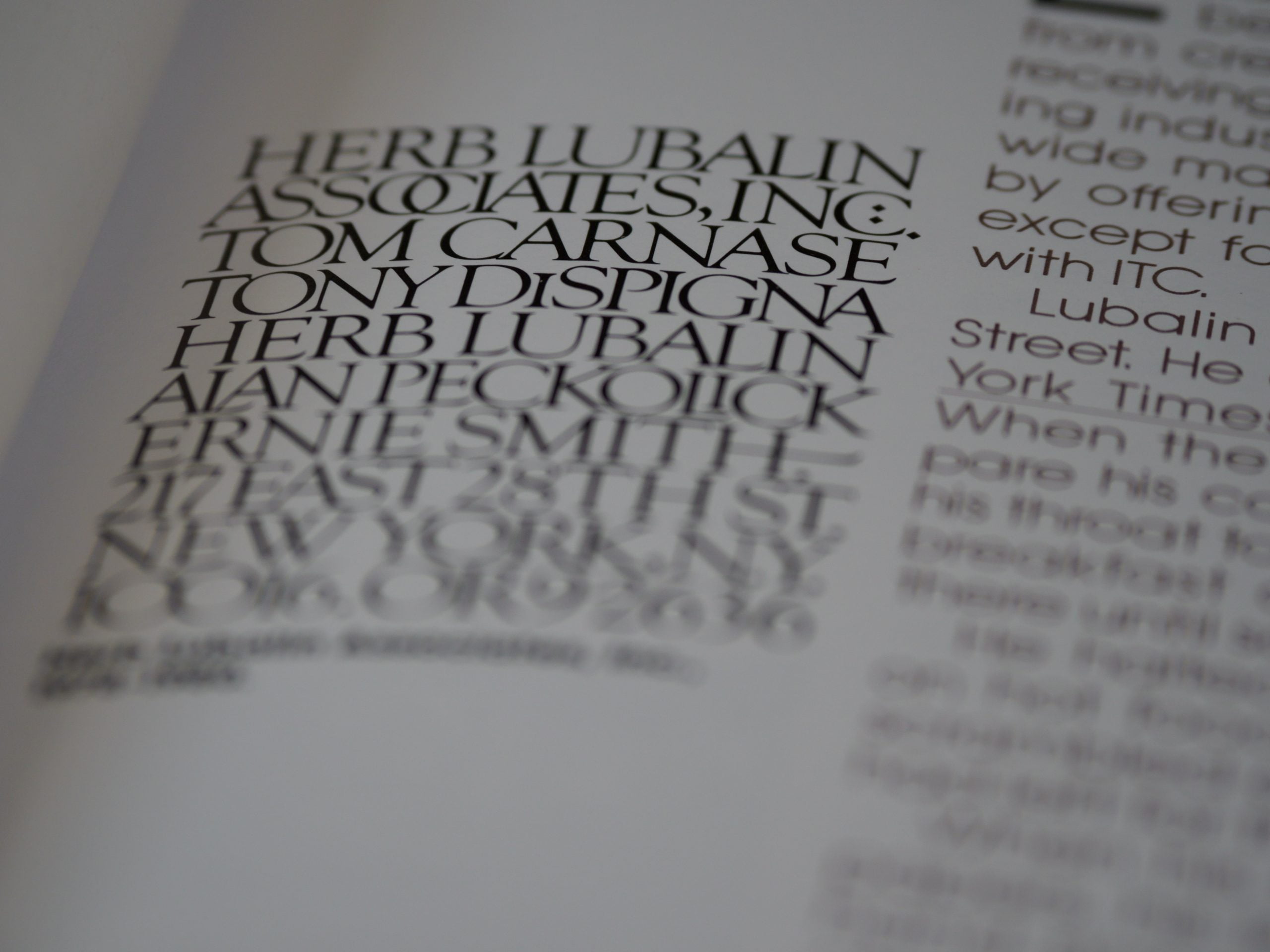
Introduction to Kerning: The Art of Typography Spacing
Typography is an essential aspect of design that involves the arrangement of letters and characters to create visually appealing and readable text. Kerning is a crucial element of typography that involves adjusting the spacing between individual letters to improve legibility and visual harmony. Kerning is an art that requires a keen eye for detail and an understanding of the principles of typography.
Kerning is a term that originated from the metal typesetting era, where individual metal letters were arranged by hand to create text. The term refers to the process of adjusting the space between two letters to create a visually pleasing and balanced appearance. Kerning is essential in typography design as it can significantly impact the readability and overall aesthetic of the text.
The Importance of Kerning in Typography Design
Kerning is a critical aspect of typography design as it can significantly impact the readability and overall aesthetic of the text. Poor kerning can make text difficult to read, unbalanced, and unprofessional. On the other hand, well-kerned text can improve legibility, create visual harmony, and enhance the overall design.
According to a study by the Nielsen Norman Group, users spend an average of 20 seconds on a webpage, and 80% of that time is spent reading the text. Therefore, it is crucial to ensure that the text is easy to read and visually appealing to keep the user engaged. Kerning plays a significant role in achieving this goal.
Understanding the Basics of Kerning: Letter Spacing and Visual Harmony
Kerning involves adjusting the space between individual letters to create a visually pleasing and balanced appearance. The goal of kerning is to create a consistent and even spacing between all letters, regardless of their shape or size. Kerning can be achieved by adjusting the space between individual letters or by adjusting the overall spacing of a block of text.
The spacing between letters can significantly impact the visual harmony of the text. For example, if the space between two letters is too wide, it can create an awkward gap that disrupts the flow of the text. On the other hand, if the space between two letters is too narrow, it can create a cramped appearance that makes the text difficult to read.
Techniques for Achieving Optimal Kerning in Typography Design
Achieving optimal kerning in typography design requires a combination of technical skill and artistic intuition. Here are some techniques that can help you achieve optimal kerning in your typography design:
1. Use a Kerning Tool: Many design software programs have built-in kerning tools that can help you adjust the spacing between letters. These tools can save you time and ensure that your kerning is consistent throughout the text.
2. Adjust the Space Between Pairs of Letters: Kerning involves adjusting the space between pairs of letters to create a visually pleasing appearance. Start by focusing on pairs of letters that are commonly kerned, such as “AV,” “WA,” and “To.”
3. Consider the Shape of the Letters: The shape of the letters can significantly impact the spacing between them. For example, letters with curved shapes, such as “C” and “S,” may require more space than letters with straight lines, such as “H” and “T.”
4. Use Visual Guides: Visual guides, such as grids and rulers, can help you achieve consistent spacing between letters. These guides can also help you ensure that your kerning is aligned with other design elements, such as margins and columns.
Common Mistakes to Avoid in Kerning: Tips for Improving Your Typography
Kerning is an art that requires practice and attention to detail. Here are some common mistakes to avoid when kerning your typography:
1. Over-Kerning: Over-kerning involves adjusting the space between letters too much, which can create an unnatural appearance. Avoid over-kerning by focusing on achieving consistent and even spacing between all letters.
2. Under-Kerning: Under-kerning involves not adjusting the space between letters enough, which can create an unbalanced appearance. Avoid under-kerning by focusing on achieving consistent and even spacing between all letters.
3. Ignoring the Shape of the Letters: The shape of the letters can significantly impact the spacing between them. Ignoring the shape of the letters can result in uneven spacing and an unbalanced appearance.
4. Inconsistent Kerning: Inconsistent kerning involves adjusting the space between letters differently throughout the text. Inconsistent kerning can create an unprofessional appearance and disrupt the flow of the text.
Conclusion: Mastering Kerning for Effective Typography Design
Kerning is an essential aspect of typography design that involves adjusting the spacing between individual letters to improve legibility and visual harmony. Achieving optimal kerning requires a combination of technical skill and artistic intuition. By using a kerning tool, adjusting the space between pairs of letters, considering the shape of the letters, and using visual guides, you can achieve consistent and even spacing between all letters.
Avoid common mistakes such as over-kerning, under-kerning, ignoring the shape of the letters, and inconsistent kerning to improve the overall aesthetic and readability of your typography. By mastering kerning, you can create effective typography design that engages the reader and enhances the overall design.
