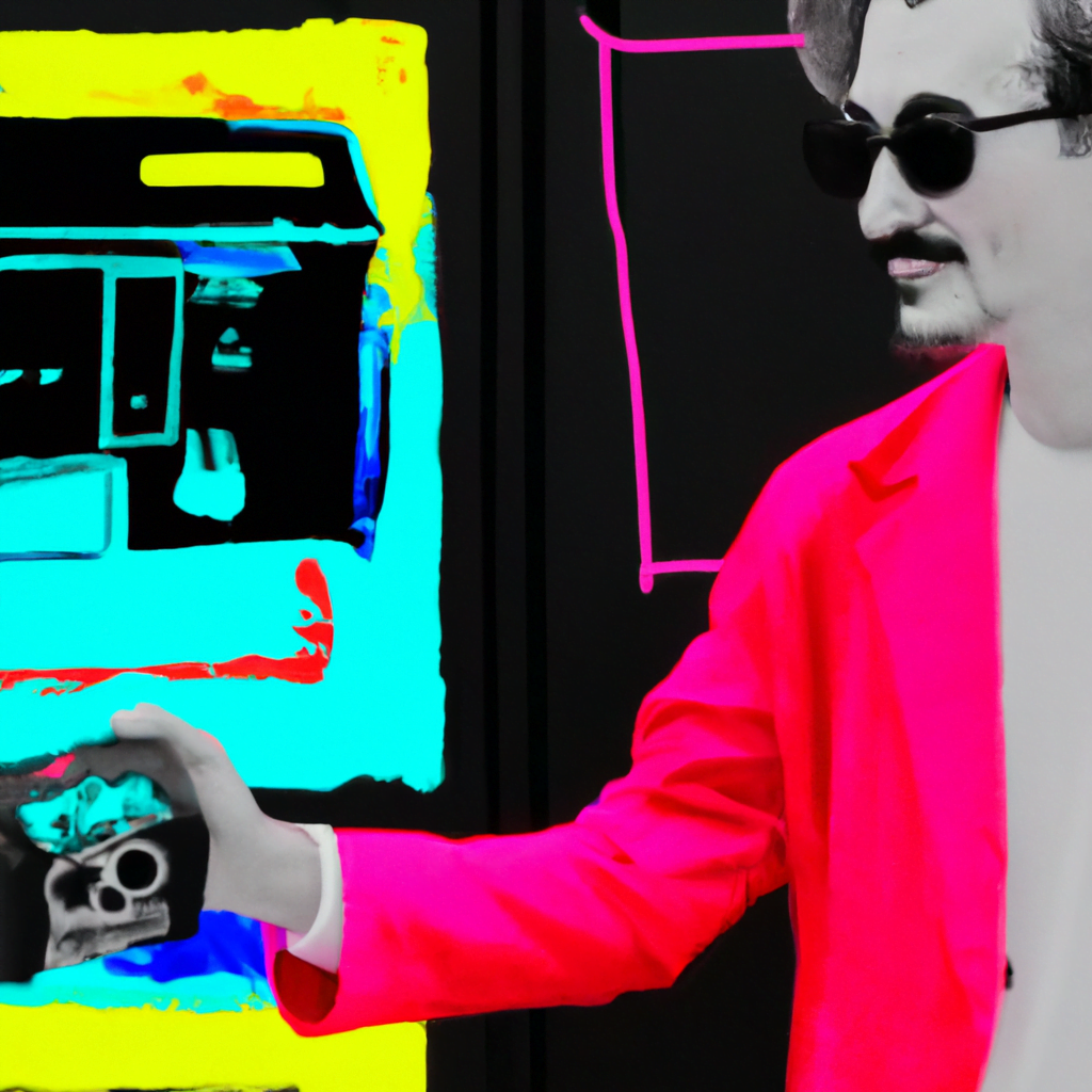
Tips for Creating Illustrations with a Neon Color Palette

Neon colors have become increasingly popular in the world of design and illustration. Their vibrant and eye-catching nature can bring life and energy to any artwork. However, working with neon colors requires careful consideration and skill to create visually appealing illustrations. In this article, we will explore some tips and techniques for creating illustrations with a neon color palette.
Understanding Neon Colors
Before diving into the tips, it’s important to understand what neon colors are. Neon colors are extremely bright and intense hues that appear to glow, mimicking the effect of neon lights. They are often associated with the 1980s aesthetic and are commonly used to create a sense of nostalgia or futuristic vibes.
Neon colors are typically created by combining bright, saturated hues with a high level of brightness. They often have a fluorescent quality, making them appear to emit light. Some popular neon colors include electric blue, hot pink, lime green, and vibrant orange.
Tip 1: Choose the Right Color Combination
When working with a neon color palette, it’s crucial to choose the right color combination to create a visually appealing illustration. Here are some tips to help you select the perfect colors:
- Contrast: Neon colors are already vibrant, so it’s important to create contrast within your illustration. Pairing a neon color with a darker or more muted color can help create balance and make the neon color stand out.
- Complementary Colors: Consider using complementary colors to create a visually striking illustration. Complementary colors are opposite each other on the color wheel, such as blue and orange or green and pink. When used together, they create a strong visual impact.
- Analogous Colors: Another option is to use analogous colors, which are adjacent to each other on the color wheel. This creates a harmonious and cohesive color scheme. For example, combining different shades of neon green and neon yellow can create a visually pleasing illustration.
Tip 2: Use Neon Colors as Accents
While neon colors can be captivating, it’s important to use them strategically in your illustrations. Using neon colors as accents can create a focal point and draw attention to specific elements of your artwork. This technique can help prevent overwhelming the viewer with an excessive amount of neon.
For example, you can use neon colors to highlight important details, such as a character’s eyes or a specific object in the composition. By using neon colors sparingly, you can create a sense of balance and make your illustration more visually appealing.
Tip 3: Consider the Mood and Message
Neon colors can evoke different emotions and convey various messages depending on how they are used. When creating illustrations with a neon color palette, consider the mood and message you want to convey to your audience.
For example, if you want to create a retro or nostalgic vibe, using neon colors reminiscent of the 1980s can help achieve that effect. On the other hand, if you want to create a futuristic or high-tech atmosphere, using neon colors with a sleek and modern design can be more appropriate.
Tip 4: Experiment with Different Lighting Effects
One of the unique characteristics of neon colors is their ability to mimic the glow of neon lights. To enhance the visual impact of your illustrations, experiment with different lighting effects that complement the neon color palette.
For instance, you can create a sense of depth and dimension by adding subtle gradients or shadows to your neon elements. This can give the illusion of light emitting from the illustration, making it more dynamic and engaging.
Case Study: Neon Illustrations in Advertising
Neon colors are often used in advertising to grab attention and create a memorable visual experience. Let’s take a look at a case study of how neon illustrations were used in an advertising campaign:
Company XYZ, a trendy clothing brand, wanted to promote their new line of neon-colored clothing. They decided to create a series of illustrations featuring models wearing their neon outfits in various urban settings.
The illustrations used a neon color palette to highlight the vibrant and energetic nature of the clothing line. The neon colors were strategically placed to draw attention to the models and the clothing they were wearing.
The campaign was a huge success, with the illustrations capturing the attention of the target audience and generating a significant increase in sales for the neon clothing line.
Conclusion
Creating illustrations with a neon color palette can be a fun and exciting process. By understanding the characteristics of neon colors, choosing the right color combinations, using neon colors as accents, considering the mood and message, and experimenting with different lighting effects, you can create visually stunning illustrations that captivate your audience.
Remember, neon colors are powerful and should be used strategically to create balance and visual impact. By following these tips and incorporating your own creativity, you can create illustrations that stand out and leave a lasting impression.
