-
Table of Contents
Typography in Restaurant Menus: Enhancing Appetite Appeal

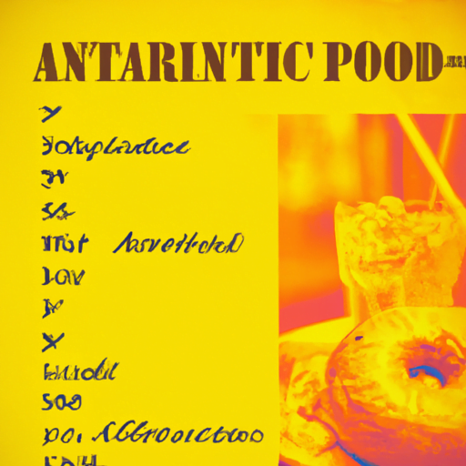
When it comes to dining out, the menu is often the first point of contact between a restaurant and its customers. A well-designed menu not only provides information about the dishes but also creates a visual experience that can enhance appetite appeal. One crucial element of menu design is typography. The choice of fonts, sizes, and styles can significantly impact how customers perceive the food and influence their ordering decisions. In this article, we will explore the importance of typography in restaurant menus and how it can be used to enhance appetite appeal.
The Psychology of Typography
Typography plays a vital role in shaping our perception and understanding of information. Different fonts evoke different emotions and associations, which can influence how we interpret the content. When it comes to restaurant menus, the psychology of typography becomes even more critical as it directly affects our perception of the food being offered.
Research has shown that certain fonts can evoke specific emotions and influence our perception of taste. For example, a study conducted by researchers at the University of Oxford found that rounded fonts, such as Comic Sans, were associated with sweetness, while angular fonts, like Times New Roman, were associated with bitterness. This finding suggests that the choice of font can subconsciously influence how customers perceive the flavors of the dishes on the menu.
Choosing the Right Fonts
When selecting fonts for a restaurant menu, it is essential to consider the overall theme and ambiance of the establishment. The fonts should align with the restaurant’s brand identity and convey the desired atmosphere. Here are some factors to consider when choosing fonts:
- Legibility: The fonts should be easy to read, even in dimly lit environments. Avoid overly decorative or script fonts that may be difficult to decipher.
- Personality: The fonts should reflect the personality of the restaurant. For example, a casual eatery may opt for a playful and informal font, while a fine dining establishment may choose a more elegant and sophisticated font.
- Consistency: It is important to maintain consistency in font usage throughout the menu. Using too many different fonts can create visual clutter and confusion.
Additionally, it is crucial to consider the target audience when selecting fonts. Different age groups and demographics may respond differently to certain font styles. For example, a trendy and modern font may appeal to younger customers, while a classic and traditional font may resonate with older patrons.
Font Sizes and Hierarchy
Font sizes and hierarchy play a crucial role in guiding customers’ attention and highlighting important information on the menu. By using different font sizes, restaurants can create a visual hierarchy that directs the customers’ focus to specific sections or dishes.
Key information, such as dish names and prices, should be displayed in a larger and bolder font to make them stand out. Descriptions and additional details can be presented in a slightly smaller font size to provide more context without overwhelming the reader.
It is also important to consider the readability of the font sizes. Fonts that are too small can strain the eyes and discourage customers from reading the menu. On the other hand, fonts that are too large can create a cluttered and unappealing visual experience. Finding the right balance is crucial to ensure a pleasant reading experience for customers.
Font Styles and Emphasis
Font styles, such as bold, italic, and underline, can be used to add emphasis and create visual interest in the menu. By strategically applying these styles, restaurants can draw attention to specific dishes or highlight special offers.
For example, using bold font for dish names can make them more prominent and easier to scan. Italic font can be used for descriptions or to indicate specific ingredients or flavors. Underlining can be reserved for special offers or limited-time promotions.
However, it is important not to overuse these styles as it can lead to visual clutter and confusion. The emphasis should be used sparingly and purposefully to guide customers’ attention without overwhelming them.
Case Studies: Typography in Action
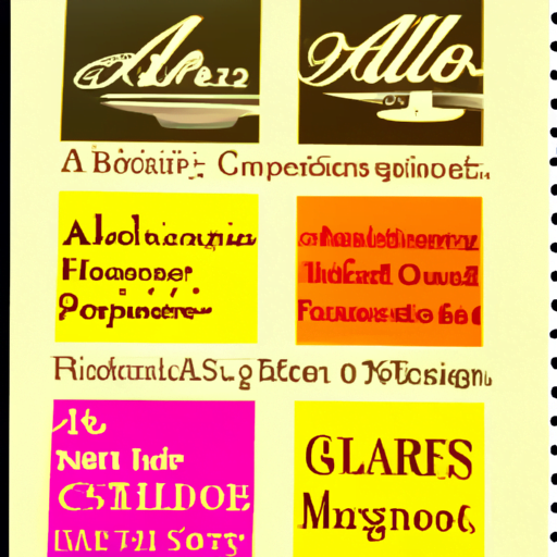
Several restaurants have successfully utilized typography to enhance appetite appeal and improve the overall dining experience. Let’s take a look at two case studies:
Case Study 1: The Spicy Spoon
The Spicy Spoon, a popular Mexican restaurant, wanted to create a menu that reflected its vibrant and energetic atmosphere. They opted for a bold and playful font that resembled hand-painted signage found in traditional Mexican markets. The font choice not only aligned with the restaurant’s brand identity but also added a sense of authenticity and excitement to the menu. The use of bright colors and large font sizes further enhanced the appetite appeal, making the dishes visually enticing.
Case Study 2: The Elegant Plate
The Elegant Plate, a high-end French restaurant, aimed to create a menu that exuded sophistication and elegance. They chose a classic serif font with delicate curves and refined details. The font’s timeless appeal complemented the restaurant’s ambiance and conveyed a sense of tradition and craftsmanship. The use of generous spacing and elegant typography created a luxurious and refined visual experience, elevating the perception of the dishes.
Summary
Typography plays a crucial role in enhancing appetite appeal in restaurant menus. The choice of fonts, sizes, and styles can influence customers’ perception of the food and impact their ordering decisions. By understanding the psychology of typography and considering factors such as legibility, personality, and consistency, restaurants can create menus that align with their brand identity and create a visually appealing experience for customers.
Additionally, font sizes and hierarchy can guide customers’ attention and highlight important information, while font styles can add emphasis and create visual interest. By carefully selecting and applying typography, restaurants can enhance appetite appeal and improve the overall dining experience.
Remember, the menu is not just a list of dishes; it is an opportunity to engage customers and entice their taste buds. So, the next time you dine out, pay attention to the typography on the menu and see how it influences your perception of the food.
