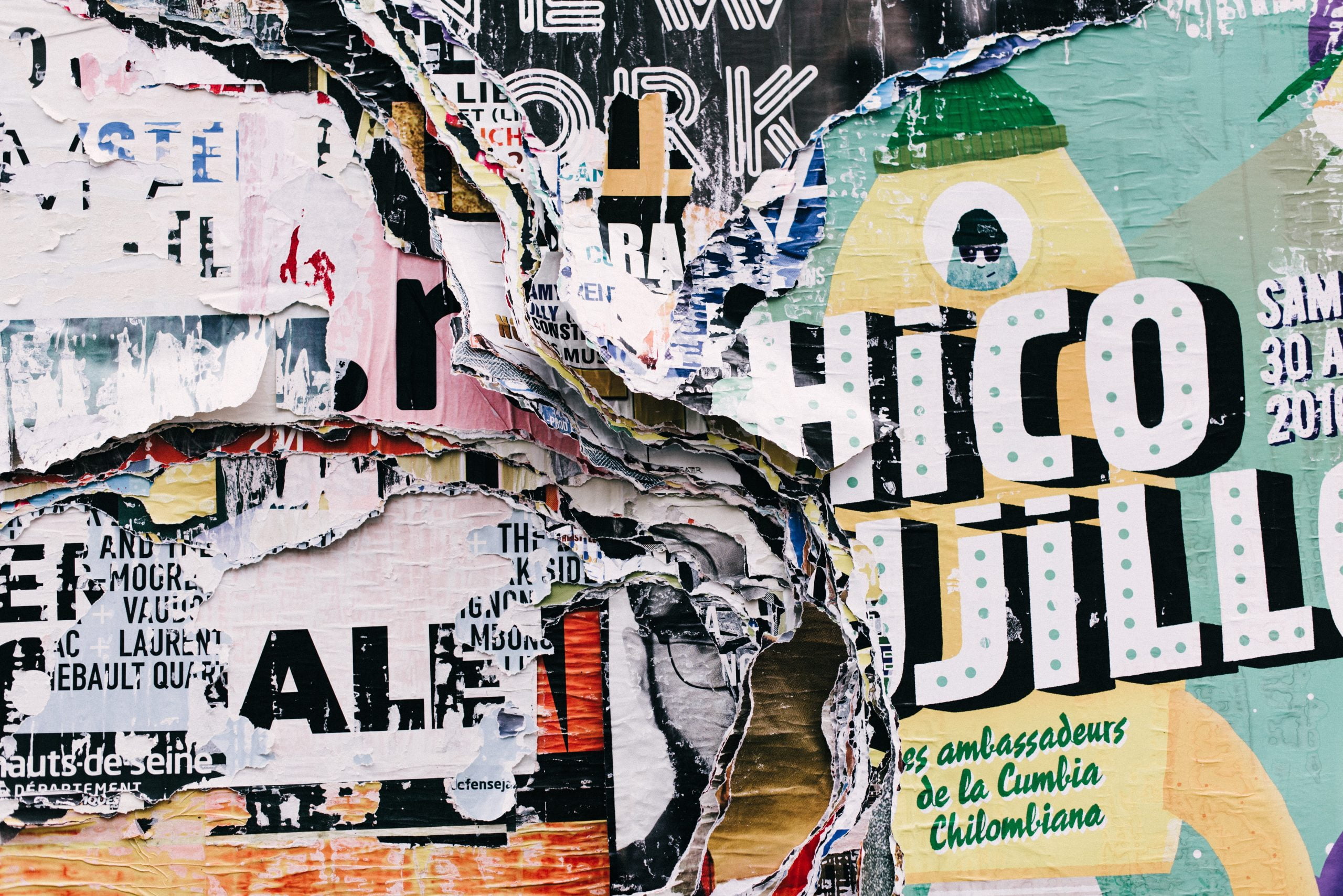
Introduction: The Importance of Typography in Print Design
Typography is an essential element of print design that can make or break the success of a project. It is the art and technique of arranging type to make written language legible, readable, and appealing when displayed. Typography is not just about choosing a font or typeface; it is about creating a visual hierarchy, guiding the reader’s eye, and conveying a message through the use of type. In this article, we will explore the power of typography in print design and how designers can use it to create effective and impactful designs.
The Basics of Typography: Understanding Fonts, Typefaces, and Styles
Before we dive into the power of typography, it is essential to understand the basics of typography. Fonts, typefaces, and styles are the building blocks of typography. A font is a specific size, weight, and style of a typeface. A typeface is a collection of fonts that share the same design characteristics. Styles refer to the variations within a typeface, such as bold, italic, or regular.
Choosing the right font, typeface, and style is crucial in creating a cohesive and effective design. The font should match the tone and message of the content. For example, a playful font may be suitable for a children’s book, but it may not be appropriate for a legal document. The typeface should also be legible and easy to read, even at small sizes.
The Psychology of Typography: How Font Choices Affect Reader Perception
Typography can also affect the reader’s perception of the content. Different fonts can evoke different emotions and convey different messages. For example, serif fonts are often associated with tradition, while sans-serif fonts are associated with modernity. Script fonts are often associated with elegance and sophistication.
The psychology of typography is essential in creating a design that resonates with the target audience. A designer must consider the audience’s age, gender, culture, and preferences when choosing a font. For example, a font that appeals to a younger audience may not be suitable for an older audience.
The Art of Hierarchy: Using Typography to Guide the Reader’s Eye
Typography can also be used to create a visual hierarchy that guides the reader’s eye through the content. A visual hierarchy is the arrangement of elements in a way that implies importance. The most important elements are placed at the top, while the least important elements are placed at the bottom.
Typography can be used to create a visual hierarchy by varying the font size, weight, and style. The most important elements can be emphasized with a larger font size, bold weight, or a different font style. The use of hierarchy can make the content more engaging and easier to read.
The Role of Contrast: Creating Visual Interest with Font Pairings
Contrast is another essential element of typography. Contrast refers to the difference between two elements, such as font size, weight, or style. Contrast can create visual interest and make the content more engaging.
Font pairings are an excellent way to create contrast in typography. Font pairings refer to the combination of two or more fonts in a design. The fonts should complement each other and create a cohesive design. For example, a serif font can be paired with a sans-serif font to create contrast and visual interest.
The Impact of White Space: Using Typography to Create Balance and Harmony
White space, also known as negative space, is the area between design elements. White space is essential in creating balance and harmony in a design. It can also be used to emphasize important elements and create a visual hierarchy.
Typography can be used to create white space by adjusting the font size, weight, and style. The use of white space can make the content more readable and engaging. It can also create a sense of elegance and sophistication in the design.
The Power of Typography in Branding: How Font Choices Define a Company’s Identity
Typography is also essential in branding. Font choices can define a company’s identity and create a recognizable brand. For example, the Coca-Cola logo is instantly recognizable due to its unique font style.
The font choice should match the company’s tone and message. For example, a tech company may choose a modern and sleek font, while a luxury brand may choose an elegant and sophisticated font. The font choice should also be consistent across all marketing materials to create a cohesive brand identity.
Conclusion: Harnessing the Power of Typography to Create Effective Print Designs
Typography is a powerful tool in print design that can make a significant impact on the success of a project. Understanding the basics of typography, the psychology of font choices, and the art of hierarchy, contrast, and white space can help designers create effective and impactful designs. Typography can also be used to create a recognizable brand identity that resonates with the target audience. By harnessing the power of typography, designers can create designs that are engaging, readable, and memorable.
