-
Table of Contents
- The Geometric Abstraction of Piet Mondrian in Design
- The Origins of Geometric Abstraction
- The Principles of Mondrian’s Geometric Abstraction
- Balance and Harmony
- Reduction to Essentials
- The Influence of Mondrian’s Geometric Abstraction on Design
- Graphic Design
- Fashion
- Interior Design
- Case Studies: Mondrian-Inspired Designs
- Case Study 1: Mondrian-inspired Website Design
- Case Study 2: Mondrian-inspired Fashion Collection
- The Enduring Legacy of Mondrian’s Geometric Abstraction
- Key Takeaways
- Conclusion
The Geometric Abstraction of Piet Mondrian in Design

Piet Mondrian, a Dutch painter and art theorist, is widely recognized for his pioneering work in geometric abstraction. His unique style, characterized by the use of primary colors and straight lines, has had a profound impact on various fields, including design. In this article, we will explore the influence of Mondrian’s geometric abstraction on design and how it continues to shape the modern aesthetic.
The Origins of Geometric Abstraction
Geometric abstraction emerged as an art movement in the early 20th century, with artists like Kazimir Malevich and Wassily Kandinsky exploring the use of geometric shapes and lines to create non-representational art. However, it was Piet Mondrian who truly embraced and refined this style, becoming one of its most prominent figures.
The Principles of Mondrian’s Geometric Abstraction
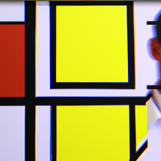
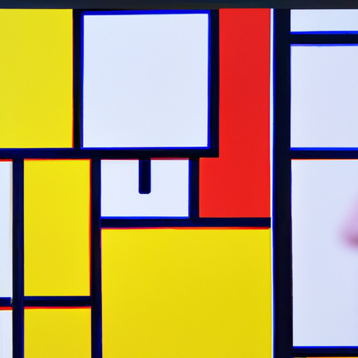
Mondrian believed that art should reflect the underlying harmony and order of the universe. He sought to achieve this through the use of simple geometric forms, such as squares and rectangles, and primary colors, namely red, blue, and yellow. Mondrian’s compositions were characterized by a grid-like structure, with the lines and shapes carefully arranged to create a sense of balance and harmony.
Balance and Harmony
One of the key principles of Mondrian’s geometric abstraction is the pursuit of balance and harmony. He believed that by arranging geometric elements in a precise and balanced manner, he could create a sense of order and tranquility. This principle is evident in his famous painting “Composition with Red, Blue, and Yellow,” where the carefully placed lines and shapes create a harmonious composition.
Reduction to Essentials
Mondrian’s geometric abstraction also emphasized the reduction of forms to their essential elements. He believed that by simplifying shapes and colors, he could reveal the underlying essence of reality. This reductionist approach is evident in his painting “Broadway Boogie Woogie,” where he transformed the chaotic energy of New York City into a grid of intersecting lines and vibrant colors.
The Influence of Mondrian’s Geometric Abstraction on Design
Mondrian’s geometric abstraction has had a profound influence on various design disciplines, including graphic design, fashion, and interior design. His bold use of primary colors and clean lines continues to inspire designers around the world.
Graphic Design
In graphic design, Mondrian’s geometric abstraction has been widely used to create visually striking compositions. His grid-like structures and primary colors provide a strong foundation for designing logos, posters, and websites. For example, the logo of the famous fashion brand Yves Saint Laurent features a simplified version of Mondrian’s composition, with bold lines and primary colors.
Fashion
Mondrian’s influence on fashion can be seen in the iconic “Mondrian dress” designed by Yves Saint Laurent in 1965. The dress, inspired by Mondrian’s paintings, features blocks of primary colors and straight lines, capturing the essence of his geometric abstraction. This design became a symbol of the 1960s mod fashion movement and continues to be referenced by designers today.
Interior Design
Mondrian’s geometric abstraction has also found its way into interior design. The clean lines and primary colors of his compositions can be seen in modern furniture and decor. For example, the famous Barcelona chair, designed by Ludwig Mies van der Rohe, features a grid-like structure and uses primary colors to create a visually striking piece of furniture.
Case Studies: Mondrian-Inspired Designs
Let’s explore some case studies of designs that have been directly influenced by Mondrian’s geometric abstraction:
Case Study 1: Mondrian-inspired Website Design
A web design agency created a website for a modern art gallery, taking inspiration from Mondrian’s compositions. The website features a grid-like layout with blocks of primary colors, reminiscent of Mondrian’s paintings. The clean lines and balanced composition create a visually appealing and user-friendly interface.
Case Study 2: Mondrian-inspired Fashion Collection
A fashion designer created a collection inspired by Mondrian’s geometric abstraction. The collection features garments with bold primary colors and clean lines, reminiscent of Mondrian’s paintings. The designer incorporated the grid-like structure into the patterns and silhouettes, creating a cohesive and visually striking collection.
The Enduring Legacy of Mondrian’s Geometric Abstraction
Piet Mondrian’s geometric abstraction continues to be a significant influence in the world of design. His emphasis on balance, harmony, and reduction to essentials has shaped the modern aesthetic and inspired countless designers. From graphic design to fashion and interior design, Mondrian’s legacy can be seen in various disciplines.
Key Takeaways
- Piet Mondrian was a pioneer of geometric abstraction, characterized by the use of primary colors and straight lines.
- Mondrian’s geometric abstraction sought to achieve balance, harmony, and reduction to essentials.
- His influence can be seen in graphic design, fashion, and interior design.
- Case studies demonstrate how designers have directly incorporated Mondrian’s style into their work.
- Mondrian’s legacy continues to shape the modern aesthetic and inspire designers worldwide.
Conclusion
Piet Mondrian’s geometric abstraction has left an indelible mark on the world of design. His pursuit of balance, harmony, and reduction to essentials has influenced various design disciplines, from graphic design to fashion and interior design. The bold use of primary colors and clean lines continues to inspire designers, and his legacy remains relevant in the modern aesthetic. By understanding and appreciating Mondrian’s geometric abstraction, designers can tap into a rich source of inspiration and create visually striking and harmonious designs.
