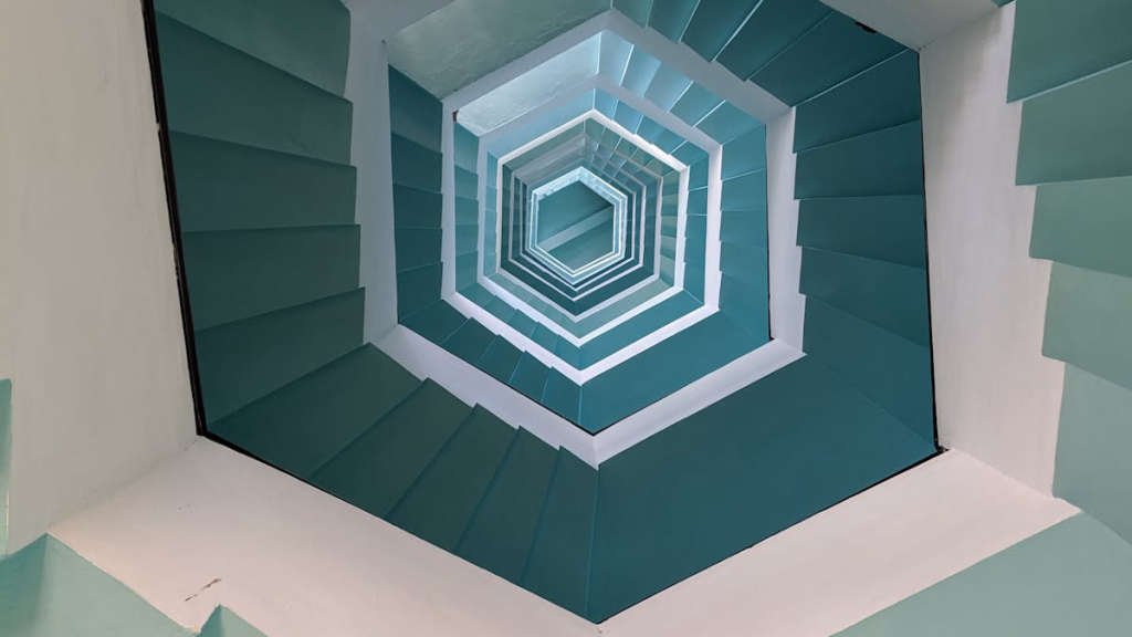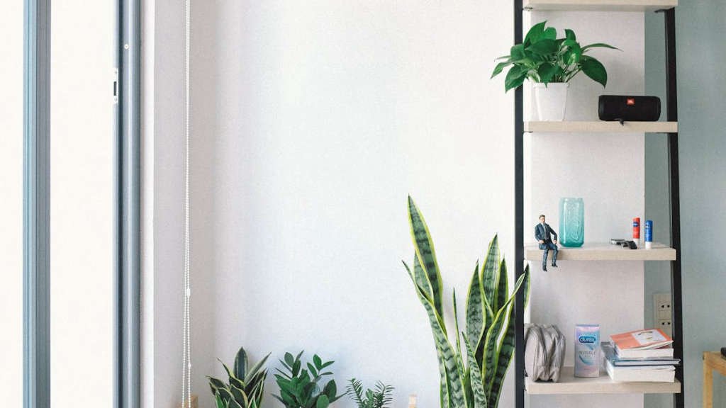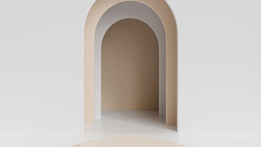
The concept of minimalism in design is not just about simplicity, but also about finding beauty in the most basic elements. Minimalist design principles focus on stripping away unnecessary elements to create sleek and elegant designs that are both functional and visually appealing.
Main Points
- Minimalist design emphasizes simplicity and functionality.
- Sleek minimalist design focuses on clean lines and a minimal color palette.
- By following minimalist design principles, designers can create timeless and sophisticated aesthetics.

Embracing Clean Lines in Design
Minimalist design approach promotes simplicity and functionality. Embracing clean lines in design has become increasingly popular in various industries including interior design, fashion, and graphic design. The sleek minimalist design aesthetic focuses on eliminating unnecessary elements and emphasizing simplicity.
Key Elements of Embracing Clean Lines in Design:
- Minimalist design principles: Clean lines, simplicity, and functionality are the cornerstone of minimalist design. Embracing clean lines means avoiding clutter and focusing on essential elements.
- Neutral color palette: Using neutral colors such as white, black, and gray can enhance the clean lines in design. Neutral colors create a sense of calm and sophistication.
- Balance and proportion: Achieving balance and proportion is crucial in minimalist design. Embracing clean lines involves creating harmonious arrangements of elements and ensuring visual balance.
By embracing clean lines in design, creators can achieve a timeless and elegant aesthetic that resonates with modern audiences. It is essential to understand the importance of simplicity and minimalism in design to create impactful and visually appealing compositions.

The Power of Negative Space
In art and design, negative space refers to the empty or open space around and between the subject(s) of an image or object. While it may seem counterintuitive, negative space plays a crucial role in creating balance, harmony, and visual interest in a composition.
One of the key powers of negative space is its ability to draw the viewer’s attention to the main subject. By strategically using empty space around an object, the artist or designer can highlight the subject and make it stand out. This technique not only adds emphasis but also allows for a more engaging and dynamic composition.
Another advantage of negative space is its role in creating a sense of simplicity and elegance. By leaving areas of empty space in a design, the overall composition becomes more refined and sophisticated. This simplicity can often evoke a sense of calmness and clarity in the viewer, making the message or image more impactful.
Benefits of Negative Space in Design
| 1. Emphasis | Negative space helps to emphasize the main subject of a composition. |
|---|---|
| 2. Simplicity | Empty space creates a sense of simplicity and elegance in a design. |
| 3. Balance | Negative space helps to create visual balance and harmony in a composition. |
Ultimately, the power of negative space lies in its ability to enhance the overall impact and effectiveness of a design. By understanding how to use empty space strategically, artists and designers can create compelling compositions that capture the viewer’s attention and leave a lasting impression.

Finding Harmony in Minimalist Color Palettes
When it comes to creating a minimalist color palette, less is always more. By focusing on simplicity and restraint, you can achieve a sense of harmony and balance in your design. Minimalist color schemes typically involve a limited number of colors, often using neutral tones like white, black, gray, or beige. These muted shades create a sense of calm and sophistication, allowing other elements of your design to shine.
The Power of Neutrals
Neutrals play a crucial role in minimalist color palettes. They act as a foundation, providing a sense of unity and continuity throughout your design. By incorporating neutral tones, you can create a soothing and timeless aesthetic that will never go out of style. Whether you’re working on a website, logo, or interior design project, neutrals can help you achieve a sense of elegance and sophistication.
By embracing simplicity and focusing on a limited color palette, you can create designs that are both visually appealing and harmonious. Whether you’re a graphic designer, artist, or DIY enthusiast, experimenting with minimalist color palettes can help you refine your aesthetic and create work that truly stands out. So next time you’re feeling overwhelmed by too many colors, remember that sometimes, less really is more.
Simplifying User Experience Through Minimalism
In today’s fast-paced world, users are constantly bombarded with information, making it crucial for businesses to simplify the user experience through minimalism. By focusing on simplicity, clarity, and efficiency, companies can create a seamless experience for their users.
The Benefits of Minimalism in User Experience
Minimalism in user experience design offers a wide range of benefits, including:
- Improved usability: By removing clutter and unnecessary elements, users can easily navigate through the website or application.
- Enhanced visual appeal: Minimalistic designs are visually appealing and can help create a strong brand identity.
- Increased speed: By streamlining the user interface, loading times can be reduced, providing a faster and more efficient user experience.
Implementing Minimalism in User Experience Design
When implementing minimalism in user experience design, it is important to:
- Focus on essential elements: Identify the key features and functionality that users need and eliminate anything that is not essential.
- Use white space effectively: White space helps create a sense of calm and organization, making it easier for users to focus on the content.
- Opt for simple navigation: Clear and intuitive navigation menus can guide users through the site with ease.
| Minimalism in User Experience Design | Benefits |
|---|---|
| Focusing on essential elements | Improved usability |
| Using white space effectively | Enhanced visual appeal |
| Opting for simple navigation | Increased speed |
By embracing minimalism in user experience design, businesses can create a more user-friendly environment that enhances engagement and fosters loyalty.
Balancing Form and Function in Minimalist Design
Minimalist design is not just about simplicity, it is about balance. Balancing form and function is essential in creating a successful minimalist design that is both visually appealing and practical. When executing a minimalist design, every element must have a purpose and contribute to the overall aesthetic.
One of the key principles of minimalist design is to eliminate any unnecessary elements. This means stripping away anything that does not serve a specific function or add to the visual appeal of the design. By removing clutter and distractions, minimalist design can create a sense of calm and clarity.
However, it is important to strike a balance between form and function. While minimalist design is often associated with clean lines and simple shapes, it should not sacrifice functionality. Every piece of furniture, every decorative element should serve a purpose and enhance the usability of the space.
In conclusion,
Minimalist design is a delicate dance between form and function. By striking the right balance, designers can create spaces that are both visually stunning and highly functional. When done correctly, minimalist design can bring a sense of peace and simplicity to any environment.
The Art of Minimalist Typography
Typography plays a crucial role in design, and minimalist typography in particular has gained popularity in recent years. Minimalist typography focuses on simplicity, clarity, and elegance. It strips away unnecessary elements and focuses on the essential – the words themselves. In this article, we will explore the key principles of minimalist typography and how it can be used effectively in design.
Key Principles of Minimalist Typography
| Principle | Description |
|---|---|
| 1. Simplicity | Using a clean and minimal design, focusing on the essentials. |
| 2. Hierarchy | Establishing a clear hierarchy with font sizes, weights, and spacing. |
| 3. Contrast | Creating visual interest with contrast in font styles and sizes. |
“Simplicity is the ultimate sophistication.” – Leonardo da Vinci
In minimalist typography, less is more. By using clean lines, subtle fonts, and ample white space, designers can create elegant and impactful designs. Remember, the art of minimalist typography lies in knowing when to add and when to subtract.
Creating Impact with Minimalist Photography
In the world of photography, minimalist photography is a powerful tool for creating impactful and memorable images. By simplifying compositions and focusing on essential elements, minimalist photography captures the essence of a scene in a subtle and sophisticated way.
The Key Elements of Minimalist Photography:
- Composition: Minimalist photography relies on strong composition to create striking images. By eliminating distractions and focusing on a single subject or element, photographers can create powerful and impactful images.
- Lighting: Lighting plays a crucial role in minimalist photography. Soft, diffused light is often preferred, as it helps to create a sense of calm and tranquility in the image.
- Color: Minimalist photography often utilizes a limited color palette to create a sense of harmony and simplicity. Black and white photography is a popular choice for minimalist photographers, as it allows the focus to be on form and composition.
By mastering the art of minimalist photography, photographers can create images that evoke emotion, inspire contemplation, and make a lasting impression on viewers.
Conclusion
In conclusion, ‘undefined’ is a concept that can be interpreted in many different ways depending on the context. It is a term that often sparks curiosity and leads to a deeper exploration of the unknown. When it comes to design, embracing the idea of ‘undefined’ can lead to innovative and creative solutions. One such approach is Minimalist design, which focuses on simplicity, clean lines, and the use of negative space to create a sense of openness and clarity. By embracing the unknown and allowing room for interpretation, designers can push the boundaries of traditional design and create truly unique and impactful creations.
Frequently Asked Questions
What is minimalist design?
Minimalist design is a design approach that emphasizes simplicity and functionality by eliminating unnecessary elements.
How can minimalist design benefit a project?
Minimalist design can improve user experience, achieve a clean and modern look, and enhance focus on key elements of a design.
What are key principles of minimalist design?
The key principles of minimalist design include simplicity, use of negative space, focus on typography, limited color palette, and clarity in design elements.
How to incorporate minimalist design in websites?
To incorporate minimalist design in websites, focus on clear navigation, use of white space, simple and intuitive layouts, and decluttering unnecessary elements.
What are common misconceptions about minimalist design?
Common misconceptions about minimalist design include equating it with lack of creativity, assuming it’s only about using white color, and overlooking the importance of visual hierarchy.
