
-
Table of Contents
- The Art of Visual Synchrony: Creating Cohesive Design Systems
- Understanding Visual Synchrony
- The Benefits of Visual Synchrony
- Key Elements of Visual Synchrony
- 1. Colors
- 2. Typography
- 3. Spacing
- 4. Imagery
- Case Studies: Successful Examples of Visual Synchrony
- 1. Apple
- 2. Airbnb
- 3. Google Material Design
- Key Takeaways
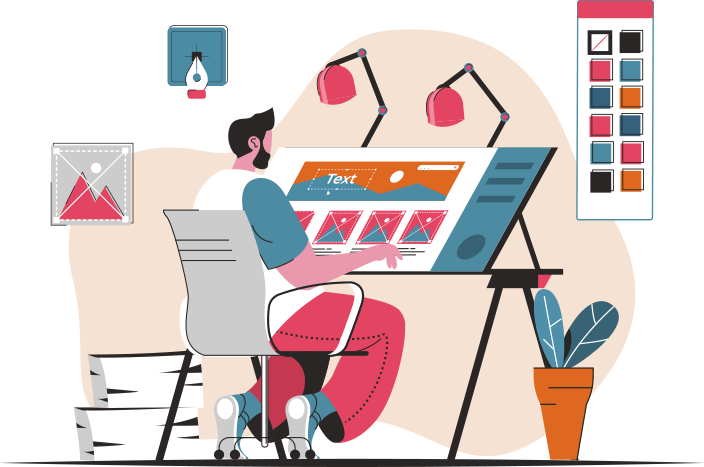
The Art of Visual Synchrony: Creating Cohesive Design Systems

Design is not just about aesthetics; it is about creating a seamless and harmonious experience for the user. One of the key elements in achieving this is visual synchrony, which refers to the coordination and consistency of visual elements in a design system. When done right, visual synchrony can enhance the user experience, establish brand identity, and improve overall usability. In this article, we will explore the importance of visual synchrony in design and provide valuable insights on how to create cohesive design systems.
Understanding Visual Synchrony
Visual synchrony is the art of creating a sense of unity and coherence in a design system through the consistent use of visual elements such as colors, typography, spacing, and imagery. It ensures that all the components of a design work together seamlessly, creating a visually pleasing and intuitive experience for the user.
Visual synchrony is crucial in design because it helps users navigate and understand the interface more easily. When visual elements are consistent and predictable, users can quickly identify patterns and make informed decisions. It also establishes a sense of trust and professionalism, as a well-designed and cohesive system reflects attention to detail and a commitment to quality.
The Benefits of Visual Synchrony
Creating a cohesive design system with visual synchrony offers several benefits:
- Improved User Experience: Visual synchrony enhances the usability of a design system by providing visual cues and patterns that users can easily recognize and understand. This reduces cognitive load and improves efficiency.
- Brand Identity: Consistent visual elements across different touchpoints help establish a strong brand identity. When users encounter consistent visuals, they can easily associate them with a particular brand, creating a sense of familiarity and trust.
- Increased Engagement: A visually appealing and cohesive design system captures users’ attention and encourages them to explore further. It creates a positive first impression and increases the likelihood of user engagement.
- Efficient Design Process: By establishing a set of visual guidelines and patterns, designers can work more efficiently and consistently. Visual synchrony streamlines the design process and reduces the need for constant decision-making.
Key Elements of Visual Synchrony
To create a cohesive design system, it is essential to pay attention to the following key elements:
1. Colors
Colors play a vital role in establishing visual synchrony. Consistent color palettes help create a unified look and feel across different components of a design system. It is important to define a primary color palette and a set of secondary colors that complement each other. These colors should be used consistently throughout the design system, from buttons and links to backgrounds and illustrations.
2. Typography
Typography is another crucial element in visual synchrony. Consistent typography ensures that text is easily readable and visually appealing. It is important to define a set of fonts and font sizes for different types of content, such as headings, body text, and captions. These fonts should be used consistently across all touchpoints, including websites, mobile apps, and marketing materials.
3. Spacing
Spacing refers to the distance between different elements in a design. Consistent spacing helps create a sense of order and hierarchy. It is important to define a set of spacing guidelines for margins, padding, and line heights. These guidelines should be followed consistently across all components of the design system.
4. Imagery
Imagery plays a significant role in creating visual synchrony. Consistent use of imagery, such as illustrations and photographs, helps establish a cohesive visual language. It is important to define a style guide for imagery, including the use of colors, composition, and subject matter. These guidelines should be followed consistently across all visual assets.
Case Studies: Successful Examples of Visual Synchrony
Let’s take a look at some successful examples of visual synchrony in design:
1. Apple
Apple is known for its consistent and cohesive design system. From its products to its marketing materials, Apple maintains a unified visual language. The use of clean lines, minimalist typography, and a limited color palette creates a sense of elegance and simplicity across all touchpoints.
2. Airbnb
Airbnb’s design system is another great example of visual synchrony. The use of bold colors, playful illustrations, and consistent typography creates a cohesive and inviting experience. Whether users are browsing listings on the website or using the mobile app, they encounter a consistent visual language that reflects Airbnb’s brand identity.
3. Google Material Design
Google’s Material Design is a comprehensive design system that focuses on visual synchrony. It provides guidelines for colors, typography, spacing, and motion. By following these guidelines, designers can create visually consistent and intuitive experiences across different platforms and devices.
Key Takeaways
Visual synchrony is a crucial aspect of design that can greatly enhance the user experience and establish a strong brand identity. Here are the key takeaways from this article:
- Visual synchrony refers to the coordination and consistency of visual elements in a design system.
- Visual synchrony improves the user experience, establishes brand identity, and increases engagement.
- Key elements of visual synchrony include colors, typography, spacing, and imagery.
- Successful examples of visual synchrony include Apple, Airbnb, and Google Material Design.
By paying attention to visual synchrony and creating cohesive design systems, designers can create intuitive and visually appealing experiences that leave a lasting impression on users.