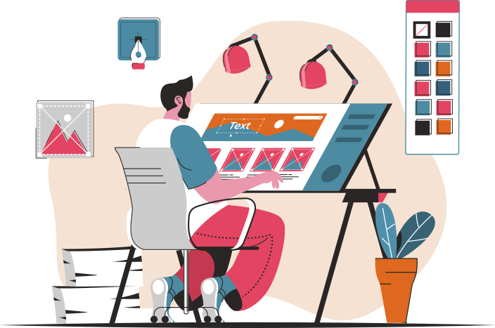
Are you torn between **Material Design** and **Flat Design** for your next project? You’re not alone! Many designers find themselves grappling with the decision of which design style to choose. But what if I told you that you don’t have to choose just one? What if you could combine the best elements of both **Material Design** and **Flat Design** to create a unique and visually appealing interface that stands out from the rest?
Main Points:
- Understanding the core principles of **Material Design** and **Flat Design**
- Exploring the benefits of each design style for user experience
- Best practices for integrating **Material Design** elements into a **Flat Design** framework
- Case studies showcasing successful implementations of combined design styles

Understanding the Core Principles of Material Design and Flat Design
When it comes to designing websites and applications, two popular design trends that have emerged in recent years are Material Design and Flat Design. These design principles focus on simplicity, clarity, and usability, making them essential for creating modern and user-friendly interfaces.
Flat Design Principles Optimization
Flat design principles emphasize clean and minimalistic designs that prioritize user experience. By utilizing simple shapes, bright colors, and crisp typography, flat design creates a sleek and visually appealing aesthetic. To optimize flat design principles, designers should focus on:
- Utilizing white space effectively to enhance visual hierarchy and readability.
- Choosing a limited color palette to create a cohesive and harmonious design.
- Using icons and illustrations to convey information in a clear and concise manner.
Best Practices for Flat Design Principles
When implementing flat design principles, it is important to follow best practices to ensure a successful design. Some key considerations include:
- Avoiding skeuomorphism and unnecessary embellishments that can clutter the design.
- Ensuring that elements are easily clickable and interactive for a seamless user experience.
- Testing the design across different devices and screen sizes to guarantee responsiveness.
Implementing Flat Design Principles for SEO
While flat design principles are primarily focused on visual aesthetics, they can also impact SEO efforts. By creating a fast-loading and easy-to-navigate website, flat design can improve user engagement and ultimately boost search engine rankings. To optimize flat design for SEO, consider:
- Optimizing images and graphics for quick loading times and better performance.
- Using responsive design techniques to ensure compatibility across various devices.
- Implementing structured data markup to enhance search engine visibility and indexing.
By understanding the core principles of Material Design and Flat Design, designers can create innovative and user-centric interfaces that elevate the overall user experience. With a focus on simplicity, clarity, and usability, these design principles are essential for modern web and app design.

Exploring the Impact of Material Design on User Experience
In the fast-paced world of digital design, creating a seamless user experience is crucial for the success of any product or service. One design trend that has gained significant popularity in recent years is Material Design, a design language developed by Google. But what exactly is Material Design and how does it impact user experience?
Material Design is a design language that combines principles of classic design with innovative technology. It is characterized by clean, bold typography, vibrant colors, and subtle shadows that create a sense of depth and realism. The goal of Material Design is to create a visual hierarchy that guides users through the interface and helps them understand the relationships between different elements.
The impact of Material Design on user experience is undeniable. By following the principles of Material Design, designers can create interfaces that are intuitive, easy to use, and visually appealing. The use of consistent typography, color schemes, and spacing helps users navigate the interface with ease and reduces cognitive load.
Key Elements of Material Design
| Element | Description |
|---|---|
| Typography | Clear, bold typography that enhances readability |
| Color | Vibrant color schemes that create visual interest |
| Depth | Subtle shadows and animations that add depth to the interface |
Overall, Material Design has revolutionized the way designers approach user experience. By focusing on clarity, consistency, and usability, designers can create interfaces that not only look great but also enhance the overall user experience. So next time you’re designing a digital product, consider incorporating Material Design principles to take your user experience to the next level.

The Evolution of Flat Design in Modern UI/UX Trends
In the ever-changing world of technology, design trends play a crucial role in creating aesthetically pleasing and user-friendly interfaces. One of the most significant shifts in recent years has been the emergence and evolution of flat design.
Flat design is a minimalistic approach to design that focuses on simplicity and usability. It is characterized by clean lines, vibrant colors, and a lack of unnecessary elements such as shadows and textures. This design aesthetic gained popularity with the release of Microsoft’s Windows 8, which embraced a more simplistic and modern look.
The Benefits of Flat Design
Flat design offers several benefits for UI/UX designers and users alike. Its simplicity allows for faster loading times, improved readability, and a more intuitive user experience. Additionally, flat design is highly adaptable and responsive, making it ideal for a variety of devices and screen sizes.
As technology continues to evolve, so too will design trends. Flat design has paved the way for new innovations in UI/UX, and its influence can be seen in websites, mobile apps, and digital interfaces across the globe. By staying abreast of these trends, designers can create cutting-edge experiences that engage and delight users.
Balancing Aesthetics and Functionality in Material Design
Material design is a design language developed by Google in 2014. It aims to bring together the principles of classic design with innovation and technology. When it comes to creating a successful material design, balancing aesthetics and functionality is key.
Here are three important factors to consider when trying to achieve this balance:
- Visual Hierarchy: One of the main principles of material design is creating a clear visual hierarchy. This involves using different sizes, colors, and placement of elements to guide the user’s attention. By prioritizing elements based on their importance, you can create a visually appealing and functional design.
- Consistency: Consistency is crucial in material design to ensure a cohesive and unified look. This includes using consistent fonts, colors, and spacing throughout the design. Consistent use of design elements helps users navigate the interface more easily and improves the overall user experience.
- Usability: While aesthetics are important, usability should always be a top priority in material design. A good design not only looks great but also functions well. Make sure to test your design with real users to ensure that it is intuitive and easy to use.
Balancing Aesthetics and Functionality with Material Design
| Aesthetics | Functionality |
|---|---|
| Focus on visual appeal | Prioritize usability |
| Use consistent branding | Ensure easy navigation |
| Emphasize user experience | Test with real users |
By finding the right balance between aesthetics and functionality in material design, you can create a visually stunning and user-friendly interface that enhances the overall user experience.
User Engagement Strategies: Material Design vs Flat Design
When it comes to enhancing user engagement on a digital platform, the design plays a crucial role in capturing the attention of the audience. Two popular design styles that are often compared for their effectiveness in user engagement are Material Design and Flat Design.
Material Design is a design language developed by Google that uses shadow effects and the concepts of movement and depth to create designs that are more realistic and interactive. This design style aims to provide a seamless user experience by focusing on clean layouts and smooth animations.
Flat Design, on the other hand, is a minimalist design approach that emphasizes usability and simplicity. This design style uses simple elements, bright colors, and clean typography to create a clean and straightforward interface. Flat Design is popular for its simplicity and ease of use.
Which design style is more effective for user engagement?
Both Material Design and Flat Design have their advantages when it comes to user engagement. Material Design is known for its interactive elements and realistic approach, which can captivate users and keep them engaged for longer periods. On the other hand, Flat Design’s simplicity and ease of use can also enhance user engagement by providing a straightforward and intuitive experience.
Ultimately, the effectiveness of a design style in user engagement depends on the target audience and the goals of the platform. It is essential to test different design styles and gather feedback from users to determine which design approach works best for your specific audience.
In conclusion, both Material Design and Flat Design can be effective in enhancing user engagement. The key is to understand the preferences and behaviors of your target users and choose a design style that aligns with their needs and expectations.
Choosing the Right Design Approach for Your Project
When it comes to embarking on a new project, one of the most crucial decisions you’ll make is selecting the right design approach. The design approach you choose can heavily impact the outcome of your project, from the user experience to the overall aesthetics. So how do you go about selecting the right design approach for your project?
Understanding Your Project Needs
Before diving into different design approaches, it’s essential to first understand the specific needs of your project. Are you looking to create a user-friendly interface for a mobile app, or perhaps a visually stunning website to showcase your brand? By identifying the key objectives of your project, you can narrow down the design approaches that will best suit your needs.
Exploring Different Design Styles
Once you have a clear understanding of your project needs, it’s time to explore different design styles. From minimalist and modern to bold and colorful, there are countless design styles to choose from. Consider the message you want to convey and the emotions you want to evoke in your audience when selecting a design style that aligns with your project goals.
Collaborating with Design Professionals
While it’s important to have a vision for your project, collaborating with design professionals can provide invaluable insights and expertise. Design professionals can help you navigate the plethora of design approaches and styles available, ensuring that your project meets both your aesthetic preferences and functional requirements.
“Design is not just what it looks like and feels like. Design is how it works.” – Steve Jobs
As Steve Jobs famously said, design is about more than just aesthetics—it’s about functionality and user experience. By choosing the right design approach for your project, you can create a successful and impactful end result that resonates with your audience.
Conclusion
In conclusion, when comparing Material design and flat design, it ultimately comes down to personal preference and the specific needs of the project. Material design offers a more realistic and tactile approach with its use of shadows and depth, while flat design focuses on simplicity and minimalism. Both styles have their own strengths and weaknesses, so it’s important to carefully consider the goals of the design before making a decision. Ultimately, the best choice will be the one that best serves the purpose of the project and resonates with the target audience.
Frequently Asked Questions
What is material design?
Material design is a design language developed by Google. It is characterized by the use of layers, shadows, and vibrant colors to create a sense of depth and realism.
What is flat design?
Flat design is a minimalist design approach that emphasizes simplicity, clean typography, and flat colors. It avoids the use of elements that create a sense of depth or realism.
Which design style is better for mobile apps?
Both material design and flat design have their own strengths. Material design is more interactive and provides a sense of depth, while flat design is cleaner and focuses on simplicity. The choice between the two depends on the specific needs and aesthetic preferences of the mobile app.
Are material design and flat design mutually exclusive?
No, material design and flat design are not mutually exclusive. In fact, designers often combine elements of both styles to create interfaces that are visually appealing and user-friendly.
What are the key differences between material design and flat design?
The key differences between material design and flat design lie in the use of depth and realism. Material design uses shadows and layers to create a sense of depth, while flat design avoids these elements for a more minimalist look.
