
-
Table of Contents
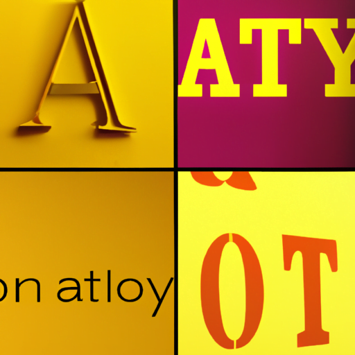
- Exploring the Anatomy of Letterforms
- The Basic Components of Letterforms
- 1. Ascender
- 2. Descender
- 3. Baseline
- 4. X-Height
- 5. Counter
- 6. Stem
- 7. Bowl
- 8. Serif
- 9. Sans Serif
- The Impact of Letterform Anatomy on Typography
- 1. Legibility and Readability
- 2. Visual Hierarchy
- 3. Emotional Impact
- Case Studies: The Role of Letterform Anatomy in Branding
- 1. Coca-Cola
- 2. Google
- The Future of Letterform Anatomy
- 1. Responsive Typography
Exploring the Anatomy of Letterforms
Typography is an essential element of design that plays a crucial role in conveying information and evoking emotions. At the heart of typography lies the anatomy of letterforms, which refers to the structure and characteristics of individual letters. Understanding the anatomy of letterforms is fundamental for designers, typographers, and anyone involved in the world of visual communication. In this article, we will delve into the intricacies of letterforms, exploring their various components and how they contribute to the overall design.
The Basic Components of Letterforms
Letterforms consist of several key components that work together to create visually appealing and legible typography. Let’s take a closer look at each of these components:
1. Ascender
The ascender is the part of a letterform that extends above the x-height, which is the height of lowercase letters without ascenders or descenders. Letters like “b,” “d,” and “h” have ascenders that reach above the x-height, adding verticality and variation to the overall design.
2. Descender
On the opposite end of the spectrum, descenders are the parts of letterforms that extend below the baseline. Letters like “g,” “j,” and “p” have descenders that add a sense of balance and rhythm to the typography.
3. Baseline
The baseline is an imaginary line upon which the letters sit. It provides a consistent reference point for aligning and spacing letterforms. Maintaining a consistent baseline is crucial for legibility and readability.
4. X-Height
The x-height refers to the height of lowercase letters without ascenders or descenders. It is a vital factor in determining the overall size and proportions of a typeface. A larger x-height can enhance readability, especially in small sizes, while a smaller x-height can create a more elegant and refined appearance.
5. Counter
The counter is the enclosed or partially enclosed space within a letterform. It can be found in letters like “o,” “p,” and “e.” The size and shape of the counter can greatly influence the overall legibility and visual balance of a typeface.
6. Stem
The stem is the main vertical stroke of a letterform. It can be found in letters like “l,” “t,” and “b.” The thickness and consistency of the stem contribute to the overall weight and style of a typeface.
7. Bowl
The bowl is the curved or round part of a letterform. It can be found in letters like “b,” “d,” and “p.” The shape and size of the bowl greatly impact the overall character and style of a typeface.
8. Serif
Serifs are the small decorative strokes or lines that extend from the ends of the main strokes of a letterform. They can be found in typefaces classified as serif, such as Times New Roman or Garamond. Serifs can add a sense of tradition, elegance, and formality to typography.
9. Sans Serif
In contrast to serifs, sans serif typefaces do not have decorative strokes at the ends of the main strokes. Examples of popular sans serif typefaces include Helvetica and Arial. Sans serif typefaces are often associated with modernity, simplicity, and clarity.
The Impact of Letterform Anatomy on Typography
The anatomy of letterforms has a profound impact on the overall design and effectiveness of typography. Here are some key ways in which letterform anatomy influences typography:
1. Legibility and Readability
The size, shape, and spacing of letterforms directly affect legibility and readability. A well-designed typeface with carefully considered letterform anatomy ensures that each letter is easily distinguishable and can be read effortlessly. For example, typefaces with larger x-heights and generous spacing between letters tend to be more legible, especially in small sizes or low-resolution environments.
2. Visual Hierarchy
The anatomy of letterforms can be used to establish a visual hierarchy within typography. By varying the size, weight, and style of letterforms, designers can guide the reader’s attention and emphasize important information. For instance, using larger and bolder letterforms for headings and subheadings creates a clear visual hierarchy and helps readers navigate the content more easily.
3. Emotional Impact
The shape and style of letterforms can evoke specific emotions and set the tone for a design. For example, typefaces with sharp and angular letterforms may convey a sense of urgency or aggression, while typefaces with rounded and flowing letterforms may evoke a feeling of warmth or friendliness. By carefully selecting typefaces with appropriate letterform anatomy, designers can enhance the emotional impact of their designs.
Case Studies: The Role of Letterform Anatomy in Branding
Brands often rely on typography to establish their visual identity and communicate their values. The anatomy of letterforms plays a crucial role in shaping the perception of a brand. Let’s explore two case studies that highlight the impact of letterform anatomy in branding:
1. Coca-Cola
The Coca-Cola logo is one of the most recognizable and enduring brand identities in the world. The letterforms in the Coca-Cola logo have a distinct script style with flowing curves and a unique “C” shape. The use of script letterforms conveys a sense of tradition, elegance, and timelessness, aligning with the brand’s long-standing history and heritage. The flowing curves and the unique shape of the “C” add a sense of friendliness and approachability, reflecting the brand’s emphasis on creating positive experiences and connections.
2. Google
Google’s logo underwent a significant redesign in 2015, shifting from a serif typeface to a custom-designed sans serif typeface. The new letterforms have a clean and geometric appearance, reflecting Google’s focus on simplicity, innovation, and user-friendly experiences. The absence of serifs in the letterforms contributes to a more modern and streamlined look, aligning with Google’s position as a leading technology company.
The Future of Letterform Anatomy
As technology continues to evolve, so does the way we interact with typography. The digital landscape has introduced new challenges and opportunities for letterform anatomy. Here are some trends that are shaping the future of letterform anatomy:
1. Responsive Typography
Responsive typography refers to the ability of typography to adapt and respond to different screen sizes and devices. With the increasing prevalence of mobile devices and varying screen resolutions, designers need to consider how letterform anatomy translates across different contexts. Ensuring legibility and readability across various devices requires careful attention to the size, spacing,