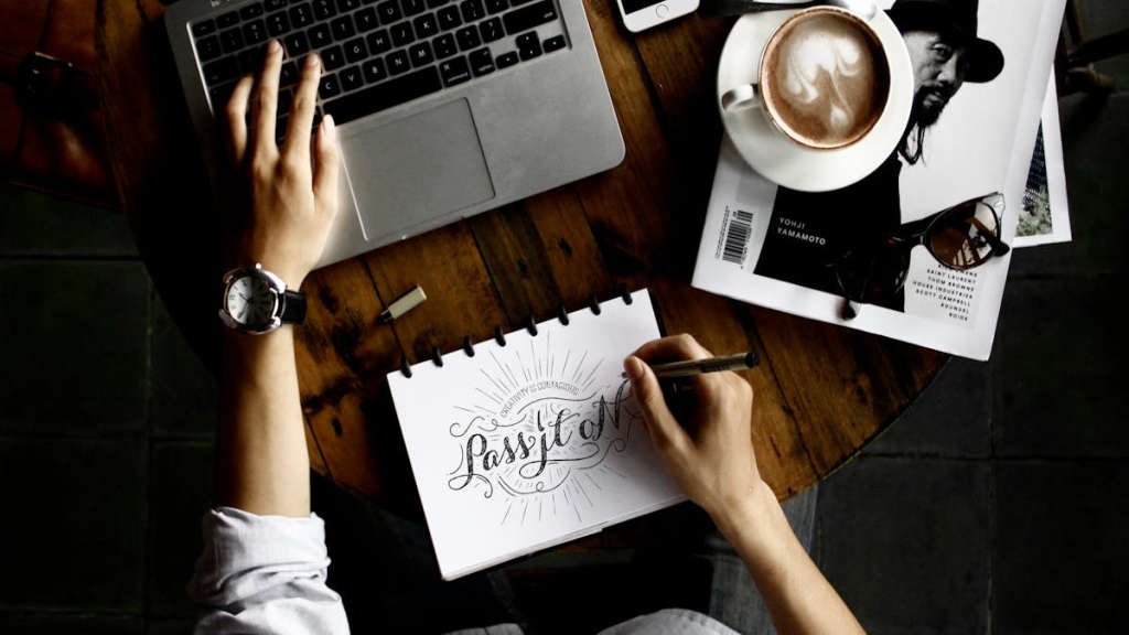
When it comes to design, typography plays a crucial role in enhancing visual appeal. Understanding advanced typography composition techniques can make a significant difference in how your content is perceived by the audience. By incorporating creative and effective typography, you can elevate the overall look and feel of your designs, making them more engaging and impactful.
Main Points
- Choosing the right fonts and pairing them strategically can make a huge difference in the overall design.
- Employing hierarchy and emphasis through font size, weight, and style helps guide the reader through the content.
- Utilizing white space and alignment techniques can improve readability and visual flow.
- Experimenting with creative layouts and text arrangements can add personality and uniqueness to your designs.

Mastering Font Pairing for Effective Communication
Typography plays a crucial role in effective communication and branding. The fonts you choose can convey a message, evoke emotions, and create a memorable experience for your audience. Mastering font pairing is essential for creating a cohesive and harmonious design that enhances your content. Here are some tips to help you master font pairing for effective communication:
1. Start with a Strong Foundation
When pairing fonts, it’s important to start with a strong foundation. Choose one font as the primary typeface for your headings and another font for your body text. This will create contrast and hierarchy in your design, making it easier for readers to navigate your content.
2. Contrast is Key
Contrast is essential when pairing fonts. Look for fonts that have different weights, styles, and proportions to create visual interest and distinction between different elements of your design. A combination of a serif and a sans-serif font can work well together, providing a balance of elegance and modernity.
3. Consistency is Crucial
While contrast is important, consistency is also crucial when pairing fonts. Stick to a limited number of fonts (typically two or three) throughout your design to maintain a cohesive look. Consistent use of fonts helps establish your brand identity and makes your content more visually appealing.
By following these tips and experimenting with different font pairings, you can create a visually appealing and effective design that enhances your communication and leaves a lasting impression on your audience.

The Power of Hierarchy in Typography Design
Typography is an essential element of design that plays a crucial role in conveying information effectively. One of the key aspects of typography design is hierarchy, which refers to the arrangement of text in a way that prioritizes certain elements over others. The power of hierarchy lies in its ability to guide the reader’s eye and create a visual structure that enhances readability and comprehension.
Why is Hierarchy Important?
Hierarchy in typography design helps establish a clear structure within a piece of text, allowing readers to easily navigate through the content. By using different font sizes, weights, and styles, designers can emphasize important information and create a visual hierarchy that guides the reader’s attention.
Creating Effective Hierarchy
To create an effective hierarchy in typography design, it is essential to consider the content and the message you want to convey. Start by determining the most important elements of the text and assign them appropriate visual attributes such as larger font sizes or bold styles.
| Tip | Örnek |
|---|---|
| Title | The Power of Hierarchy in Typography Design |
| Subtitle | Creating Effective Hierarchy |
Conclusion
Typography design plays a significant role in enhancing the visual appeal and readability of content. By understanding the power of hierarchy and effectively applying it to your designs, you can create more engaging and impactful typographic compositions that effectively communicate your message to the audience.

Exploring Innovative Text Layout Techniques
In the digital age, the way we consume information has drastically changed. With the rise of social media and mobile devices, text layout techniques play a crucial role in capturing the attention of the audience. In this article, we will explore some innovative strategies that can help you create engaging and visually appealing content.
1. Mixed Media Approach
One of the most effective ways to grab the reader’s attention is to use a mixed media approach. By combining text with images, videos, and interactive elements, you can create a dynamic and immersive reading experience. This not only enhances the visual appeal of your content but also helps in conveying information more effectively.
2. Grid Layout Design
The grid layout design is a popular technique used by many designers to organize content in a structured and visually pleasing way. By dividing the page into a grid system, you can create a sense of order and hierarchy, making it easier for the audience to navigate through the information. This technique is particularly useful for websites and digital publications.
3. Typography Experimentation
Typography plays a significant role in text layout design. By experimenting with typography, you can create unique and eye-catching layouts that stand out from the crowd. Try using different fonts, sizes, and colors to emphasize key points and create visual interest. However, it is essential to maintain readability and consistency throughout your design.
Overall, by incorporating these innovative text layout techniques, you can elevate the quality of your content and engage your audience in a meaningful way. Experiment with different strategies, and don’t be afraid to think outside the box to create a memorable reading experience.

The Impact of Color Contrast on Readability
In the world of design and typography, color contrast plays a crucial role in the readability of text. The contrast between text color and background color can greatly affect how easily a piece of content can be read and understood. When the contrast is too low, it can strain the eyes and make the text difficult to decipher. On the other hand, when the contrast is too high, it can be overwhelming and distracting.
There are several factors to consider when choosing the right color contrast for text:
- Legibility: The most important factor to consider is whether the text is easily readable against the background. High contrast between text and background colors can improve legibility.
- Accessibility: Color contrast is also important for accessibility reasons. People with visual impairments or color blindness may struggle to read content with low contrast.
- Emphasis: Using color contrast strategically can help draw attention to important information or calls to action within a piece of content.
Recommended Color Contrast Ratios
According to the Web Content Accessibility Guidelines (WCAG), the recommended color contrast ratio for normal text is at least 4.5:1 for small text and 3:1 for large text. For text that is essential for understanding content, such as headings, the ratio should be at least 3:1 for small text and 4.5:1 for large text.
| Text Size | Normal Text Ratio | Large Text Ratio |
|---|---|---|
| Small | 4.5:1 | 3:1 |
| Large | 3:1 | 4.5:1 |
By following these guidelines and considering the impact of color contrast on readability, designers and content creators can ensure that their content is accessible and easy to read for all users.
Incorporating Whitespace for Better Text Legibility
Whitespace, also known as negative space, is a crucial element in design that is often overlooked. It plays a significant role in enhancing the legibility and readability of text. Incorporating whitespace properly can make a huge difference in the overall look and feel of a document or website.
When used effectively, whitespace can help to separate different elements, create a sense of balance, and guide the reader’s eye through the content. It can also improve the overall user experience by making the text more visually appealing and easier to read.
Key Benefits of Incorporating Whitespace:
1. Improved Readability: By adding whitespace between paragraphs, headings, and other elements, you can make the text easier to read and understand. This can help to prevent the reader from feeling overwhelmed and improve retention of information.
2. Enhanced Focus: Whitespace can create emphasis and draw attention to important elements of the text, such as headings, quotes, or call-to-action buttons. This can help to guide the reader’s eye and improve overall comprehension.
3. Better User Experience: By incorporating whitespace strategically, you can create a more enjoyable and visually pleasing reading experience for your audience. This can help to keep them engaged and encourage them to explore more of your content.
Overall, whitespace is a powerful design tool that can have a significant impact on the legibility and effectiveness of your text. By incorporating whitespace thoughtfully and strategically, you can create a more visually appealing and user-friendly experience for your readers.
Utilizing Typography Trends for Modern Designs
In the world of design, typography plays a crucial role in creating visually appealing and engaging content. As technology continues to evolve, so do typography trends. By staying up-to-date with the latest typography techniques, designers can elevate their work and create modern designs that stand out.
The Power of Typography in Design
Typography is more than just selecting fonts for a design; it is a powerful tool that can convey emotion, evoke a certain feeling, and guide the viewer’s eye. Using the right typography can help establish a brand’s identity and make a lasting impression on the audience.
Key Typography Trends for Modern Designs
| 1. Variable Fonts | Variable fonts allow designers to create dynamic typography that adjusts based on screen size and resolution. This trend offers greater flexibility and creativity in design. |
|---|---|
| 2. Bold and Playful Fonts | Bold and playful fonts are becoming more popular in modern design. These fonts can add personality and charm to a design, making it more engaging for the audience. |
| 3. Minimalistic Typography | Minimalistic typography focuses on simplicity and readability. By using clean and sleek fonts, designers can create a modern and sophisticated look for their designs. |
“Typography is the craft of endowing human language with a durable visual form.” – Robert Bringhurst
As Robert Bringhurst’s quote emphasizes, typography is an essential element in design that can make a lasting impact. By incorporating the latest typography trends into modern designs, designers can create visually stunning and memorable content that resonates with their audience.
Conclusion
In conclusion, mastering Typography Composition Techniques is essential for creating visually appealing and effective designs. By understanding the principles of typography, such as hierarchy, contrast, and alignment, designers can elevate their work and effectively communicate their message to the audience. In today’s digital age, where visual content plays a crucial role in capturing the viewer’s attention, utilizing these techniques can make a significant difference in the success of a design project. Stay updated with the latest trends and experiment with different combinations to find what works best for your design style.
Frequently Asked Questions
What is typography?
Typography is the art and technique of arranging type to make written language legible, readable, and appealing when displayed.
Why is typography important in design?
Typography is important because it helps convey a message effectively, establish hierarchy, set the tone, and create visual interest in design.
What are some key typography terms to know?
Some key typography terms include serif, sans-serif, kerning, leading, tracking, alignment, and hierarchy.
How can I improve my typography skills?
You can improve your typography skills by studying typefaces, practicing different layouts, understanding typographic principles, and seeking inspiration from great designs.
What are common typography mistakes to avoid?
Common typography mistakes to avoid include using too many fonts, inappropriate typeface pairing, poor line spacing, inconsistent alignment, and ignoring legibility.
