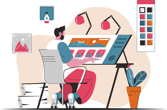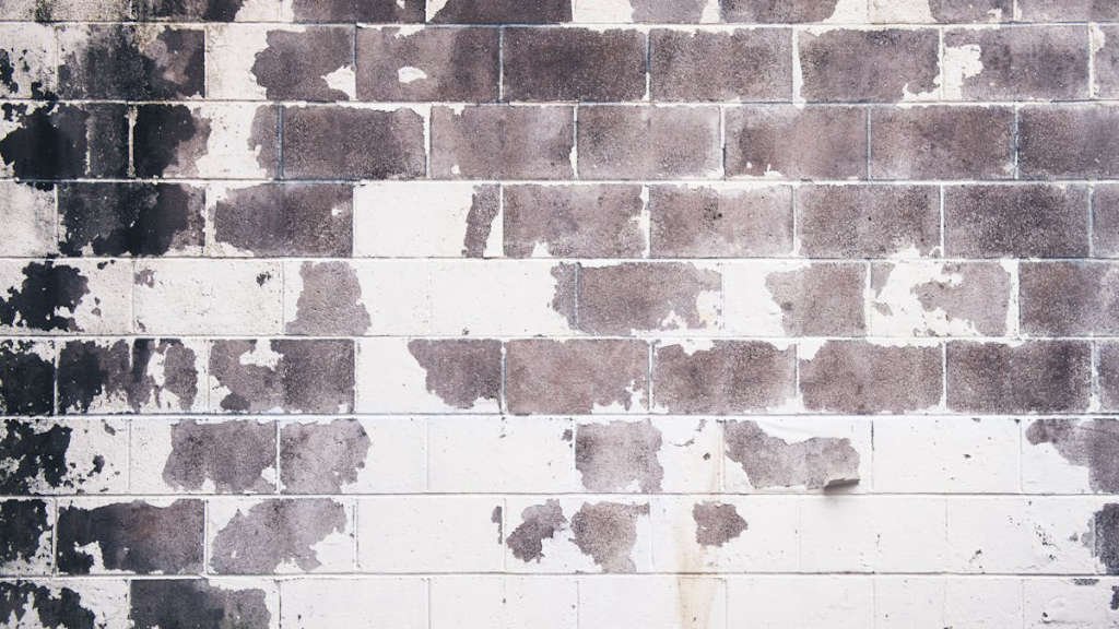
Inspiration can strike from the most unexpected places when it comes to design, and the resurgence of Grunge design trends is a perfect example of this. Embracing a raw, edgy aesthetic, Grunge design offers a fresh and non-conformist approach to traditional design principles. With its roots in the rebellious spirit of the 90s music scene, Grunge design trends are making a powerful comeback in the modern design world.
Main Points:
- Analyzing the impact of Grunge design trends on modern design practices
- Best practices for incorporating Grunge design elements into your projects
- Exploring the ways to implement a Grunge design aesthetic successfully
Evolution of Grunge Design in Modern Web Development
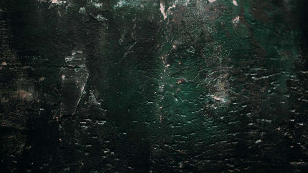
In the world of web development, design trends are constantly evolving to meet the demands of users and keep websites fresh and engaging. One design trend that has seen a resurgence in recent years is Grunge design. This gritty, edgy style has its roots in the music scene of the 1990s and has made a comeback in the digital world. Let’s explore the evolution of Grunge design and how it is being implemented in modern web development.
Grunge Design Trends Analysis
Grunge design is characterized by its rough, unpolished aesthetic. It often features textures like distressed backgrounds, hand-drawn elements, and bold typography. The use of dark colors and asymmetrical layouts also contribute to the overall gritty feel of Grunge design. This style is a departure from the clean, minimalist designs that have dominated the web in recent years, offering a more raw and rebellious look.
Best Grunge Design Trends Practices
- Texture: Incorporate textures like grunge brushes, dirt smudges, or distressed patterns to add depth to your designs.
- Typography: Use bold, grungy fonts to make a statement and evoke the edgy feel of Grunge design.
- Color Palette: Stick to a muted, earthy color palette with pops of bold colors to create a moody vibe.
Implementing Grunge Design Trends
When implementing Grunge design in modern web development, it’s important to strike a balance between the rough aesthetic and usability. Make sure the design elements serve a purpose and enhance the user experience, rather than just being decorative. Experiment with different textures, fonts, and layouts to find a style that resonates with your brand and audience.
Overall, Grunge design offers a unique and rebellious aesthetic that can set your website apart from the crowd. By embracing the gritty, raw look of Grunge design, you can create a visually striking and memorable online experience for your users.
Incorporating Raw Elements in Grunge Design Trends
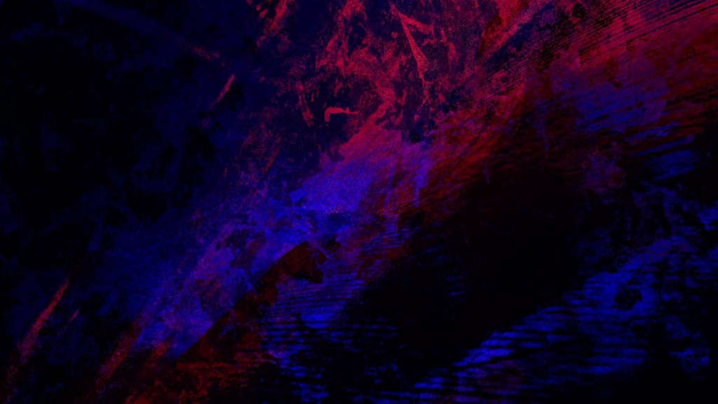
In the world of design, the grunge trend has been making a strong comeback in recent years. One of the key elements of this trend is the incorporation of raw elements into the design. Raw elements such as unfinished textures, distressed materials, and weathered surfaces add a sense of authenticity and uniqueness to grunge design.
When it comes to incorporating raw elements in grunge design, there are a few key factors to keep in mind. First and foremost, authenticity is key. Raw elements should not be forced or artificial, but rather should be organic and true to their natural state. This authenticity adds depth and character to the design, making it more engaging and captivating.
Unfinished Textures
One of the most common raw elements used in grunge design is unfinished textures. These textures can be found in materials such as concrete, wood, and metal, and add a sense of ruggedness and roughness to the design. Unfinished textures create a visual interest and complexity that is hard to achieve with more polished and refined materials.
Distressed Materials
Distressed materials, such as aged wood, rusted metal, and peeling paint, are another key component of grunge design. These materials add a sense of history and character to the design, telling a story of time and wear. Distressed materials bring a sense of authenticity and nostalgia to the design, making it more relatable and appealing to a wide audience.
Weathered Surfaces
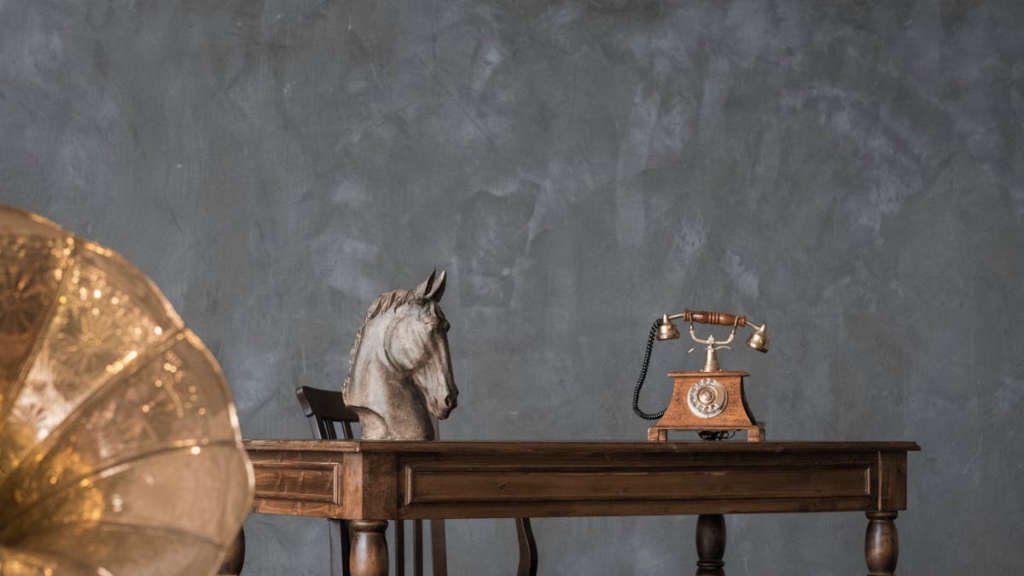
Weathered surfaces, such as cracked concrete, worn leather, and faded fabrics, also play a significant role in grunge design. These surfaces add a sense of decay and deterioration to the design, creating a sense of mystery and intrigue. Weathered surfaces bring a sense of depth and richness to the design, making it more dynamic and visually interesting.
| Key Element | Description |
|---|---|
| Unfinished Textures | Rugged and rough textures found in materials like concrete, wood, and metal |
| Distressed Materials | Aged wood, rusted metal, peeling paint, adding history and character |
| Weathered Surfaces | Cracked concrete, worn leather, faded fabrics, creating decay and mystery |
Contrasting Color Schemes for Bold Grunge Designs
When it comes to creating bold and edgy designs, contrasting color schemes can make all the difference. By combining colors that are opposite on the color wheel, you can create a dynamic and eye-catching design that demands attention.
One of the key elements of a bold grunge design is the use of contrasting colors. This can be achieved by pairing dark, muted tones with bright, vibrant hues. For example, combining deep navy blue with fiery orange creates a striking contrast that is perfect for a grunge-inspired design.
Experimenting with different color combinations
Don’t be afraid to experiment with different color combinations to find the perfect contrast for your grunge design. Try pairing bold, primary colors with soft pastels or mixing cool tones with warm tones for a unique and unexpected look.
Remember, the key to a successful bold grunge design is to embrace the unexpected and create a design that is both daring and captivating. So go ahead, play with contrasting color schemes, and let your creativity run wild!
Typography Choices for Enhanced Grunge Aesthetics
Grunge aesthetics offer a unique and edgy style that can be enhanced through the careful selection of typography. Choosing the right fonts can make a significant impact on the overall look and feel of a grunge-inspired design. Here are some typography choices that can help elevate the grunge aesthetic of your project:
1. Distressed Fonts
Distressed fonts are a staple of grunge design, adding a weathered and worn look to text. These fonts often feature irregular edges, scratches, and other imperfections that give them a raw and rugged appearance. Popular distressed fonts include Helvetica Inserat, Distressed, and Grunge Serif.
2. Handwritten Fonts
Handwritten fonts can also work well in grunge aesthetics, adding a personal and organic touch to your design. Look for fonts that mimic the look of handwriting, with uneven strokes and varying line weights. Some popular handwritten fonts for grunge design include Marker Felt, Ink Free, and Handwriting Dakota.
3. Gothic Fonts
Gothic fonts can bring a dark and mysterious element to grunge designs. These fonts often have sharp serifs and intricate details that can add a touch of drama to your typography. Consider using fonts like Old English Text MT, Blackletter, or Chiller to enhance the grunge aesthetic of your project.
4. Typewriter Fonts
Typewriter fonts can provide a vintage and retro feel to grunge designs. These fonts mimic the look of old-fashioned typewriters, with fixed-width characters and uneven spacing. Some popular typewriter fonts to consider are American Typewriter, Courier New, and Special Elite.
5. Use of Texture and Layering
In addition to choosing the right fonts, consider adding texture and layering to your typography to enhance the grunge aesthetic further. Overlaying text with distressed textures, splatter effects, or grunge-inspired graphics can create a more dynamic and visually interesting design.
| Typography Choice | Example Font |
|---|---|
| Distressed Fonts | Helvetica Inserat |
| Handwritten Fonts | Marker Felt |
| Gothic Fonts | Old English Text MT |
| Typewriter Fonts | American Typewriter |
By carefully selecting typography choices that align with the grunge aesthetic, you can create designs that are visually striking and full of character. Experiment with different fonts, textures, and layering techniques to find the perfect combination that enhances the overall grunge vibe of your project.

Balancing Minimalism with Grunge Elements in Design
In the world of design, there has always been a fine line between minimalism and grunge. While minimalism focuses on simplicity, clarity, and elegance, grunge embraces rawness, imperfection, and edginess. Balancing these two contrasting elements can result in a unique and striking design that captures the attention of the audience.
Finding Harmony
When balancing minimalism with grunge elements, it’s important to find harmony between the two. This can be achieved by incorporating clean lines and white space from minimalism, while adding rough textures, bold typography, and distressed effects from grunge. The key is to maintain a sense of cohesion and unity in the design, so that the contrasting elements complement each other rather than clash.
Embracing Contrast
Contrast plays a crucial role in balancing minimalism with grunge elements. By juxtaposing sleek, modern elements with rugged, distressed ones, designers can create visual interest and depth in their design. This can be achieved through the use of color, texture, scale, and typography. The goal is to create a dynamic interplay between the clean and the gritty, the simple and the complex.
Pushing Boundaries
To truly push boundaries and create a design that stands out, designers must be willing to experiment and take risks. This means thinking outside the box, breaking rules, and embracing unconventional ideas. By daring to mix minimalism with grunge elements in unexpected ways, designers can create innovative and thought-provoking designs that leave a lasting impression.
In conclusion, balancing minimalism with grunge elements in design requires a careful blend of restraint and boldness. By finding harmony, embracing contrast, and pushing boundaries, designers can create visually stunning and impactful designs that resonate with their audience.
Exploring Texture Techniques in Contemporary Grunge Design
Texture is a fundamental element in design, adding depth, dimension, and a tactile quality to visual art. In contemporary grunge design, texture techniques play a crucial role in creating a raw, edgy aesthetic that is both gritty and captivating.
The Art of Distressing
One of the key texture techniques used in contemporary grunge design is distressing. This involves intentionally aging or roughening up the surface of a design to give it a worn, weathered look. By using tools like sandpaper, brushes, or even chemicals, designers can create a distressed texture that adds character and authenticity to their work.
Layering for Dimension
Layering is another important texture technique in grunge design. By overlaying different elements, such as images, patterns, or text, designers can create a multi-dimensional effect that adds depth and interest to their compositions. This technique is particularly effective in creating a visually dynamic and compelling design.
“Texture adds a sense of touch to visual art, creating an emotional connection with the viewer.”
Playing with Contrast
Contrast is a powerful tool in grunge design, and texture can enhance this element significantly. By juxtaposing rough textures with smooth surfaces or combining matte finishes with glossy accents, designers can create a striking contrast that adds drama and impact to their designs.
| Texture Techniques | Description |
|---|---|
| Distressing | Aging or roughening up the surface of a design for a worn look |
| Layering | Overlaying different elements for a multi-dimensional effect |
| Contrast | Juxtaposing textures for a dramatic visual impact |
Conclusion
In conclusion, the undefined trend in design allows for endless possibilities and creativity. One particular trend that has gained popularity is Grunge design, characterized by its gritty and raw aesthetic. Grunge design trends continue to influence modern design styles, pushing boundaries and challenging traditional norms. As designers embrace the undefined and unconventional, we can expect to see even more innovative and daring creations in the future.
Frequently Asked Questions
What are the key elements of grunge design?
The key elements of grunge design include distressed textures, dark color palettes, gritty typography, and asymmetrical layouts.
How can I incorporate grunge design in my projects?
You can incorporate grunge design in your projects by using textures like grunge brushes or overlays, selecting dark and moody color schemes, and experimenting with unconventional typography.
What software can help me create grunge design effects?
Software like Adobe Photoshop, Adobe Illustrator, and Procreate can help you create grunge design effects through various tools and filters.
Are there any best practices to follow when using grunge design?
When using grunge design, it’s important to maintain a balance between chaos and legibility, experiment with different elements, and pay attention to details like layering and blending modes.
Where can I find inspiration for grunge design projects?
You can find inspiration for grunge design projects from platforms like Dribbble, Behance, Pinterest, and design blogs that showcase grunge-style artworks and designs.
