-
Table of Contents
The Role of Typography in Packaging for Children’s Products

When it comes to packaging for children’s products, typography plays a crucial role in capturing their attention and conveying important information. The right choice of fonts, colors, and layout can make a significant impact on a child’s perception of a product. In this article, we will explore the importance of typography in packaging for children’s products and how it can influence their purchasing decisions.
The Power of Typography in Capturing Attention
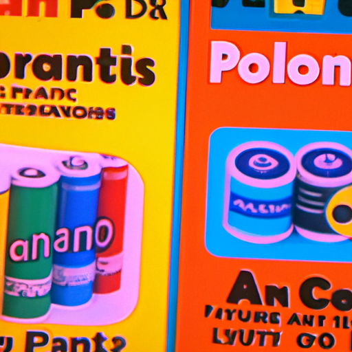
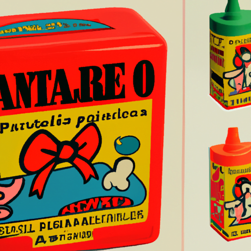
Typography is not just about choosing a font; it is about creating an entire visual language that speaks to the target audience. For children, typography needs to be fun, playful, and easy to read. The right typography can instantly capture a child’s attention and make them curious about the product.
For example, the use of bold and vibrant fonts can create a sense of excitement and energy. Fonts with rounded edges and exaggerated shapes can evoke a sense of playfulness and friendliness. By using typography that resonates with children, packaging can stand out on the shelves and attract their attention.
Enhancing Readability and Comprehension
Typography in packaging for children’s products should prioritize readability and comprehension. Children are still developing their reading skills, so it is essential to use fonts that are easy to read and understand. Clear and legible typography ensures that children can quickly grasp the information presented on the packaging.
One effective way to enhance readability is by using a combination of upper and lowercase letters. Studies have shown that mixed-case text is easier to read than all uppercase or all lowercase text. Additionally, using a larger font size and appropriate line spacing can further improve readability for young readers.
Creating a Brand Identity
Typography plays a vital role in creating a brand identity for children’s products. Consistency in typography across different products helps establish brand recognition and loyalty among young consumers. By using consistent fonts, colors, and styles, packaging can create a cohesive and memorable brand experience.
For example, the iconic typography used by LEGO has become synonymous with their brand. The bold, blocky letters instantly evoke a sense of creativity and playfulness. This consistent use of typography has helped LEGO build a strong brand identity that resonates with children and parents alike.
Case Study: Crayola
Crayola, a well-known brand of art supplies for children, understands the importance of typography in packaging. Their packaging features a combination of bold and playful fonts that instantly capture a child’s attention. The use of bright colors and large font sizes enhances readability and makes it easy for children to identify the product they want.
Furthermore, Crayola’s packaging incorporates typography that reflects the creativity and imagination associated with their brand. The use of handwritten-style fonts and colorful illustrations creates a sense of fun and excitement, making their products even more appealing to children.
The Role of Typography in Safety Information
Typography also plays a critical role in conveying safety information on packaging for children’s products. It is essential to use clear and legible fonts to ensure that parents can easily understand the instructions and warnings. By using typography that is easy to read, packaging can effectively communicate important safety information to parents.
Additionally, typography can be used to highlight key safety messages. By using bold fonts or different colors, important warnings can stand out and catch the attention of parents. This ensures that crucial safety information is not overlooked, reducing the risk of accidents or misuse of the product.
Conclusion
Typography is a powerful tool in packaging design for children’s products. It has the ability to capture attention, enhance readability, create a brand identity, and convey important safety information. By understanding the role of typography and using it effectively, brands can create packaging that appeals to children and parents alike.
When designing packaging for children’s products, it is crucial to consider the target audience and their unique needs. By choosing fonts that are fun, playful, and easy to read, packaging can stand out on the shelves and attract children’s attention. Additionally, using typography that enhances readability and comprehension ensures that children can quickly understand the information presented on the packaging.
Furthermore, typography plays a vital role in creating a brand identity. Consistency in typography across different products helps establish brand recognition and loyalty among young consumers. By using typography that reflects the brand’s values and personality, packaging can create a memorable brand experience.
Lastly, typography is essential in conveying safety information. Clear and legible fonts ensure that parents can easily understand the instructions and warnings. By using typography that highlights key safety messages, packaging can effectively communicate important information and reduce the risk of accidents or misuse.
In conclusion, typography is a crucial element in packaging for children’s products. It has the power to capture attention, enhance readability, create a brand identity, and convey important safety information. By understanding the role of typography and using it effectively, brands can create packaging that not only appeals to children but also provides valuable information to parents.
