-
Table of Contents
The Cubist Typography of Fernand Léger

Fernand Léger, a prominent French painter, sculptor, and filmmaker, was one of the key figures in the development of Cubism. While his contributions to the visual arts are widely recognized, his exploration of typography within the Cubist movement is often overlooked. In this article, we will delve into the world of Fernand Léger’s cubist typography, exploring its origins, characteristics, and impact on the art world.
Origins of Cubist Typography
Cubism, which emerged in the early 20th century, revolutionized the way artists approached representation. It sought to depict objects from multiple viewpoints, breaking them down into geometric forms and reassembling them in an abstract manner. This movement, pioneered by Pablo Picasso and Georges Braque, had a profound influence on Léger’s artistic style.
Léger’s interest in typography can be traced back to his early experiences as a draftsman and architectural apprentice. He was exposed to the principles of lettering and design, which laid the foundation for his later exploration of typography within the context of Cubism.
Characteristics of Fernand Léger’s Cubist Typography
Léger’s cubist typography can be characterized by several distinct features:
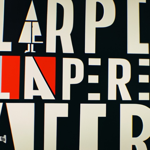
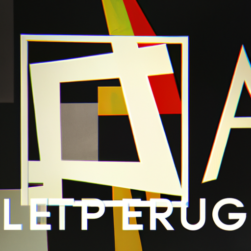
- Geometric Forms: Léger’s typography often incorporated geometric shapes, such as squares, circles, and triangles. These forms were used to deconstruct and reconstruct letters, creating a sense of dynamism and movement.
- Fragmentation: Similar to the fragmentation of objects in traditional Cubist paintings, Léger fragmented letters, breaking them down into smaller components. This fragmentation allowed for a more abstract representation of the alphabet.
- Layering: Léger’s typography often involved layering different elements, such as letters, shapes, and textures. This layering created depth and complexity, adding visual interest to his compositions.
- Contrast: Léger employed contrast in his typography, juxtaposing bold and thin lines, light and dark colors, and positive and negative spaces. This contrast enhanced the visual impact of his work and emphasized the interplay between different elements.
Examples of Fernand Léger’s Cubist Typography
To better understand Léger’s cubist typography, let’s explore some of his notable works:
1. “La Ville”
“La Ville” (The City), created in 1919, is a prime example of Léger’s cubist typography. In this work, he combines fragmented letters with geometric shapes and bold colors to create a vibrant and dynamic composition. The letters are deconstructed and reassembled in a way that challenges traditional notions of legibility, emphasizing the abstract nature of his typography.
2. “Le Transport des Forces”
“Le Transport des Forces” (The Transport of Forces), completed in 1918, showcases Léger’s experimentation with layering and contrast. The typography in this work is composed of overlapping letters and shapes, creating a sense of depth and movement. The use of contrasting colors and textures further enhances the visual impact of the composition.
3. “Composition with Letters”
“Composition with Letters,” created in 1921, exemplifies Léger’s exploration of the relationship between typography and visual art. In this work, he combines fragmented letters with abstract geometric forms, blurring the boundaries between text and image. The composition is balanced and harmonious, showcasing Léger’s mastery of both typography and visual composition.
Impact of Fernand Léger’s Cubist Typography
Léger’s cubist typography had a significant impact on the art world, influencing subsequent generations of artists and designers. His innovative approach to typography challenged traditional notions of legibility and paved the way for experimentation and abstraction in the field of graphic design.
By breaking down letters into geometric forms and reassembling them in abstract compositions, Léger expanded the possibilities of typographic expression. His work blurred the boundaries between text and image, opening up new avenues for creative exploration.
Léger’s cubist typography also had a lasting impact on the development of modern advertising and graphic design. His bold and dynamic compositions inspired designers to think beyond traditional typography, encouraging them to experiment with form, color, and layout.
Summary
Fernand Léger’s cubist typography represents a fascinating intersection of art and design. His exploration of typography within the context of Cubism challenged traditional notions of legibility and opened up new possibilities for creative expression. Léger’s use of geometric forms, fragmentation, layering, and contrast created visually striking compositions that continue to inspire artists and designers today.
By pushing the boundaries of typography, Léger not only contributed to the development of the Cubist movement but also left a lasting impact on the field of graphic design. His innovative approach continues to influence contemporary designers, encouraging them to think beyond the constraints of traditional typography and explore new avenues of creative expression.
