Introduction: The Importance of Understanding Design Principles
Design is an essential aspect of our daily lives, from the clothes we wear to the buildings we inhabit. It is the art of creating something that is both functional and aesthetically pleasing. However, great design is not just about making something look good; it is about creating a product that is effective, efficient, and user-friendly. To achieve this, designers must understand the fundamental principles of design. In this article, we will explore the building blocks of great design and why every designer should know them.
Balance: Achieving Harmony in Design
Balance is the distribution of visual weight in a design. It is the equilibrium between the elements of a design, such as color, shape, and texture. Achieving balance is essential in creating a harmonious design that is pleasing to the eye. There are three types of balance: symmetrical, asymmetrical, and radial.
Symmetrical balance is when the elements of a design are mirrored on either side of a central axis. This type of balance creates a sense of stability and order. Asymmetrical balance is when the elements of a design are not mirrored but are still balanced. This type of balance creates a sense of movement and dynamism. Radial balance is when the elements of a design radiate from a central point. This type of balance creates a sense of energy and movement.
Contrast: Creating Visual Interest and Hierarchy
Contrast is the difference between two or more elements in a design. It is used to create visual interest and hierarchy. Contrast can be achieved through color, size, shape, texture, and typography. When used effectively, contrast can make a design stand out and grab the viewer’s attention.
Color contrast is the most common type of contrast used in design. It is the difference between two or more colors in a design. Color contrast can be achieved through complementary colors, analogous colors, or monochromatic colors. Size contrast is the difference in size between two or more elements in a design. Shape contrast is the difference in shape between two or more elements in a design. Texture contrast is the difference in texture between two or more elements in a design. Typography contrast is the difference in font size, weight, and style between two or more elements in a design.
Proportion: Establishing a Sense of Scale and Unity
Proportion is the relationship between the elements of a design. It is used to establish a sense of scale and unity. Proportion can be achieved through size, shape, and placement. When used effectively, proportion can create a sense of balance and harmony in a design.
Size proportion is the relationship between the size of the elements in a design. Shape proportion is the relationship between the shape of the elements in a design. Placement proportion is the relationship between the placement of the elements in a design.
Color: Using Color Theory to Enhance Design
Color is an essential aspect of design. It is used to create mood, convey meaning, and enhance the overall aesthetic of a design. Understanding color theory is essential in creating effective and aesthetically pleasing designs.
Color theory is the study of how colors interact with each other. It is based on the color wheel, which is a visual representation of the primary, secondary, and tertiary colors. The primary colors are red, blue, and yellow. The secondary colors are green, orange, and purple. The tertiary colors are created by mixing a primary color with a secondary color.
Typography: Choosing the Right Typeface for Effective Communication
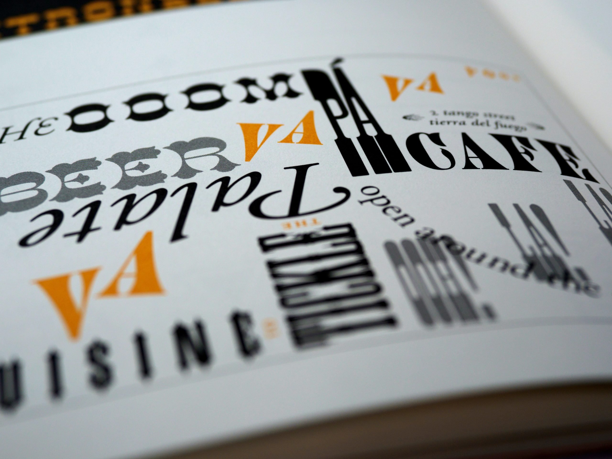
Typography is the art of arranging type to make written language legible, readable, and appealing when displayed. Choosing the right typeface is essential in effective communication. There are two main categories of typefaces: serif and sans-serif.
Serif typefaces have small lines or flourishes at the end of the strokes that make up the letters. They are often used in print media, such as books and newspapers. Sans-serif typefaces do not have these lines or flourishes and are often used in digital media, such as websites and mobile apps.
In conclusion, understanding the fundamental principles of design is essential in creating effective and aesthetically pleasing designs. Balance, contrast, proportion, color, and typography are the building blocks of great design. By mastering these principles, designers can create products that are not only beautiful but also functional and user-friendly. As the famous designer Paul Rand once said, “Design is so simple, that’s why it is so complicated.”
