-
Table of Contents
The Art of Emotive Color Grading in Graphics

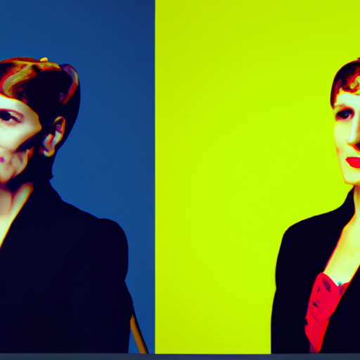
Color grading is a powerful tool in the world of graphics and visual storytelling. It allows artists and designers to evoke specific emotions, set the mood, and enhance the overall impact of their work. In this article, we will explore the art of emotive color grading and how it can be effectively used to create compelling visuals.
Understanding Color Psychology
Before diving into the techniques of emotive color grading, it is essential to understand the basics of color psychology. Colors have the ability to evoke specific emotions and associations in individuals. For example, warm colors like red and orange are often associated with energy, passion, and excitement, while cool colors like blue and green are associated with calmness, tranquility, and serenity.
By understanding the psychological impact of colors, designers can strategically use color grading to elicit specific emotional responses from their audience. Let’s explore some key techniques and examples.
Creating Contrast and Impact
One of the fundamental techniques in emotive color grading is creating contrast. By manipulating the color tones and hues, designers can draw attention to specific elements in their graphics and create a sense of visual impact. For example, a black and white photograph with a single element in vibrant color can create a striking contrast and emphasize the importance of that element.
Case Study: The movie “Schindler’s List” directed by Steven Spielberg is a powerful example of using color grading to create contrast and impact. The majority of the film is presented in black and white, but there are a few scenes where a little girl in a red coat appears. The use of color in these scenes highlights the innocence and vulnerability of the character, making a lasting emotional impact on the audience.
Setting the Mood with Color Temperature
Color temperature refers to the warmth or coolness of a color. It plays a crucial role in setting the mood and atmosphere of a graphic or visual composition. Warm colors, such as reds, oranges, and yellows, create a sense of energy, passion, and intensity. On the other hand, cool colors, such as blues and greens, evoke feelings of calmness, tranquility, and serenity.
By adjusting the color temperature, designers can create a specific mood that aligns with the intended emotional response. For example, a warm color grading with vibrant reds and oranges can be used to convey excitement and intensity in an action-packed movie poster. In contrast, a cool color grading with blues and greens can create a sense of tranquility and peace in a landscape photograph.
Case Study: “The Grand Budapest Hotel”
Wes Anderson’s film “The Grand Budapest Hotel” is a perfect example of using color grading to set the mood and enhance the storytelling. The film features a distinctive color palette with pastel hues, predominantly pinks and purples. This color grading choice creates a whimsical and nostalgic atmosphere, transporting the audience to a different era and immersing them in the story.
Symbolism and Cultural Associations
Colors also carry symbolic meanings and cultural associations that can be leveraged in emotive color grading. For example, red is often associated with love, passion, and danger, while blue is associated with trust, stability, and calmness. By utilizing these symbolic meanings, designers can enhance the narrative and create a deeper emotional connection with the audience.
It is important to consider cultural associations as well. Colors can have different meanings in different cultures. For example, in Western cultures, white is often associated with purity and innocence, while in some Eastern cultures, it is associated with mourning and death. Understanding these cultural nuances is crucial to ensure the intended emotional response is achieved.
Conclusion
Emotive color grading is a powerful tool in the world of graphics and visual storytelling. By understanding color psychology, creating contrast, setting the mood with color temperature, and leveraging symbolism and cultural associations, designers can evoke specific emotions and enhance the impact of their work.
Whether it’s a movie poster, a photograph, or a digital illustration, the art of emotive color grading allows artists to create visuals that resonate with the audience on a deeper level. So next time you embark on a creative project, remember the power of color and how it can be harnessed to evoke emotions and tell compelling stories.
