-
Table of Contents
- Illustrating for Podcasts: Cover Art and Visual Branding
- The Importance of Illustrating for Podcasts
- The Elements of Successful Cover Art
- 1. Clear and Eye-Catching Imagery
- 2. Legible Typography
- 3. Consistent Branding
- 4. Emotional Appeal
- 5. Simplicity
- Visual Branding Strategies for Podcasts
- 1. Logo Design
- 2. Color Palette
- 3. Visual Style
- 4. Consistent Imagery
- 5. Brand Guidelines
- Case Studies: Successful Podcast Cover Art and Visual Branding
- 1. “Serial” Podcast
- 2. “The Joe Rogan Experience” Podcast
- Key Takeaways
Illustrating for Podcasts: Cover Art and Visual Branding

Podcasts have become an increasingly popular form of entertainment and information sharing, with millions of episodes available on various platforms. As the podcast industry continues to grow, it becomes crucial for podcasters to stand out from the crowd and attract listeners. One effective way to achieve this is through compelling cover art and visual branding. In this article, we will explore the importance of illustrating for podcasts, discuss the elements of successful cover art, and provide valuable insights on visual branding strategies.
The Importance of Illustrating for Podcasts
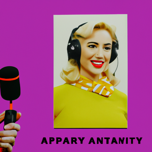
When it comes to podcasts, the saying “don’t judge a book by its cover” doesn’t hold true. In a sea of podcast options, potential listeners often make split-second decisions based on cover art alone. A visually appealing and well-designed cover can catch the eye, pique curiosity, and entice listeners to click and explore further.
Furthermore, cover art serves as a visual representation of the podcast’s content and brand. It sets the tone, communicates the genre, and creates a memorable impression. Just like a book cover, podcast cover art can make a lasting impact on potential listeners, influencing their decision to subscribe and listen to episodes.
The Elements of Successful Cover Art
Creating effective cover art requires careful consideration of various elements. Let’s explore the key components that contribute to successful podcast cover art:
1. Clear and Eye-Catching Imagery
The imagery used in podcast cover art should be clear, visually appealing, and relevant to the podcast’s content. It should capture the essence of the show and instantly convey its genre or theme. For example, a podcast about true crime might feature a mysterious crime scene or a silhouette of a detective.
2. Legible Typography
Typography plays a crucial role in cover art design. The text should be easily readable, even when displayed as a small thumbnail. Selecting the right font, size, and color is essential to ensure that the podcast’s title and any additional text are legible and visually appealing.
3. Consistent Branding
Consistency in branding is vital for podcast cover art. It helps establish recognition and builds trust with the audience. The cover art should align with the overall branding of the podcast, including its logo, color scheme, and visual style. Consistent branding creates a cohesive and professional look across all episodes and platforms.
4. Emotional Appeal
Effective cover art evokes emotions and connects with the target audience. It should resonate with the podcast’s intended listeners and create a sense of intrigue or excitement. Understanding the target audience’s preferences and interests is crucial in designing cover art that resonates with them.
5. Simplicity
Keeping the design simple and uncluttered is essential for effective cover art. A cluttered design can be overwhelming and fail to capture attention. By focusing on a few key elements and avoiding unnecessary details, the cover art can make a stronger impact and stand out among other podcasts.
Visual Branding Strategies for Podcasts
Creating a strong visual brand for a podcast goes beyond cover art. It involves consistent visual elements that extend across various platforms and marketing materials. Here are some valuable strategies for visual branding:
1. Logo Design
A well-designed logo is the cornerstone of a podcast’s visual brand. It should be unique, memorable, and reflective of the podcast’s identity. The logo can be incorporated into the cover art, website, social media profiles, and promotional materials to create a cohesive visual presence.
2. Color Palette
Choosing a consistent color palette is crucial for visual branding. Colors evoke emotions and can help convey the podcast’s tone and personality. For example, warm colors like red and orange may be suitable for a podcast about passion or energy, while cool colors like blue and green may be more appropriate for a podcast about relaxation or nature.
3. Visual Style
Defining a visual style helps create a recognizable and cohesive brand. The visual style can include elements such as illustrations, photography, or graphic patterns. For example, a podcast about technology might incorporate futuristic and tech-inspired visuals, while a podcast about history might use vintage or historical imagery.
4. Consistent Imagery
Using consistent imagery across different platforms and episodes helps reinforce the podcast’s brand. Whether it’s the cover art, social media posts, or episode thumbnails, maintaining a consistent visual style and theme creates a cohesive and professional look.
5. Brand Guidelines
Developing brand guidelines is essential for maintaining consistency in visual branding. These guidelines outline the proper usage of the logo, color palette, typography, and other visual elements. They serve as a reference for podcasters and designers, ensuring that the visual brand remains consistent across all materials.
Case Studies: Successful Podcast Cover Art and Visual Branding
Let’s take a look at two case studies of podcasts that have successfully utilized cover art and visual branding to attract and engage their audience:
1. “Serial” Podcast
The “Serial” podcast, hosted by Sarah Koenig, became a cultural phenomenon and set the standard for true crime podcasts. Its cover art features a simple yet captivating design. The use of a black and white photograph of a telephone booth, combined with bold typography, creates a sense of mystery and intrigue. The cover art perfectly captures the essence of the podcast, drawing in true crime enthusiasts.
Furthermore, “Serial” has a strong visual brand that extends beyond the cover art. The podcast’s website, social media profiles, and promotional materials all feature consistent branding elements, such as the use of the same typography and color scheme. This cohesive visual presence contributes to the podcast’s overall success and recognition.
2. “The Joe Rogan Experience” Podcast
“The Joe Rogan Experience” is one of the most popular podcasts in the world, known for its long-form interviews with a wide range of guests. The cover art for this podcast features a simple yet impactful design. It prominently displays the podcast’s title in bold typography against a black background. The simplicity of the design allows the focus to remain on the podcast’s host, Joe Rogan, and his guests.
In addition to the cover art, “The Joe Rogan Experience” has a strong visual brand that extends to its YouTube channel, where the podcast episodes are also uploaded. The channel features consistent branding elements, such as the use of the same logo, color scheme, and visual style. This visual consistency helps build recognition and reinforces the podcast’s brand.
Key Takeaways
Illustrating for podcasts through compelling cover art and visual branding is crucial for attracting and engaging listeners. Here are the key takeaways from
