-
Table of Contents
- Grid Systems in Interface Design
- The Role of Grid Systems in Interface Design
- The Benefits of Using Grid Systems in Interface Design
- 1. Consistency and Visual Hierarchy
- 2. Responsive Design
- 3. Efficiency in Design and Development
- 4. Scalability and Maintainability
- Implementing Grid Systems in Interface Design
- 1. Define the Grid Structure
- 2. Establish Grid Spacing
- 3. Align Elements to the Grid
- 4. Adapt for Responsive Design
- 5. Test and Iterate
- Case Studies: Successful Implementation of Grid Systems
- 1. Airbnb
- 2. Google Material Design
- Conclusion
Grid Systems in Interface Design

Grid systems have long been an essential tool in graphic design, providing structure and organization to layouts. In recent years, grid systems have also become a fundamental element in interface design, helping designers create visually appealing and user-friendly digital experiences. This article explores the importance of grid systems in interface design, their benefits, and how they can be effectively implemented to enhance user experience.
The Role of Grid Systems in Interface Design
Interface design involves creating the visual and interactive elements of a digital product, such as websites, mobile apps, and software interfaces. The goal is to design interfaces that are intuitive, aesthetically pleasing, and functional. Grid systems play a crucial role in achieving these objectives by providing a framework for organizing content and elements within a digital interface.
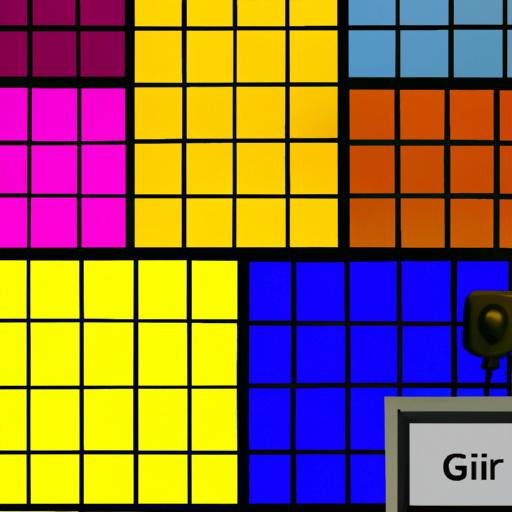
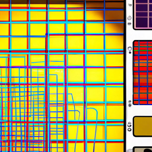
Grid systems act as a guide for designers, helping them align and arrange various elements consistently throughout the interface. By establishing a set of rules and guidelines, grid systems ensure visual harmony and coherence, making it easier for users to navigate and understand the interface. They create a sense of order and structure, which enhances the overall user experience.
The Benefits of Using Grid Systems in Interface Design
Implementing grid systems in interface design offers several benefits that contribute to the success of a digital product. Let’s explore some of these advantages:
1. Consistency and Visual Hierarchy
A well-designed grid system ensures consistency in the placement and alignment of elements across different screens and devices. This consistency helps users understand the interface and navigate it effortlessly. By establishing a visual hierarchy, grid systems guide users’ attention to the most important elements, such as call-to-action buttons or key information, improving the overall usability of the interface.
2. Responsive Design
In today’s digital landscape, where users access interfaces on various devices with different screen sizes, responsive design is crucial. Grid systems facilitate responsive design by providing a flexible framework that adapts to different screen sizes and orientations. Designers can create multiple layouts within the grid system, ensuring a seamless user experience across devices.
3. Efficiency in Design and Development
Grid systems streamline the design and development process by providing a structured framework. Designers can quickly iterate and experiment with different layouts and arrangements within the grid, saving time and effort. Developers also benefit from grid systems as they can easily translate the design into code, ensuring consistency and efficiency in the development phase.
4. Scalability and Maintainability
As digital products evolve and grow, maintaining consistency becomes challenging. Grid systems address this challenge by providing a scalable and maintainable structure. Designers can easily add or modify elements within the grid, ensuring the interface remains consistent and visually appealing even as the product expands or undergoes updates.
Implementing Grid Systems in Interface Design
Implementing grid systems effectively requires careful planning and consideration. Here are some key steps to follow:
1. Define the Grid Structure
The first step is to define the grid structure based on the requirements of the interface. Consider the content and elements that need to be included and determine the appropriate number of columns and rows. For example, a news website might require a grid with multiple columns to accommodate various articles and images.
2. Establish Grid Spacing
Grid spacing refers to the gaps between columns, rows, and elements within the grid. It is essential to establish consistent spacing to maintain visual harmony. Consider the size and proportions of the elements within the interface and determine appropriate spacing values. For example, larger gaps might be suitable for headlines and sections, while smaller gaps can be used for text paragraphs and buttons.
3. Align Elements to the Grid
Once the grid structure and spacing are defined, align the elements of the interface to the grid. This alignment ensures consistency and visual harmony. Elements such as text blocks, images, buttons, and navigation menus should align with the grid lines to create a cohesive and organized layout.
4. Adapt for Responsive Design
Consider how the grid system will adapt to different screen sizes and orientations. Define breakpoints where the layout will change to accommodate smaller or larger screens. Create alternative layouts within the grid system to ensure a seamless user experience across devices.
5. Test and Iterate
Testing is a crucial step in implementing grid systems effectively. Conduct usability tests to ensure the interface is intuitive and easy to navigate. Gather feedback from users and iterate on the design if necessary. Grid systems provide a solid foundation for testing and iterating, as changes can be made within the established structure.
Case Studies: Successful Implementation of Grid Systems
Several digital products have successfully implemented grid systems to enhance their interface design. Let’s explore a couple of case studies:
1. Airbnb
Airbnb, the popular online marketplace for accommodations, utilizes a grid-based layout to showcase listings. The grid system allows users to easily browse through various listings, with consistent spacing and alignment. The use of a grid system ensures a visually appealing and user-friendly interface, contributing to Airbnb’s success.
2. Google Material Design
Google’s Material Design, a design language used across their products, incorporates a grid system to maintain consistency and visual hierarchy. The grid system provides guidelines for spacing, alignment, and responsive design, ensuring a seamless experience across different devices and platforms.
Conclusion
Grid systems are a powerful tool in interface design, providing structure, consistency, and visual harmony. By implementing grid systems effectively, designers can create intuitive and aesthetically pleasing interfaces that enhance the user experience. The benefits of using grid systems, such as consistency, responsive design, efficiency, and scalability, contribute to the success of digital products. Through careful planning, alignment, and testing, grid systems can be implemented to create visually appealing and user-friendly interfaces that meet the needs of modern users.
