-
Table of Contents
- Film Noir Aesthetics: Cinematic Inspiration in Design
- The Origins of Film Noir
- The Visual Style of Film Noir
- The Influence of Film Noir on Design
- Graphic Design
- Fashion
- Interior Design
- Case Studies: Film Noir-Inspired Designs
- Case Study 1: “Sin City” Graphic Novel
- Case Study 2: “Mad Men” TV Series
- Conclusion
Film Noir Aesthetics: Cinematic Inspiration in Design

Film noir, a genre of movies that emerged in the 1940s and 1950s, has had a significant impact on various art forms, including design. The dark and mysterious atmosphere, the use of shadows and light, and the complex characters of film noir have inspired designers to incorporate these elements into their work. In this article, we will explore the aesthetics of film noir and how they have influenced design, providing valuable insights into the world of cinematic inspiration.
The Origins of Film Noir
Film noir originated in Hollywood during the post-World War II era. The term “film noir” was coined by French critics who noticed a trend in American movies that featured dark and pessimistic themes. These films often depicted crime, corruption, and moral ambiguity, reflecting the anxieties and uncertainties of the time.
Some of the most iconic film noir movies include “Double Indemnity” (1944), “The Maltese Falcon” (1941), and “Sunset Boulevard” (1950). These films were characterized by their distinctive visual style, which became synonymous with film noir aesthetics.
The Visual Style of Film Noir
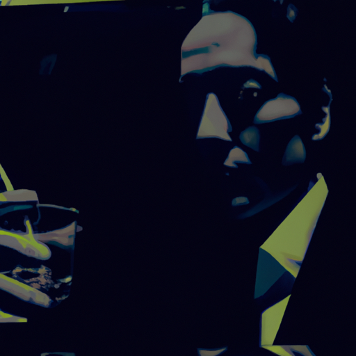
Film noir is known for its unique visual style, which is characterized by the use of shadows, low-key lighting, and high contrast. These elements create a sense of mystery and suspense, enhancing the overall atmosphere of the film.
One of the key features of film noir aesthetics is the use of chiaroscuro lighting. Chiaroscuro refers to the strong contrast between light and dark areas in a composition. In film noir, this technique is often used to create dramatic and moody scenes. For example, in “Double Indemnity,” the use of shadows and light creates a sense of unease and tension, reflecting the moral ambiguity of the characters.
Another important aspect of film noir aesthetics is the use of low-angle shots. Low-angle shots are taken from a low position, looking up at the subject. This technique is often used to depict power dynamics and create a sense of unease. In “The Maltese Falcon,” for instance, low-angle shots are used to emphasize the dominance of the characters and their morally ambiguous nature.
The Influence of Film Noir on Design
The visual style of film noir has had a significant influence on various design disciplines, including graphic design, fashion, and interior design. Designers have drawn inspiration from the dark and mysterious atmosphere of film noir, incorporating its elements into their work.
Graphic Design
In graphic design, film noir aesthetics are often used to create a sense of intrigue and suspense. The use of shadows, high contrast, and dramatic lighting can evoke a film noir atmosphere, capturing the attention of the viewer. For example, a poster for a crime thriller may incorporate the visual elements of film noir to convey the genre and create anticipation.
Typography also plays a crucial role in film noir-inspired graphic design. Bold and dramatic fonts, often with a vintage feel, can enhance the overall aesthetic and evoke a sense of nostalgia. The use of typography in film noir movie posters, such as the iconic title designs of “The Big Sleep” (1946) and “Touch of Evil” (1958), has inspired many designers to experiment with typography in their work.
Fashion
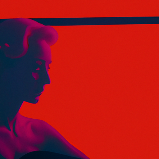
Film noir has also had a significant influence on fashion. The iconic style of femme fatales, with their glamorous yet mysterious appearance, has become synonymous with film noir aesthetics. The use of dark colors, such as black, gray, and deep red, is often associated with film noir-inspired fashion.
Designers have incorporated film noir elements into their collections, creating garments that evoke the allure and sophistication of the genre. For example, the fashion brand Prada’s Fall/Winter 2012 collection drew inspiration from film noir, featuring tailored suits, pencil skirts, and fur coats reminiscent of the 1940s and 1950s.
Interior Design
Film noir aesthetics have also found their way into interior design. The dark and moody atmosphere of film noir can be recreated in interior spaces through the use of color, lighting, and materials. Dark colors, such as black, deep blue, and burgundy, can create a sense of mystery and elegance.
Lighting is another crucial element in film noir-inspired interior design. The use of dim lighting, accentuated by strategically placed lamps and spotlights, can create a dramatic and atmospheric effect. For example, the interior of a bar or a lounge inspired by film noir may feature low lighting, leather furniture, and a black and white color scheme.
Case Studies: Film Noir-Inspired Designs
Let’s take a look at some case studies that demonstrate how film noir aesthetics have been incorporated into design:
Case Study 1: “Sin City” Graphic Novel
Frank Miller’s graphic novel series “Sin City” is a prime example of how film noir aesthetics can be translated into graphic design. The series, which was later adapted into a film, features a distinctive visual style characterized by high contrast black and white illustrations, reminiscent of classic film noir movies.
The use of shadows, dramatic lighting, and bold typography creates a dark and gritty atmosphere, perfectly capturing the essence of film noir. The success of “Sin City” demonstrates the enduring appeal of film noir aesthetics in graphic design.
Case Study 2: “Mad Men” TV Series
The critically acclaimed TV series “Mad Men” is known for its meticulous attention to detail in recreating the 1960s aesthetic. The show’s production design draws heavily from film noir, incorporating its visual elements into the sets, costumes, and overall atmosphere.
The use of low-key lighting, dark color palettes, and mid-century modern furniture creates a sense of nostalgia and sophistication, reflecting the era and the characters’ complex personalities. “Mad Men” demonstrates how film noir aesthetics can be adapted to different time periods and contexts.
Conclusion
Film noir aesthetics have had a lasting impact on design, inspiring designers to incorporate its elements into various disciplines. The dark and mysterious atmosphere, the use of shadows and light, and the complex characters of film noir have become synonymous with sophistication and intrigue.
Whether it’s in graphic design, fashion, or interior design, film noir aesthetics continue to captivate and inspire. By drawing from the visual style of film noir, designers can create compelling and evocative designs that resonate with audiences.
As we continue to explore the world of design, it’s important to recognize the influence of film noir and its enduring appeal. By understanding the aesthetics of film noir, designers can tap into its rich visual language and create designs that stand the test of time.
