Are you curious about the impact of flat design graphics on user experience? In my latest blog post, we will delve into this interesting topic to explore how the use of flat design principles can enhance the overall user experience of a website or application. Flat design graphics have gained popularity in recent years for their minimalist and clean aesthetic, but their influence goes beyond just visual appeal. Let’s uncover the various ways in which flat design graphics can positively affect user experience.
Main Points:
- Understanding the basics of flat design graphics and their principles
- Exploring the benefits of using flat design graphics for user experience
- Best practices for implementing flat design principles in web and mobile design
- Optimizing flat design graphics for SEO without compromising user experience
- The future of flat design graphics and its potential impact on user experience trends

The Evolution of Flat Design in Graphic Design History
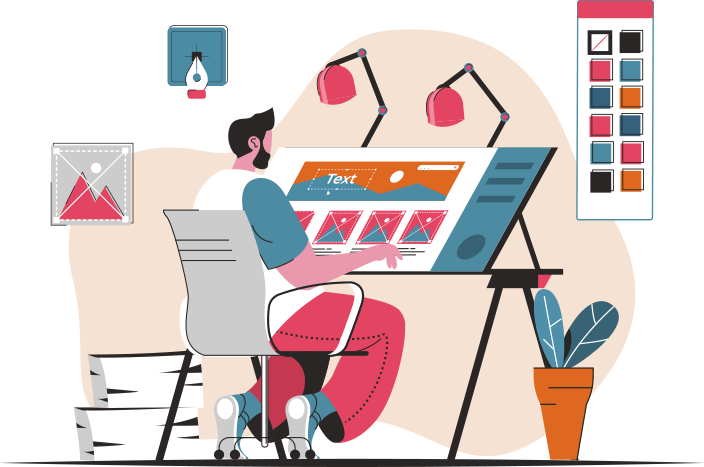
Flat design has become a prominent trend in the world of graphic design in recent years. Its evolution can be traced back to the early days of digital design, but it has truly flourished in the modern era. This minimalist approach to design focuses on simplicity, typography, and bold colors.
Flat design principles optimization
One of the key principles of flat design is simplicity. Designers strive to create clean and uncluttered layouts that are easy to navigate. This approach eliminates unnecessary elements and focuses on essential components that enhance the user experience.
Best practices for Flat design principles
- Utilize negative space: Negative space helps to create a sense of balance and harmony in flat design. It allows elements to breathe and stand out.
- Choose bold typography: Typography is a crucial element in flat design. Opt for simple yet impactful fonts that complement the overall aesthetic.
- Use vibrant colors: Flat design embraces bright and bold colors to draw attention and create a visually appealing design.
Implementing Flat design principles for SEO
When applying flat design principles to web design, it is essential to consider SEO best practices. This includes optimizing images, using descriptive alt text, and creating a mobile-friendly layout.

The Essence of Flat Design and Its Impact on User Experience
Flat design has emerged as a prominent trend in the field of graphic design and user interface (UI) design in recent years. This minimalistic approach focuses on simplicity, clarity, and functionality, creating an aesthetic that is clean and uncluttered. The key principles of flat design play a crucial role in enhancing the overall user experience and usability of a website or application.
Key Principles of Flat Design:
| Principle | Description |
|---|---|
| Simplicity | Flat design eliminates unnecessary elements and embellishments, focusing on essential features and content. |
| Clarity | Clear typography, simple colors, and intuitive navigation enhance the clarity of the design, making it easier for users to understand and interact with the interface. |
| Functionality | Emphasizing usability and functionality, flat design focuses on providing a seamless user experience by prioritizing intuitive interactions and efficient workflows. |
By following these key principles, designers can create visually appealing and user-friendly interfaces that not only look modern and stylish but also improve the overall user experience. Flat design not only enhances the aesthetic appeal of a website or application but also contributes to increased engagement, improved usability, and higher conversion rates.

Unleashing Creativity: Examining Success Stories of Flat Design in User Interfaces
Flat design has taken the digital world by storm, revolutionizing the way users interact with websites and applications. This minimalist approach to user interface design focuses on simplicity, clarity, and functionality, ultimately enhancing the user experience. In this article, we will delve into case studies that showcase the successful implementation of flat design in user interfaces, highlighting the key benefits and impact on user engagement.
Minimalism
One of the key principles of flat design is minimalism, which eliminates unnecessary elements and distractions to create a clean and sleek interface. By removing clutter and focusing on essential elements, users can navigate the interface more easily and efficiently. This approach promotes a seamless user experience, leading to increased user satisfaction and engagement.
Color Scheme
The choice of colors in flat design plays a crucial role in enhancing visual appeal and conveying information effectively. Bold and vibrant colors are often used to create a visually striking interface, while subtle gradients and shadows add depth and dimension. The use of a consistent color scheme throughout the interface helps users easily identify different sections and functions, contributing to a more cohesive and intuitive user experience.
User Interaction
Flat design promotes intuitive user interaction by incorporating familiar design patterns and gestures. Clear typography, icons, and buttons guide users through the interface, allowing for seamless navigation and interaction. Animations and transitions are used sparingly to enhance user engagement without overwhelming or distracting the user. By focusing on user-centered design principles, flat design prioritizes usability and accessibility, ultimately improving the overall user experience.
In conclusion, the implementation of flat design in user interfaces has proven to be a game-changer in the digital landscape. By emphasizing simplicity, clarity, and functionality, flat design enhances user engagement and satisfaction, ultimately leading to a more enjoyable and efficient user experience. The case studies discussed above exemplify the success of flat design in modern user interfaces, highlighting its impact on visual aesthetics, usability, and user interaction. As technology continues to evolve, flat design will undoubtedly remain a driving force in shaping the future of user interface design.
The Role of Color Theory in Flat Design Graphics
In the world of graphic design, color theory plays a crucial role in creating visually appealing and effective designs. When it comes to flat design graphics, understanding the principles of color theory becomes even more significant. Flat design, with its minimalistic approach and emphasis on simplicity, relies heavily on the careful selection of colors to create a clean and modern aesthetic.
Primary Colors
One of the fundamental aspects of color theory is the concept of primary colors. In flat design graphics, primary colors are often used to create a bold and striking visual impact. Colors such as red, blue, and yellow are commonly used as primary colors in flat design, providing a strong foundation for the overall color scheme.
Color Combinations
Another important consideration in flat design graphics is the use of color combinations. Understanding how different colors interact with each other is essential in creating harmonious and balanced designs. Analogous color schemes, complementary colors, and monochromatic palettes are commonly used in flat design to achieve a cohesive and unified look.
Psychology of Color
Color psychology is another aspect of color theory that plays a significant role in flat design graphics. Different colors evoke different emotions and moods, and understanding the psychological impact of color can help designers create designs that resonate with their audience. For example, blue is often associated with trust and reliability, while red is commonly used to convey energy and passion.
Color Contrast
Color contrast is a key principle in flat design graphics, as it helps to create visual interest and hierarchy in the design. By utilizing contrasting colors, designers can draw attention to specific elements and create a sense of depth and dimension. Bold contrasts between light and dark colors can make elements stand out and enhance the overall visual impact of the design.
Conclusion
In conclusion, color theory plays a crucial role in the creation of flat design graphics. By understanding the principles of color theory, designers can effectively use color to communicate their message, evoke emotions, and create visually appealing designs. Whether it’s primary colors, color combinations, color psychology, or color contrast, a thorough knowledge of color theory is essential for creating successful flat design graphics.
Embracing the Challenge: Crafting the Future with Flat Design
In the fast-paced world of web design, staying ahead of the curve is essential. As technology continues to evolve, web designers face both challenges and opportunities in adopting flat design. This minimalist approach to design has gained popularity in recent years for its clean aesthetic and user-friendly interface. However, transitioning to flat design is not without its hurdles.
The Challenge of Simplicity
One of the main challenges web designers face when adopting flat design is the need to simplify their approach. Traditional design elements such as drop shadows, gradients, and textures are replaced with flat colors and simple shapes. This shift requires designers to rethink their design process and focus on creating a visually appealing layout without relying on intricate details.
The Opportunity for Creativity
Despite the challenges, flat design also presents a unique opportunity for web designers to showcase their creativity. By embracing the minimalistic style, designers can experiment with bold colors, typography, and negative space to create a modern and engaging website. This shift in design philosophy encourages innovation and allows designers to push the boundaries of traditional design concepts.
Conclusion: Navigating the Future of Web Design
In conclusion, the challenges and opportunities in adopting flat design for web designers highlight the importance of adaptability and creativity in a rapidly changing industry. By embracing the simplicity of flat design and exploring new ways to engage users, designers can craft the future of web design with confidence and innovation.
Conclusion
In conclusion, the concept of ‘undefined’ in the world of design is constantly evolving and expanding. With the rise of technology and the shift towards digital platforms, designers are constantly pushing boundaries and challenging traditional norms. Flat design graphics have become increasingly popular due to their simplicity, clean lines, and modern aesthetic. As we move forward, it will be interesting to see how the idea of ‘undefined’ continues to shape and influence the design world.
Frequently Asked Questions
What is flat design?
Flat design is a minimalist design approach that emphasizes usability. It features clean, open space, crisp edges, bright colors, and two-dimensional illustrations.
Why is flat design popular?
Flat design is popular because it provides a modern and clean visual aesthetic, improves user experience by focusing on content, and adapts well to various screen sizes.
What are the key principles of flat design?
Key principles of flat design include simplicity, use of basic shapes, minimalism, emphasis on typography, vibrant colors, and lack of unnecessary elements like gradients and shadows.
How does flat design differ from skeuomorphism?
Flat design is a stark contrast to skeuomorphism, as it eliminates realistic textures, drop shadows, and reflections in favor of a more simplistic and clean approach to design.
What are the potential drawbacks of flat design?
Some potential drawbacks of flat design include the risk of user confusion due to minimal visual cues, challenges in creating visual hierarchy without 3D elements, and the need for strong typography and color choices to convey information effectively.
