-
Table of Contents
Dynamic Poster Design: Mixing Typography and Imagery

Posters have long been a powerful medium for communication, capturing attention and conveying messages in a visually striking manner. In the digital age, where attention spans are shorter than ever, it is crucial for poster designs to be dynamic and captivating. One effective way to achieve this is by combining typography and imagery in a harmonious and impactful way. This article explores the art of dynamic poster design, delving into the importance of typography and imagery, providing examples, case studies, and statistics to support the key points.
The Power of Typography in Poster Design
Typography plays a vital role in poster design, as it not only communicates the message but also sets the tone and evokes emotions. The right choice of fonts, sizes, and styles can make a significant difference in how the poster is perceived and understood. Here are some key considerations when using typography in dynamic poster design:
- Font Selection: Choosing the right font is crucial to convey the intended message. Different fonts have distinct personalities and evoke different emotions. For example, a bold and sans-serif font may convey strength and modernity, while a script font may evoke elegance and sophistication.
- Hierarchy: Establishing a clear hierarchy in typography helps guide the viewer’s attention and ensures that the most important information stands out. This can be achieved through variations in font size, weight, and color.
- Contrast: Contrast is essential to create visual interest and make the typography stand out. Contrast can be achieved through variations in font size, weight, color, or even by combining different fonts.
- Whitespace: Whitespace, or negative space, is the empty space around and between elements. It helps create balance, improve readability, and draw attention to the typography. Strategic use of whitespace can make the typography more impactful and legible.
By carefully considering these typography elements, designers can create visually appealing and engaging posters that effectively communicate the intended message.
The Role of Imagery in Dynamic Poster Design
While typography is crucial, imagery also plays a significant role in dynamic poster design. Imagery has the power to evoke emotions, capture attention, and convey complex ideas in a single glance. Here are some key considerations when incorporating imagery in dynamic poster design:
- Relevance: The imagery used in a poster should be relevant to the message and the target audience. It should support and enhance the overall concept rather than distract or confuse viewers.
- Visual Impact: The imagery should have a strong visual impact and grab the viewer’s attention. This can be achieved through the use of bold colors, striking compositions, or unexpected perspectives.
- Symbolism: Imagery can be used symbolically to convey deeper meanings or associations. By using symbols or metaphors, designers can add layers of interpretation and engage viewers on a deeper level.
- Integration with Typography: The imagery and typography should work together harmoniously to create a cohesive and impactful design. They should complement each other and reinforce the overall message.
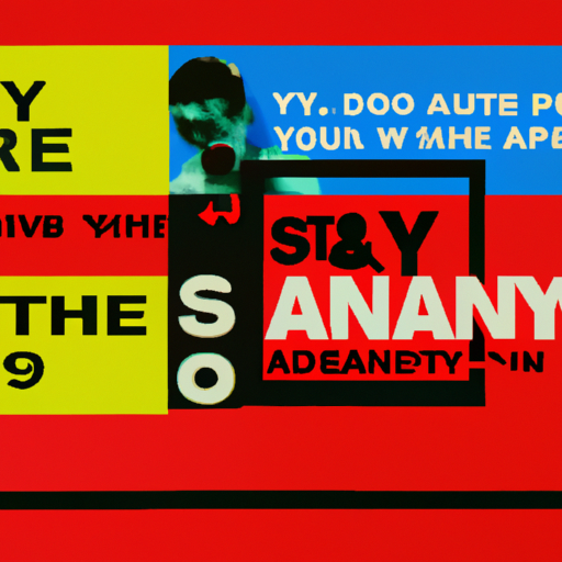
When typography and imagery are combined effectively, they create a powerful synergy that captures attention, communicates messages, and leaves a lasting impression on viewers.
Case Studies: Dynamic Poster Designs
Let’s explore some real-world examples of dynamic poster designs that successfully combine typography and imagery:
1. Nike: “Just Do It”
Nike’s iconic “Just Do It” campaign is a prime example of dynamic poster design. The posters feature bold typography with a strong and motivational message, combined with powerful imagery of athletes in action. The typography and imagery work together to convey a sense of determination, energy, and athleticism.
2. Apple: “Think Different”
Apple’s “Think Different” campaign revolutionized the tech industry and left a lasting impact on poster design. The posters feature a simple yet powerful black-and-white portrait of influential figures, such as Albert Einstein and Martin Luther King Jr., accompanied by the iconic Apple logo and the phrase “Think Different.” The combination of typography and imagery creates a sense of inspiration, innovation, and individuality.
3. WWF: “Save the Earth”
The World Wildlife Fund (WWF) is known for its powerful and impactful poster designs. In their “Save the Earth” campaign, they combine typography with imagery of endangered animals and environmental destruction. The typography is integrated seamlessly with the imagery, creating a sense of urgency and raising awareness about the importance of conservation.
The Impact of Dynamic Poster Design
Dynamic poster design, with its effective combination of typography and imagery, has a significant impact on viewers. Here are some statistics that highlight the importance and effectiveness of dynamic poster design:
- According to a study by the Outdoor Advertising Association of America, 71% of people often look at roadside billboards, and 56% talk about funny or interesting ones.
- A study conducted by the University of San Diego found that adding visuals to text increases information retention by 42%.
- In a survey conducted by Adobe, 66% of respondents agreed that good design plays a crucial role in capturing attention.
These statistics demonstrate the power of dynamic poster design in capturing attention, conveying messages effectively, and leaving a lasting impression on viewers.
Summary
Dynamic poster design, achieved through the effective combination of typography and imagery, is a powerful tool for communication in the digital age. By carefully selecting fonts, establishing hierarchy, creating contrast, and utilizing whitespace, designers can create impactful typography. Similarly, by considering relevance, visual impact, symbolism, and integration with typography, designers can incorporate imagery that captures attention and conveys messages effectively. Real-world examples, such as Nike’s “Just Do It,” Apple’s “Think Different,” and WWF’s “Save the Earth,” demonstrate the success of dynamic poster design. The impact of dynamic poster design is further supported by statistics that highlight the effectiveness of visual communication. By mastering the art of dynamic poster design, designers can create visually striking and engaging posters that leave a lasting impression on viewers.
