-
Table of Contents
Applying Motion and Animation in Interface Design

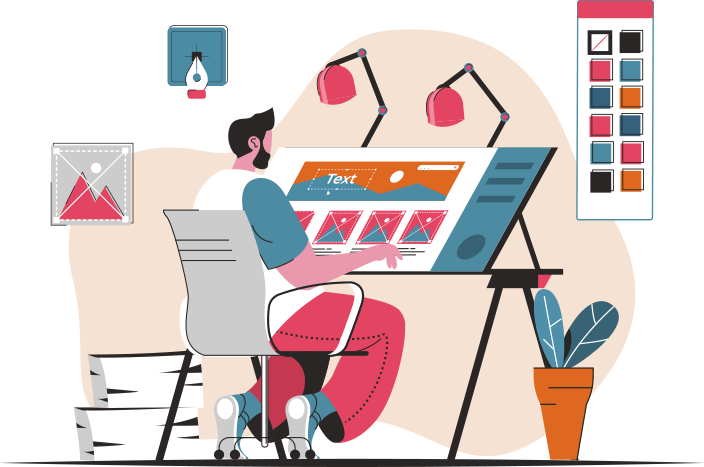
Interface design plays a crucial role in creating engaging and user-friendly digital experiences. As technology continues to evolve, designers are constantly exploring new ways to enhance user interactions. One such approach is the use of motion and animation in interface design. By incorporating motion and animation, designers can create visually appealing and intuitive interfaces that captivate users and improve their overall experience. In this article, we will explore the benefits of applying motion and animation in interface design and provide valuable insights into its implementation.
The Power of Motion and Animation
Motion and animation have the ability to convey information, guide users, and evoke emotions. When used effectively, they can transform a static interface into a dynamic and engaging experience. Here are some key benefits of incorporating motion and animation in interface design:
- Enhanced User Engagement: Motion and animation capture users’ attention and encourage them to interact with the interface. By adding subtle animations to buttons, menus, or transitions, designers can create a sense of delight and surprise, making the experience more enjoyable for users.
- Improved User Understanding: Motion and animation can help users understand how to navigate through an interface or interact with specific elements. For example, a loading animation can indicate that a process is in progress, providing feedback to the user and reducing frustration.
- Visual Hierarchy and Focus: Motion and animation can be used to guide users’ attention to important elements or actions. By animating a call-to-action button or highlighting a specific section, designers can direct users’ focus and improve the overall usability of the interface.
- Storytelling and Branding: Motion and animation can be powerful tools for storytelling and branding. By incorporating animated characters, transitions, or visual effects that align with the brand’s personality, designers can create a unique and memorable experience that resonates with users.
Best Practices for Implementing Motion and Animation
While motion and animation can greatly enhance interface design, it is important to use them judiciously and purposefully. Here are some best practices to consider when implementing motion and animation:
- Keep it Subtle: Subtle animations are often more effective than flashy and excessive ones. Aim for animations that enhance the user experience without overwhelming or distracting users from the main content.
- Use Meaningful Transitions: Transitions should have a clear purpose and meaning. They should provide visual cues to help users understand the relationship between different elements or screens. For example, a smooth transition between two screens can create a sense of continuity and flow.
- Consider Performance: While animations can greatly enhance the user experience, they should not compromise the performance of the interface. Optimize animations to ensure they load quickly and run smoothly on different devices and platforms.
- Align with User Expectations: Users have become accustomed to certain interaction patterns and animations. While it is important to innovate, it is also crucial to align with users’ expectations to provide a familiar and intuitive experience.
- Test and Iterate: As with any design element, it is essential to test animations with real users and gather feedback. Iterate based on user insights to refine and improve the animations over time.
Case Studies: Successful Implementation of Motion and Animation
Let’s explore some real-world examples of successful implementation of motion and animation in interface design:
1. Google Material Design
Google’s Material Design is a widely recognized design language that incorporates motion and animation to create a cohesive and delightful user experience. The use of subtle animations for button presses, transitions, and loading indicators adds a layer of interactivity and responsiveness to the interface. These animations not only enhance the visual appeal but also provide valuable feedback to users, making the overall experience more intuitive and engaging.
2. Apple iOS Interface
Apple’s iOS interface is known for its smooth and fluid animations. From the parallax effect on the home screen to the subtle transitions between apps, Apple has mastered the art of using motion and animation to create a visually stunning and immersive experience. These animations not only make the interface feel alive but also provide users with a sense of control and responsiveness.
3. Slack’s Onboarding Experience
Slack, a popular team communication platform, uses motion and animation to guide users through their onboarding experience. By incorporating animated tutorials and interactive elements, Slack ensures that new users quickly understand how to navigate and use the platform. These animations not only make the onboarding process more engaging but also reduce the learning curve for new users.
Conclusion
Motion and animation have become integral elements of modern interface design. By leveraging the power of motion and animation, designers can create visually appealing, intuitive, and engaging interfaces that captivate users. From enhancing user engagement to improving understanding and guiding users, motion and animation offer numerous benefits. However, it is important to use them judiciously and purposefully, keeping in mind best practices and user expectations. By incorporating motion and animation effectively, designers can elevate the user experience and create interfaces that leave a lasting impression.
