-
Table of Contents
Chiaroscuro Drama: Light and Shadow in Design

Design is a powerful tool that can evoke emotions, tell stories, and create memorable experiences. One technique that designers often use to achieve these effects is chiaroscuro, a technique borrowed from the world of art. Chiaroscuro, which means “light-dark” in Italian, refers to the use of light and shadow to create contrast and depth. In this article, we will explore the concept of chiaroscuro drama in design, its history, its applications, and its impact on the viewer.
The History of Chiaroscuro
Chiaroscuro has its roots in the art world, particularly in the works of Renaissance painters such as Leonardo da Vinci and Caravaggio. These artists used light and shadow to create a sense of volume and three-dimensionality in their paintings. By strategically placing light sources and casting shadows, they were able to give their subjects a sense of depth and realism.
Over time, chiaroscuro became a popular technique in other art forms, such as photography and film. In photography, photographers use lighting techniques to create dramatic effects and highlight certain elements of a composition. In film, directors and cinematographers use lighting to set the mood, create tension, and guide the viewer’s attention.
The Role of Chiaroscuro in Design
Chiaroscuro drama has found its way into the world of design, where it is used to create visually striking and emotionally engaging experiences. Designers use light and shadow to manipulate the perception of depth, create focal points, and guide the viewer’s attention. By carefully controlling the interplay between light and shadow, designers can create a sense of drama and intrigue.
One area where chiaroscuro drama is commonly used in design is in the creation of user interfaces. Designers use light and shadow to create a sense of hierarchy and depth, making it easier for users to navigate and understand the interface. By using shadows to simulate the effect of light hitting physical objects, designers can create a more intuitive and immersive user experience.
Chiaroscuro drama is also used in graphic design to create visually striking compositions. By using light and shadow to create contrast, designers can make certain elements stand out and grab the viewer’s attention. This technique is often used in advertising and branding to create memorable and impactful visuals.
Examples of Chiaroscuro Drama in Design
Let’s take a look at some examples of chiaroscuro drama in design to better understand how it is used and its impact on the viewer:
Example 1: Apple’s Product Photography
Apple is known for its sleek and minimalist product designs, and their product photography is no exception. In their marketing materials, Apple often uses chiaroscuro lighting techniques to create a sense of depth and highlight the product’s form. By casting shadows and using soft, diffused lighting, Apple is able to make their products look more three-dimensional and desirable.
Example 2: Film Posters
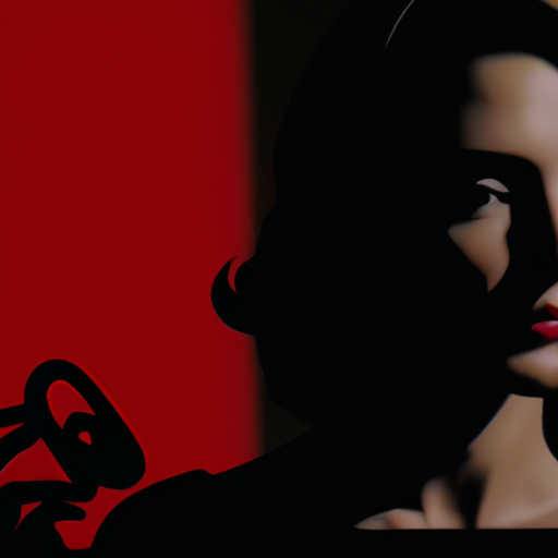
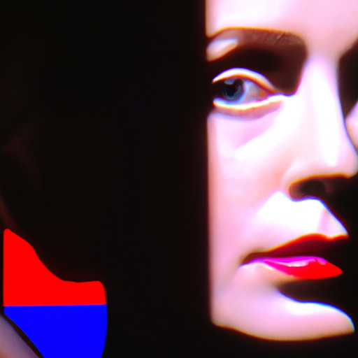
Film posters are a great example of how chiaroscuro drama can be used to create a sense of intrigue and capture the viewer’s attention. Many film posters use dramatic lighting and shadows to create a sense of mystery and suspense. By strategically placing light sources and casting shadows, designers can create a visually striking composition that draws the viewer in.
Example 3: Website Design
Website design is another area where chiaroscuro drama can be effectively used. By using light and shadow to create depth and hierarchy, designers can guide the user’s attention and make the interface more intuitive. For example, a button with a drop shadow can appear more clickable and interactive, while a subtle gradient can create a sense of depth and realism.
The Impact of Chiaroscuro Drama on the Viewer
Chiaroscuro drama has a profound impact on the viewer, both on a conscious and subconscious level. By using light and shadow to create contrast and depth, designers can evoke emotions, create a sense of drama, and tell stories. The interplay between light and shadow can create a sense of mystery and intrigue, drawing the viewer in and encouraging them to explore further.
Research has shown that the use of chiaroscuro drama in design can also improve the user experience. By creating a sense of hierarchy and depth, designers can make interfaces more intuitive and easier to navigate. The use of light and shadow can also help to guide the user’s attention and highlight important elements.
Conclusion
Chiaroscuro drama is a powerful technique that designers can use to create visually striking and emotionally engaging experiences. By using light and shadow to create contrast and depth, designers can evoke emotions, tell stories, and guide the viewer’s attention. Whether it’s in user interfaces, graphic design, or photography, chiaroscuro drama has the ability to create memorable and impactful visuals. So, the next time you’re working on a design project, consider incorporating chiaroscuro drama to create a truly captivating experience.
