

-
Table of Contents
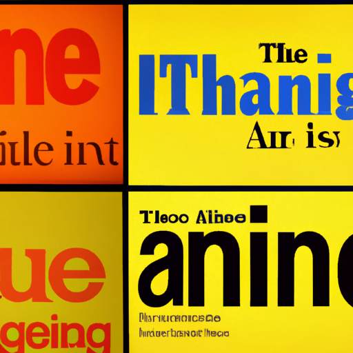
- The Influence of Typography in Editorial Design
- The Importance of Typography in Editorial Design
- Key Considerations in Typography for Editorial Design
- 1. Typeface Selection
- 2. Font Size and Line Spacing
- 3. Hierarchy and Contrast
- 4. Alignment and Layout
- Case Studies: The Impact of Typography in Editorial Design
- 1. The New York Times
- 2. Vogue
- Best Practices in Typography for Editorial Design
- Summary
The Influence of Typography in Editorial Design
Typography plays a crucial role in editorial design, shaping the way readers perceive and engage with content. From newspapers and magazines to online articles and blogs, the choice of typeface, font size, spacing, and layout can significantly impact the readability, visual appeal, and overall effectiveness of a publication. In this article, we will explore the influence of typography in editorial design, examining its importance, key considerations, and best practices.
The Importance of Typography in Editorial Design
Typography is more than just selecting a font; it is a powerful tool that can enhance the message, evoke emotions, and guide readers through the content. Here are some key reasons why typography is crucial in editorial design:
- Readability: The primary purpose of typography is to make the text legible and easy to read. The right choice of typeface, font size, and line spacing can significantly improve the reading experience, ensuring that readers can effortlessly consume the content.
- Visual Hierarchy: Typography helps establish a visual hierarchy within the publication, guiding readers’ attention and emphasizing important information. By using different font sizes, weights, and styles, designers can create a clear structure and make key elements stand out.
- Brand Identity: Typography plays a crucial role in establishing and maintaining a brand’s identity. Consistent use of fonts across different publications helps create a recognizable and cohesive brand image.
- Emotional Impact: Typography can evoke emotions and set the tone for the content. Different typefaces have distinct personalities, and designers can leverage this to create the desired emotional response from readers.
Key Considerations in Typography for Editorial Design
When selecting typography for editorial design, several factors need to be considered to ensure the best possible outcome. Here are some key considerations:
1. Typeface Selection
The choice of typeface is critical as it sets the overall tone and personality of the publication. Different typefaces have different characteristics, such as serif or sans-serif, modern or traditional, elegant or playful. The typeface should align with the content and the target audience.
For example, a serious news publication may opt for a classic serif typeface to convey authority and professionalism, while a lifestyle magazine targeting a younger audience may choose a more contemporary and playful sans-serif typeface.
2. Font Size and Line Spacing
Font size and line spacing directly impact readability. The text should be large enough to be easily legible, especially for longer articles. The line spacing, or leading, should provide enough breathing space between lines to prevent the text from appearing cramped or overwhelming.
It is important to consider the medium in which the publication will be consumed. For print, a larger font size may be necessary, while for online articles, where readers may be viewing the content on smaller screens, a slightly smaller font size may be more appropriate.
3. Hierarchy and Contrast
Creating a clear visual hierarchy is essential in editorial design. By using different font sizes, weights, and styles, designers can guide readers’ attention and emphasize key elements. Headlines and subheadings should be distinct from the body text to make them stand out.
Contrast is also crucial in typography. The contrast between font sizes, colors, and styles helps create visual interest and makes the content more engaging. However, it is important to strike a balance and avoid excessive contrast that may distract or confuse readers.
4. Alignment and Layout
The alignment and layout of text can significantly impact the readability and visual appeal of a publication. The text should be aligned consistently throughout the publication, whether it is left-aligned, right-aligned, centered, or justified.
Additionally, the layout should be carefully considered to ensure that the text flows smoothly and is easy to follow. Columns, margins, and spacing between paragraphs should be optimized to create a comfortable reading experience.
Case Studies: The Impact of Typography in Editorial Design
Let’s explore some real-world examples that highlight the influence of typography in editorial design:
1. The New York Times
The New York Times is renowned for its editorial design, and typography plays a crucial role in its success. The newspaper uses a classic serif typeface, often Times New Roman, for its body text, conveying a sense of tradition and authority. The font size and line spacing are carefully chosen to ensure readability, even in small print.
The New York Times also utilizes a strong visual hierarchy, with bold headlines and subheadings that stand out from the body text. The alignment and layout are clean and consistent, making it easy for readers to navigate through the content.
2. Vogue
Vogue, a leading fashion magazine, showcases the power of typography in creating a distinct brand identity. The magazine often uses elegant and sophisticated serif typefaces for its headlines and subheadings, reflecting the luxury and high-end nature of the fashion industry.
The font sizes are carefully chosen to create a visual hierarchy, with larger headlines grabbing attention and smaller subheadings guiding readers through the content. The layout is visually appealing, with ample white space and well-aligned text.
Best Practices in Typography for Editorial Design
Here are some best practices to consider when working with typography in editorial design:
- Choose typefaces that align with the content and target audience.
- Ensure readability by selecting appropriate font sizes and line spacing.
- Create a clear visual hierarchy by using different font sizes, weights, and styles.
- Use contrast effectively to make key elements stand out.
- Align text consistently and optimize the layout for a comfortable reading experience.
- Consider the medium in which the publication will be consumed (print, online, mobile) and adapt typography accordingly.
Summary
Typography plays a vital role in editorial design, influencing the readability, visual appeal, and overall effectiveness of publications. By carefully selecting typefaces, font sizes, line spacing, and layouts, designers can create a clear visual hierarchy, evoke emotions, and guide readers through the content. The New York Times and Vogue are examples of publications that effectively leverage typography to enhance their brand identity and engage readers. By following best practices and considering key factors, designers can harness the power of typography to create compelling and impactful editorial designs.